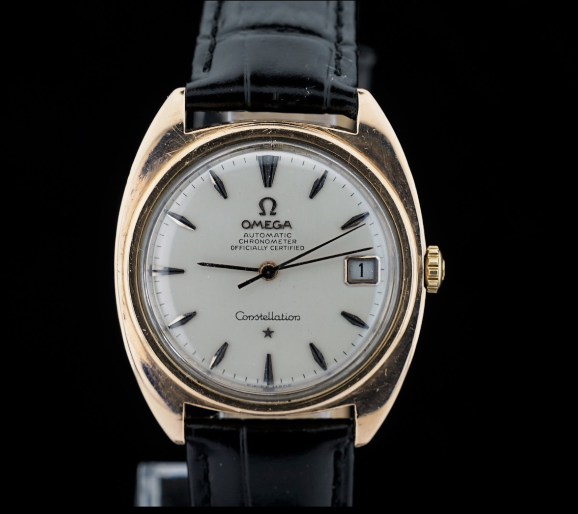
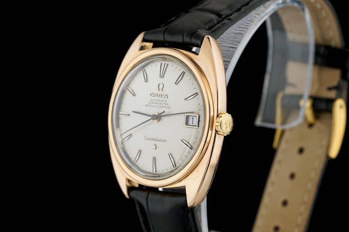
Interesting dial on a 168.017 Constellation
Peemacgee
·Interesting indeed.
The dial looks porcelain white.
The coffin shaped markers are a late 50s, early sixties thing for Omega.
The applied ‘OMEGA’ is quite fine. (Too thin?)
The applied Omega symbol is an unusual shape, too fine and too rounded?
The fonts look pretty good but ( from what we can see) are sans serif.
A mystery to be sure!
gbesq
·I can confirm that the coffin style markers are likely early 60s. I have them on a 1961 Seamaster. The onyx inlays are a nice bonus.
gbesq
·Ah, interesting. Whatever they are appropriately termed, I like them.
kaplan
·Another interesting thing is that CE 168.017's are usually coming out of Turkey. They are all quite worn down by life. I've only seen 2 black dial CE 168.017's and both were from Turkey, that's why this watch boggled my brain more than usual
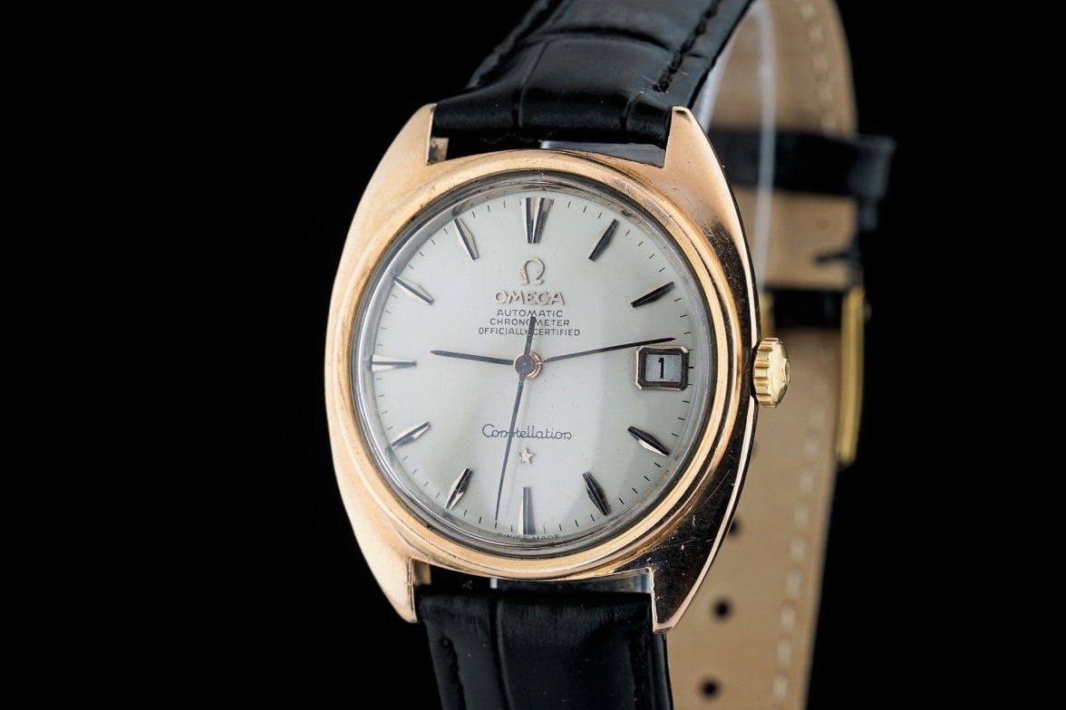
Calibre is 565 instead of 564 and the armor ring is overlaying "SWISS MADE" - otherwise I'd be more tempted to think it's original
I've recently seen someone strip a dial, spray paint it, print the dial text using a regular A4 laser printer onto transfer paper and transfer it to the dial, the result was awesome like this one and all easy to reach and easy to use components
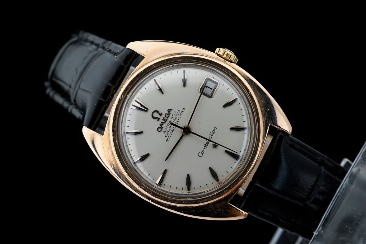
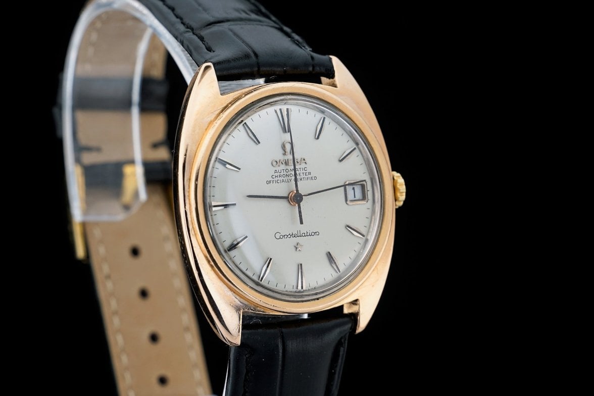
Whatever the case is, beautiful dial, and some more angles:
