- Posts
- 3
- Likes
- 0
Little_Loser
·Hi guys,
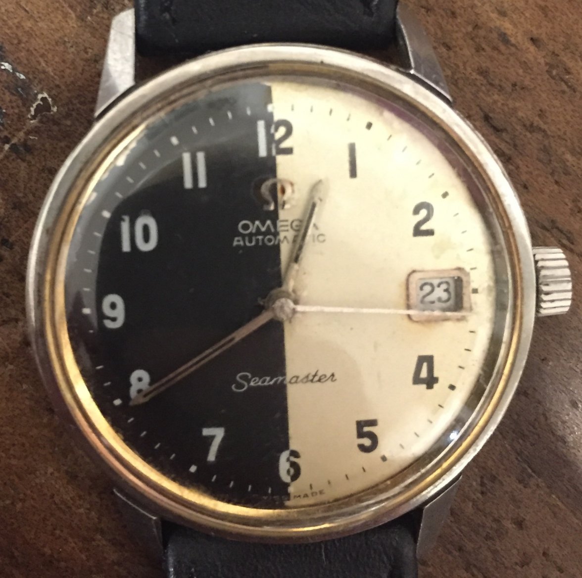
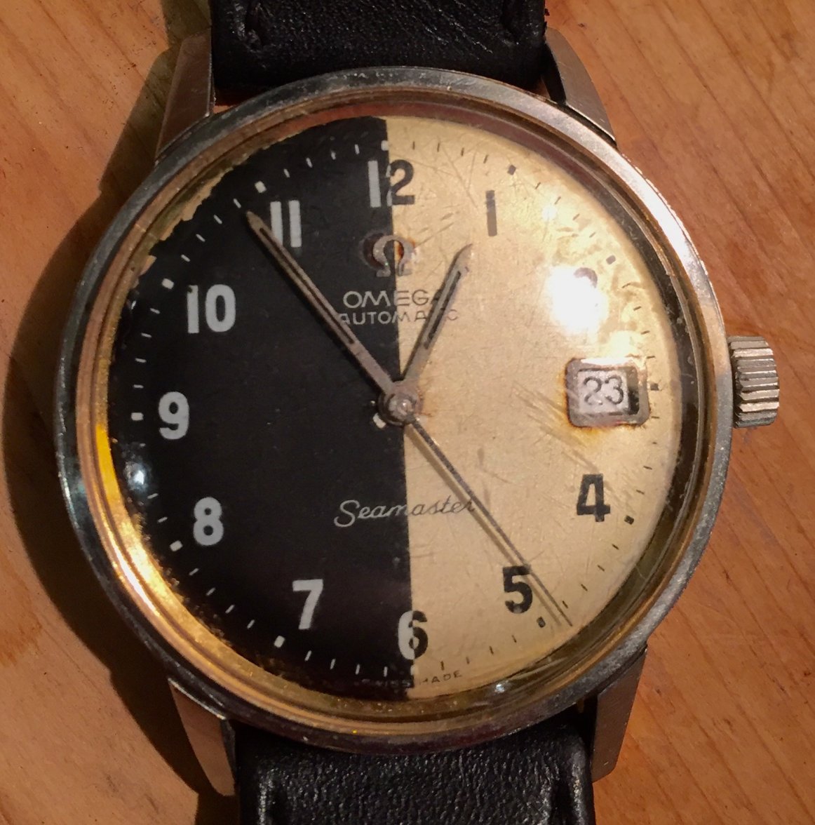
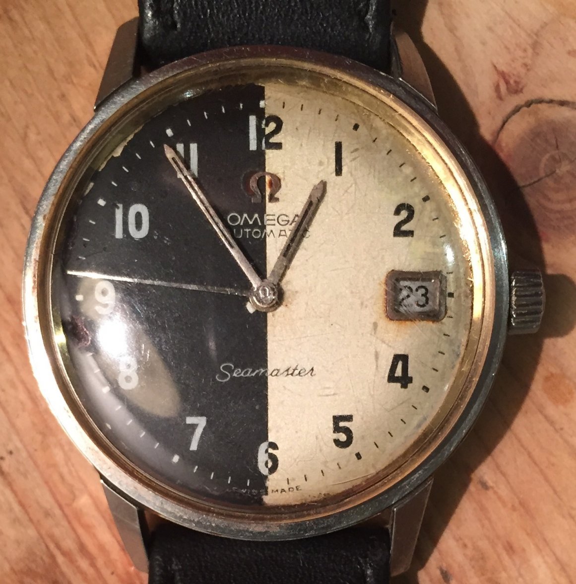
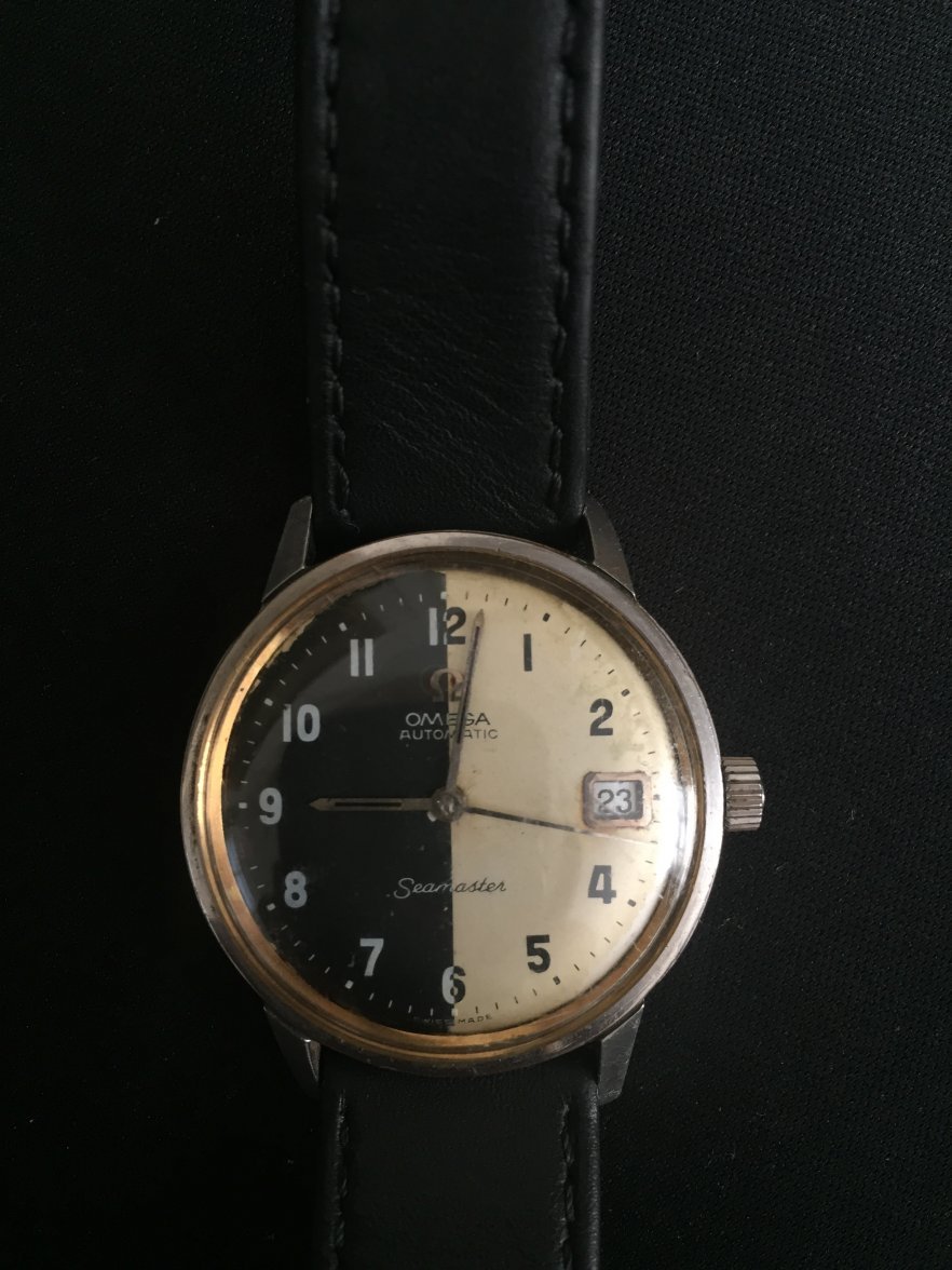
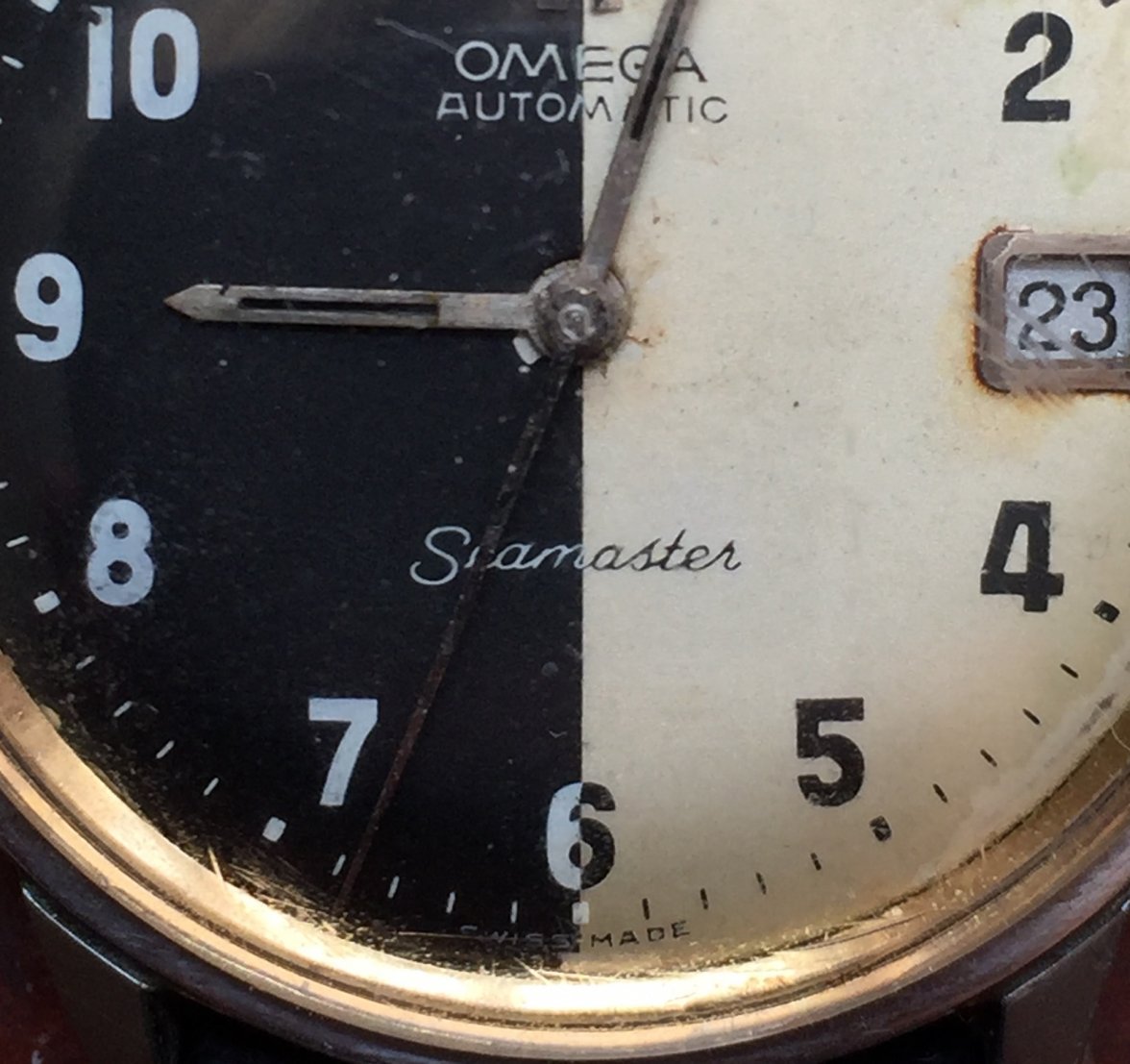
I've only recently become interested in watches/movements and I really like early Seamasters and other similar looking 1960s watches. This watch has been in my family for around 15 years or so now, it was purchased second hand in Vietnam in the 1990s I believe.
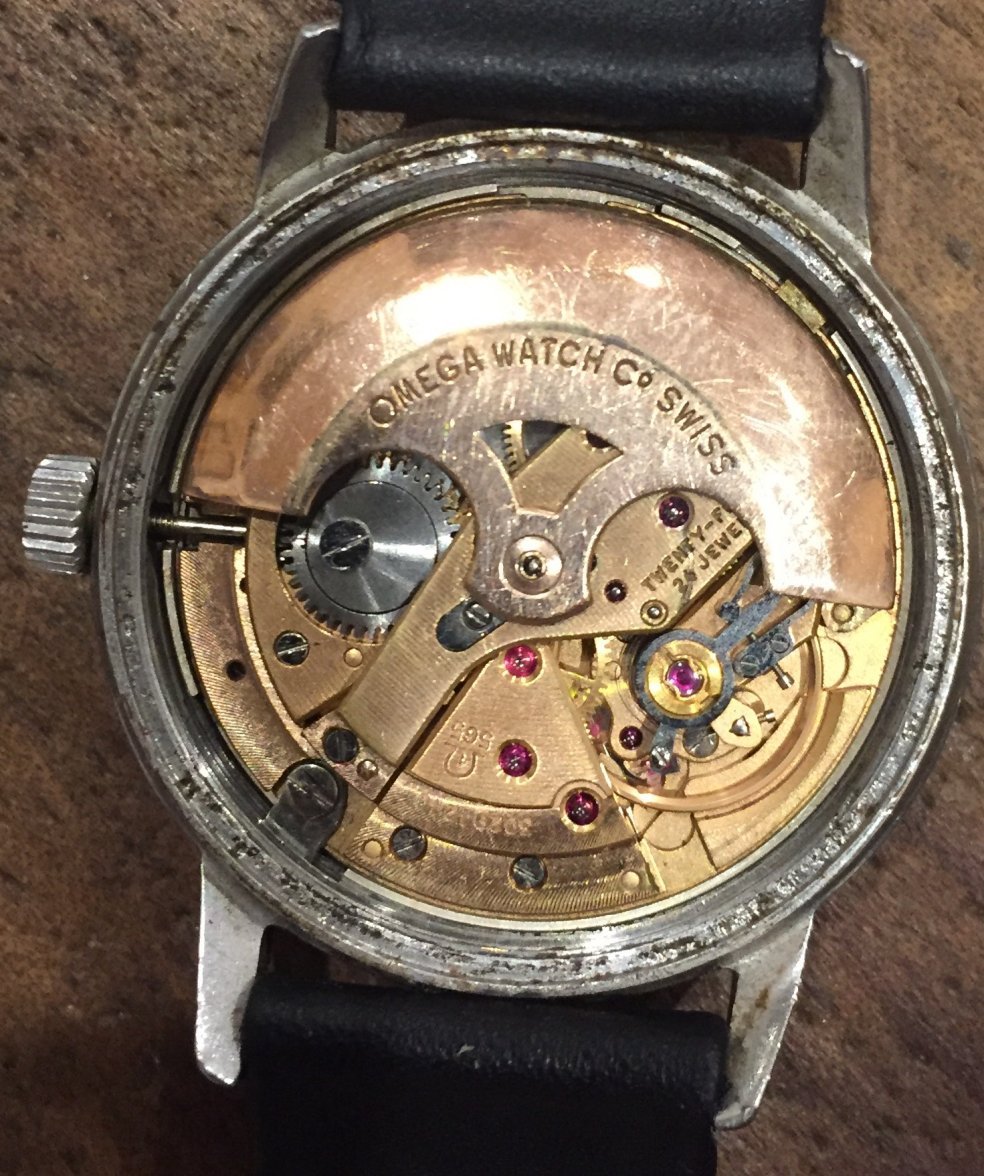
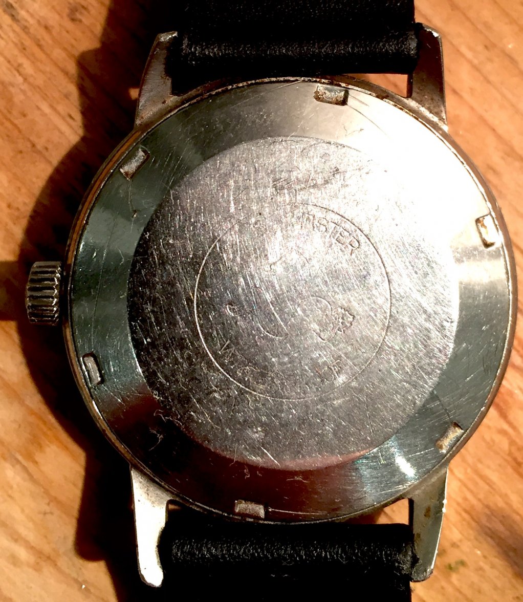
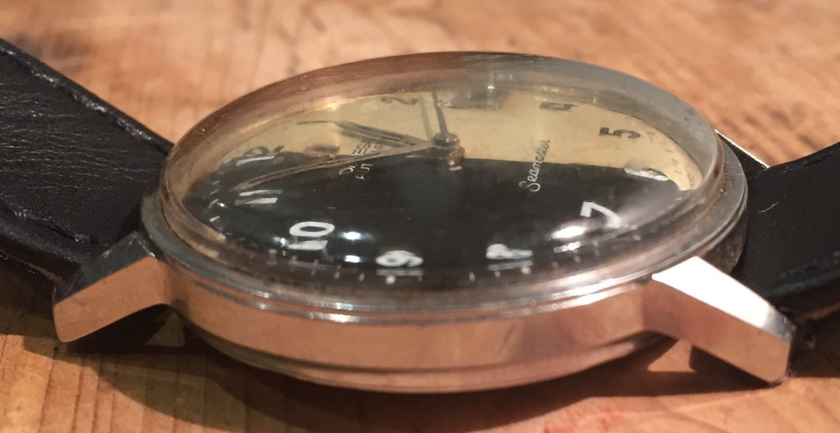
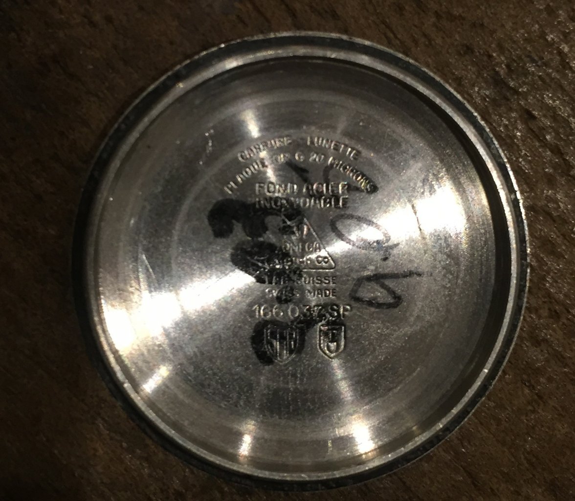
I've never seen a Seamaster with a dial that looks anything like this, and haven't been able to find anything close to similar online. It appears to be cal 565, the serial begins with #302 (which from what i can tell means it could be dated to around 1969 or 1970, and the case reference is 166 037 SP, which I think also points to a similar time-frame? It's very rough condition but functions quite well, and still looks quite charming despite being put through the washing machine (not my doing) at some point.
Does anyone know anything about this watch or its origins? I was convinced it was fake until I opened the case tonight and saw the movement, but I really don't know what I'm looking at or talking about other than information I've managed to gather online.
