Forums Latest Members

Help with purchasing a Polerouter Date

  1. mcnuonuo Aug 21, 2019

    Posts
    31
    Likes
    11
    Hello Guys,

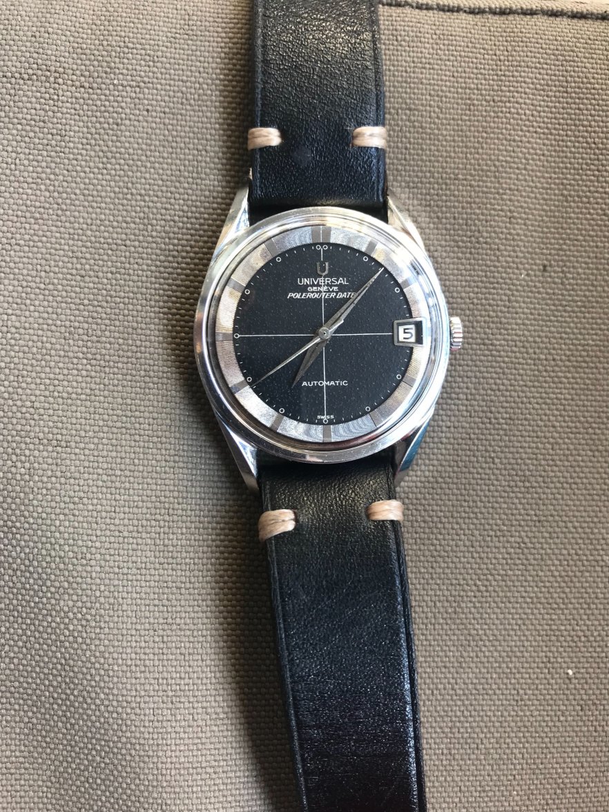
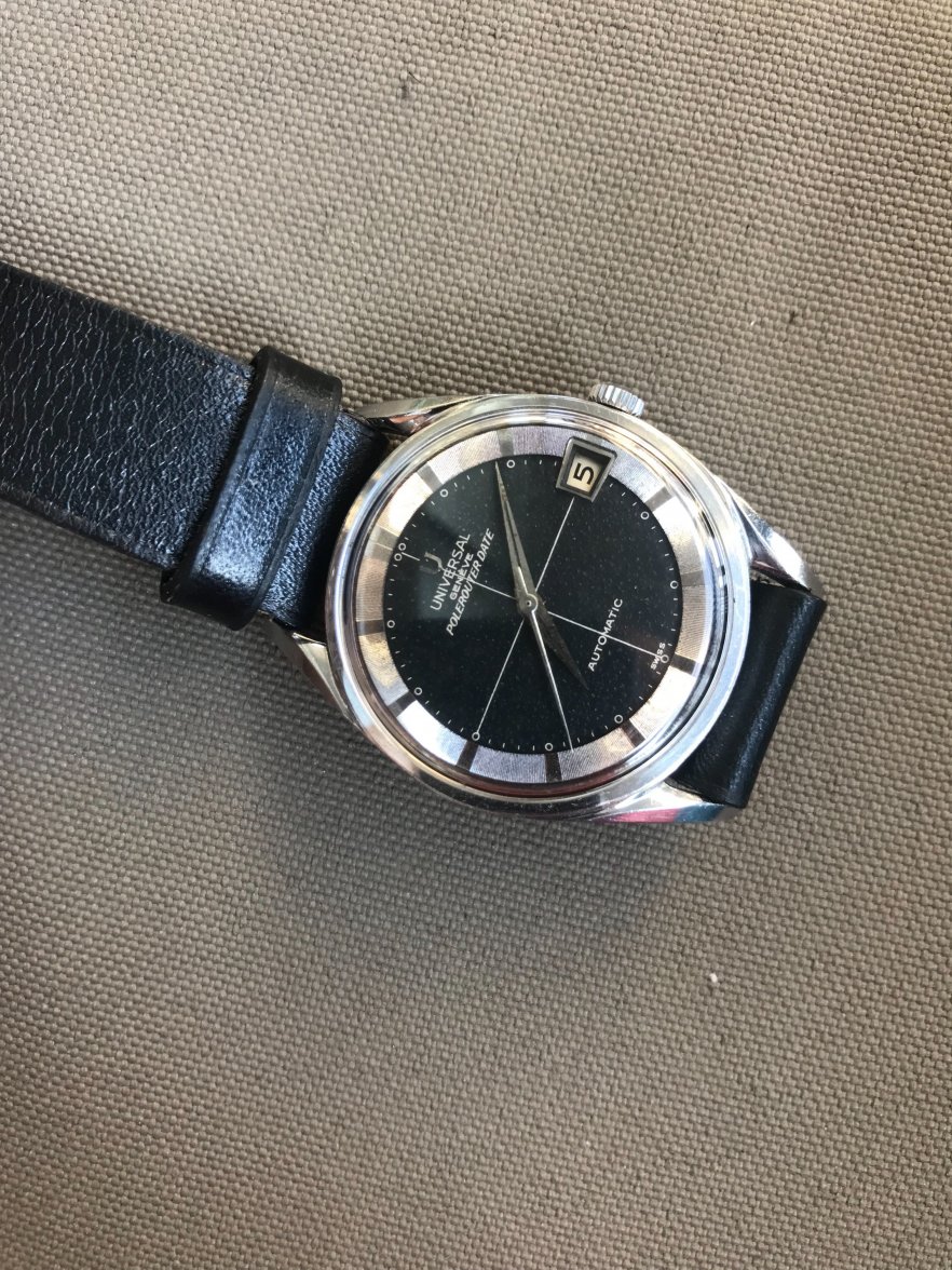
    I saw this watch online and can use some 2nd opinions on it.

    My questions include:
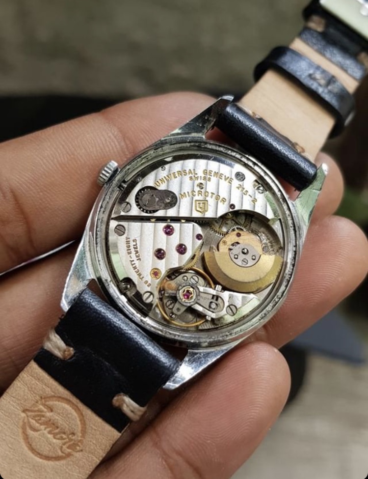
    1. The 204503-2 I could find pictures online all seem to have the word "Microroter" below "Automatic". This one does not.
    2. Is the bubble effect on the dial a fair aging result?
    3. The lume plots all wore off and became circles, but do they look too identical to each other?
    4. Seller says everything is original other than the crystal.


    Asking price is $1200 shipped.

    Thanks in advance!
    FullSizeRender-2.jpg FullSizeRender-3.jpg FullSizeRender-4.jpg FullSizeRender-5.jpg FullSizeRender.jpg IMG_5711.jpeg IMG_5712.jpeg
     
    Benbradstock likes this.
  2. Adam2941 Aug 22, 2019

    Posts
    220
    Likes
    288
    I would be careful about this one. Looks like a possible redial. The cross hairs and some of the text looks too thick to me, the texture of the black paint looks odd, and overall it just does not look quite right to me, though I am not sure. I have seen many Polerouters that have lost their lume, to reveal only painted circle plots, but usually there is some trace of the lume. Here there is none. I have also seen these micro-rotor Polerouters without "Microtor" on the dial, but that, too, raises a question. Better, sharper, closer-up photos are needed. Let's see what others think.
     
    mcnuonuo likes this.
  3. BlackTalon This Space for Rent Aug 22, 2019

    Posts
    5,181
    Likes
    8,388
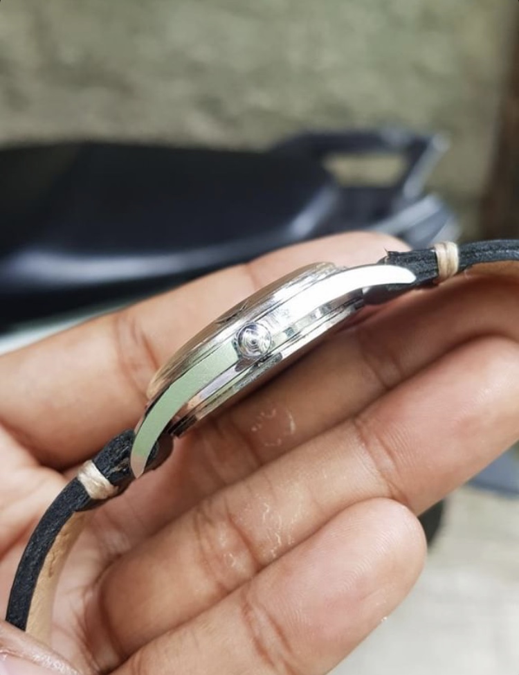
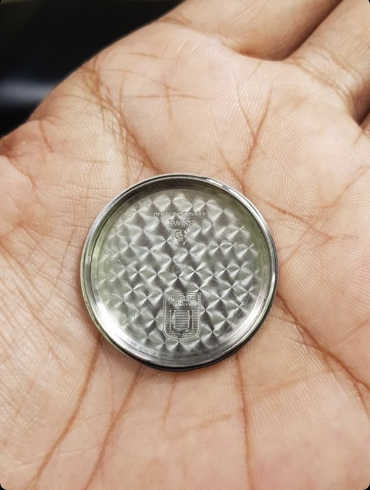
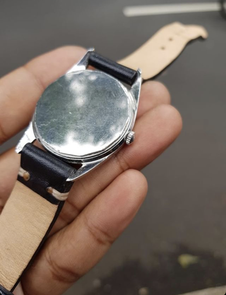
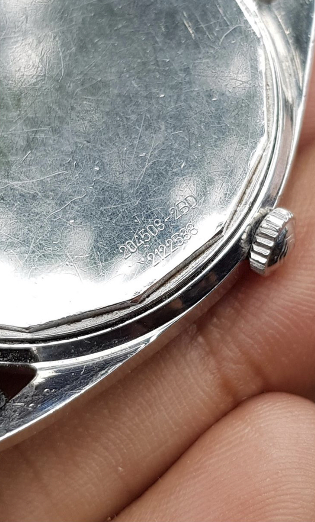
    rotor has been rubbing on the caseback and movement looks a bit grungy, so factor a service cost in as well.
     
    mcnuonuo likes this.
  4. Larry S Color Commentator for the Hyperbole. Aug 22, 2019

    Posts
    12,544
    Likes
    49,825
    Redial...
     
    mcnuonuo likes this.
  5. CafeRacer Aug 22, 2019

    Posts
    388
    Likes
    879
    Edited Aug 22, 2019
    mcnuonuo likes this.
  6. Adam2941 Aug 22, 2019

    Posts
    220
    Likes
    288
    At the very least we need better photos. Compared to the "Velvet Caramel" example you have linked to here, the one in question very much looks like a redial to me. Look at the last two S's in Swiss, and how thick the white printing is, and the lack of luminous at all in the circles.
     
  7. CafeRacer Aug 23, 2019

    Posts
    388
    Likes
    879
    I agree on the need for better photos.
    In my experience, thicker printing like this can often be an artefact of the camera used, and looks much finer and in person.
    The OP example looks to be zoomed in from a phone camera, whereas the VVW one is clearly done with something a bit more professional.
    The lume is gone in the circles and the hands - could have just been removed at once...