- Posts
- 75
- Likes
- 144
Leostaicalmo
·Hello guys,
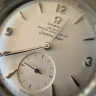
quick question, does any of you know why 2 watches of the same series can have 2 different fonts for the Seamaster on the dial? Does it mean maybe the dial was redone?
In this case the first picture is a Seamster 30 from 1963 with the correct font, the second one is from 1962 with a more rounded font.


Do you have any idea?
Thanks,
quick question, does any of you know why 2 watches of the same series can have 2 different fonts for the Seamaster on the dial? Does it mean maybe the dial was redone?
In this case the first picture is a Seamster 30 from 1963 with the correct font, the second one is from 1962 with a more rounded font.
Do you have any idea?
Thanks,