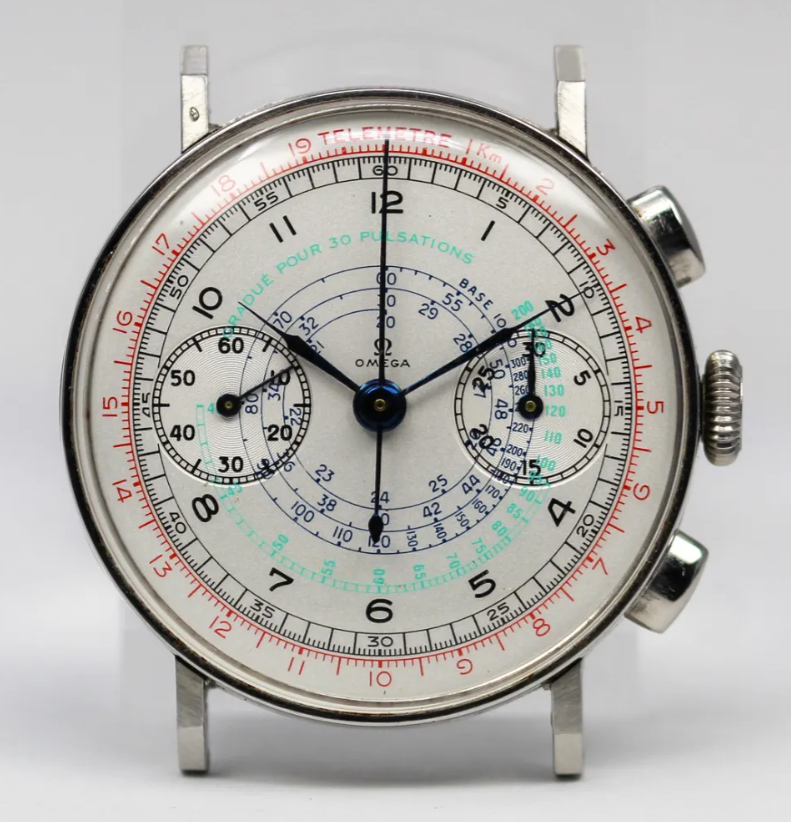
What are people's opinions on the originality of this dial? It seems all correct to me, I think - but the mint green is an extraordinary choice, and the white background I would have expected to see a greater diversion of tone across various aspects of the dial. My opinion was that it was a good refinished dial - anyone think otherwise?