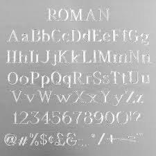
What do you think about this font. Numbers look OK, but rather deep. The "E"s should have a shorter middle, correct? font also looks a bit compressed to me. This is a 1966 1018
I have seen stainless steel written on a case, but not a 1018. I haven't seen every 1018 so don't count me as an expert. The "registered design" appeared above model "1018" . The serial number usually appeared alone. The fonts were not very uniform almost looked hand engraved on models I have seen and were usually more faint than so deeply impressed as this example.
I don't like the look of that. You're correct that the middle horizontal line of the E should not be as long as the top and bottom. You can see evidence of where the bracelet has scraped between the lugs and the engraving mostly appears to be over the top of it, which shouldn't be possible!
What do you think about this font. Numbers look OK, but rather deep. The "E"s should have a shorter middle, correct? font also looks a bit compressed to me. This is a 1966 1018
Im talking about Rolex serial number engravings, not general engravings. They use a specific style/ font type, so the OP is correct in his comment about the short middle stroke of the E.