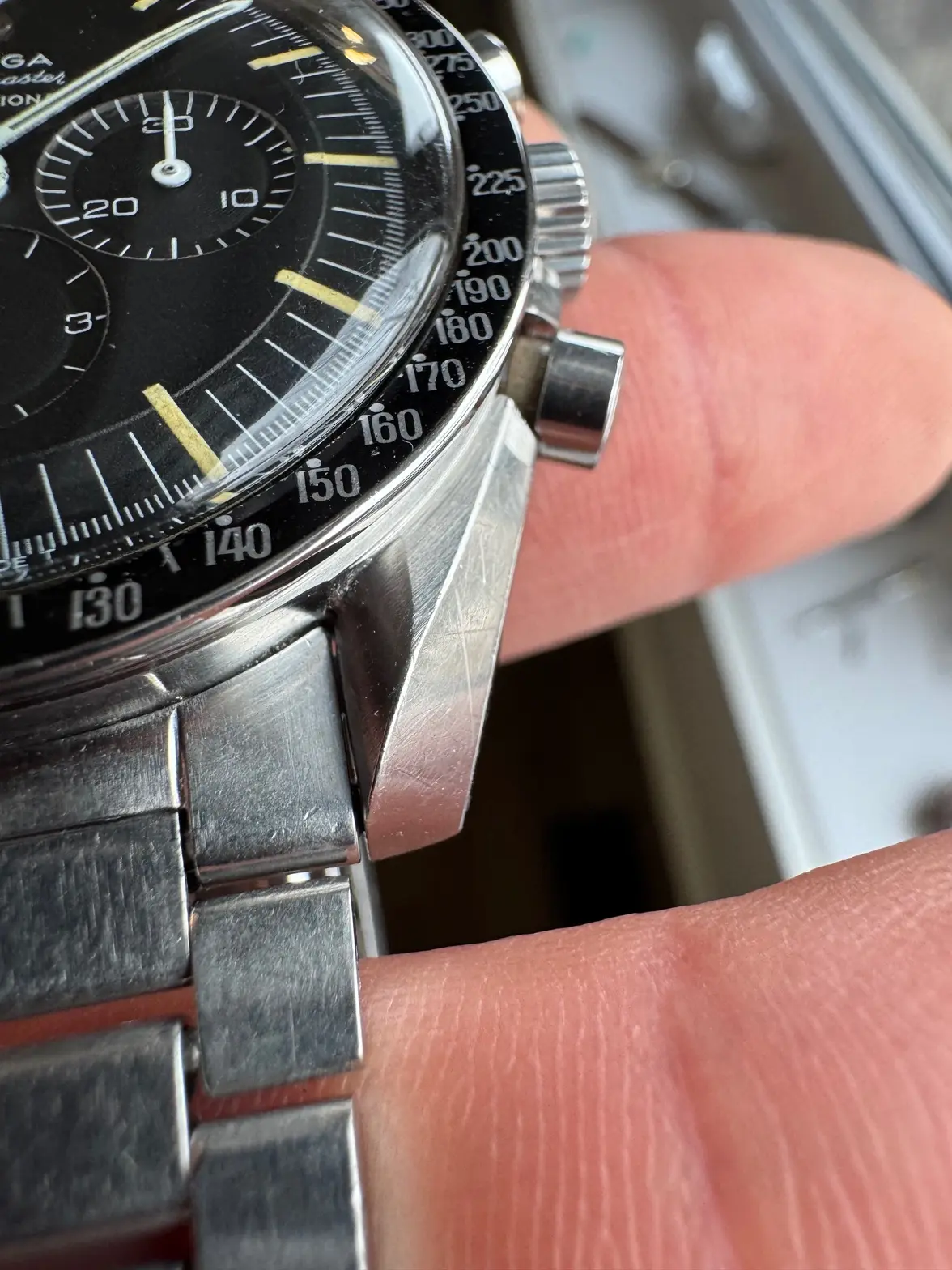
DON Speedy Bezel Check
djmusicman
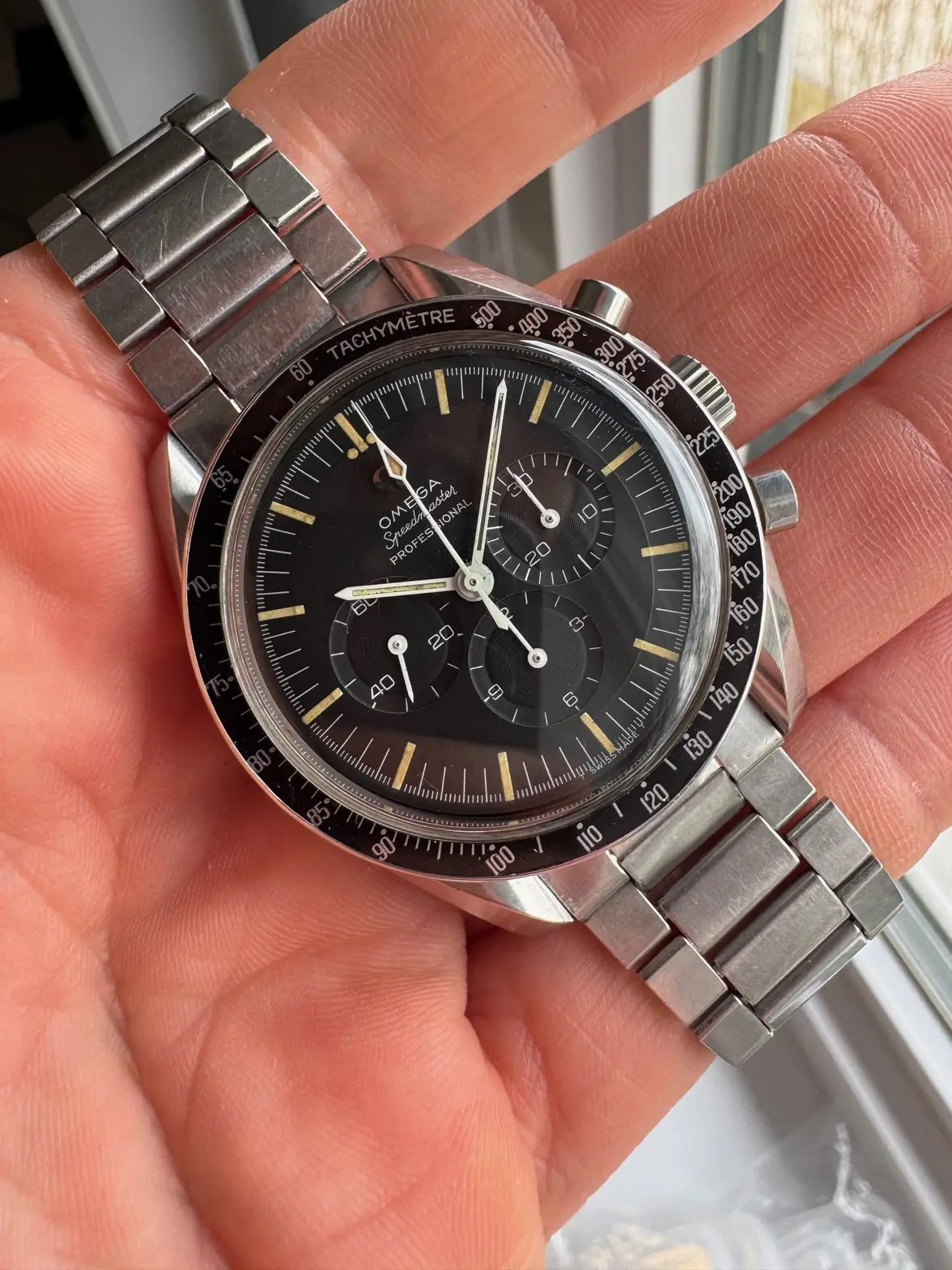
·Bezel looks alright to me, the watch looks good. If the watch was otherwise in poor condition or super overpolished it might make you want to investigate further but this makes sense.
semdot14
·Ok, That is good to know. I figured it was alright, but the font is so much more bold than on other examples I have been looking at. With how clean the bezel is, I was second-guessing. Thank you!
Passover
·Just have my -67 for comparison right now, but if you look at the 6 in 60, 65, 160 in the OP one every one seems to look different.
On my -67 they look exactely the same!
Curious what the specialist will say!
On my -67 they look exactely the same!
Curious what the specialist will say!
hansaboy
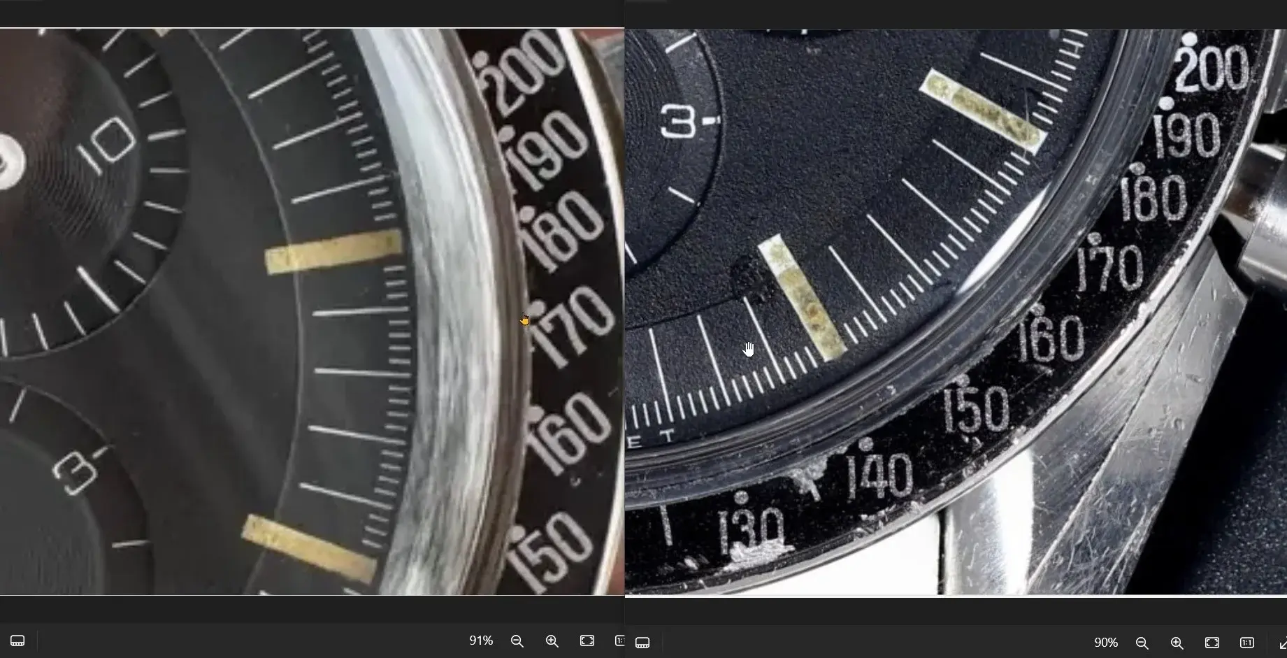
·Here is an interesting post about comparing CB´s (thanks @Spacefruit !!)
Read it a couple of times, and compare the bezels with the one you have!
Eeerhhh...is it your watch...?
Read it a couple of times, and compare the bezels with the one you have!
Eeerhhh...is it your watch...?
semdot14
·@hansaboy @Spacefruit Thank you for that post. It is extremely helpful and it put my mind at ease in buying the watch.
Ron_W
·@hansaboy @Spacefruit Thank you for that post. It is extremely helpful and it put my mind at ease in buying the watch.
I am not sure but no expert, i see different fonts in the lower bar 2, the 8 , 9 and the 5. Even thicker than in @Spacefruit example on the right. Lets wait for more eyes.
hansaboy
·@hansaboy @Spacefruit Thank you for that post. It is extremely helpful and it put my mind at ease in buying the watch.
😀
Dan S
·Those are the thickest fonts I can recall seeing. Maybe someday it will be super-desirable, like fat-font Rolex inserts.
140dave
·I have to say, I’m not sure on this one. It has some of the serifs I look for, and seems to be missing a couple also. But the “missing” ones may be obscured by the fat font.
If it was being sold as a bezel-only I would probably pass on it to be honest. It may be fine, others may think it looks great, but to me questionable enough for me to avoid it personally.
If it was being sold as a bezel-only I would probably pass on it to be honest. It may be fine, others may think it looks great, but to me questionable enough for me to avoid it personally.
Aludic
··@SpeedyBirthYearSomething is off with this one. To my eyes, at least.
Why? Have a look at the line thickness of the fonts; those should be relatively 'even' across the entire shape of the numbers, tapering slightly in the horizontally oriented lines of the numerals. On the OP's, line thickness seems to deviate a lot more than I've seen before, most notably in the 'flat' part of the 5's. The same is present in the other numerals too. Comparing it to a number of Speedies I have here, I can only conclude that I've never seen it quite like this before, in line with @Dan S observation. That said, the "fattest" DON isn't nearly as fat as this one, but does seem to show a more exaggerated line thickness variance too.
Conclusion: I am with @140dave, it might be correct and all the result of fat printing, but it's a bit of an outlier at it, at least.
semdot14
·I am not sure but no expert, i see different fonts in the lower bar 2, the 8 , 9 and the 5. Even thicker than in @Spacefruit example on the right. Lets wait for more eyes.
Harbormaster
·Calling Mr. Spacefruit himself…….!! I do believe he is an expert in this field.
semdot14
·semdot14
·djmusicman
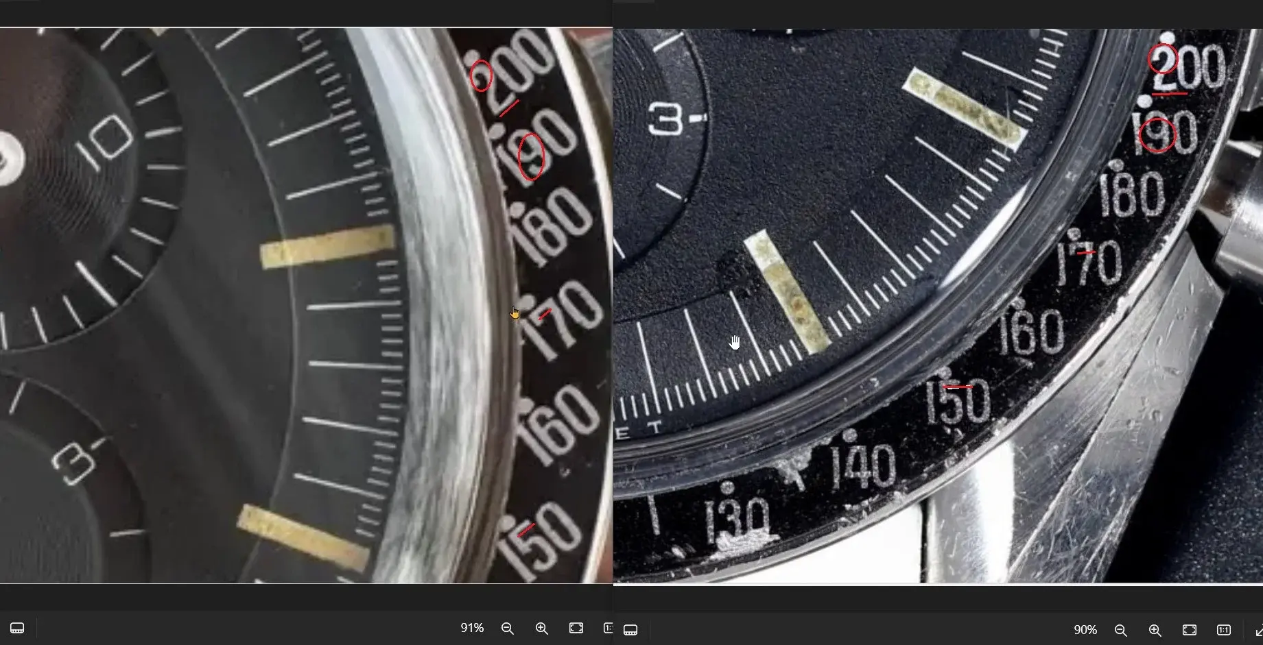
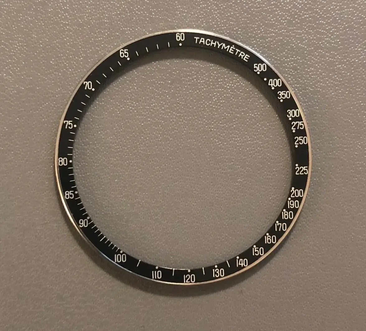
·It's super hard to tell at this point, your bezel doesn't look new... But if the "Omega fake" I posted above had all the dots aligned and a few small scratches here and there it could have easily been passed off as original.
pitbos
·This one is fake, I can't remember where I found the photo now. I saved it on my computer as "Omega fake". The tell is that the dots about 160 and 170 are too far to the left.
Regarding the OP’s inquiry, I have come across other examples with similar font thickness:
https://omegaforums.net/threads/thoughts-on-105-003-65-ed-white-speedmaster.116887/
 321Only ·
Thread 'Thoughts on 105.003-65 Ed White Speedmaster' ·
Hi all,
I just got my hands on a new Ed White Speedmaster which certainly is the nicest example I ever had the chance to hold in my hands. It was brought by and old man, the original owner to a...
I just got my hands on a new Ed White Speedmaster which certainly is the nicest example I ever had the chance to hold in my hands. It was brought by and old man, the original owner to a...
