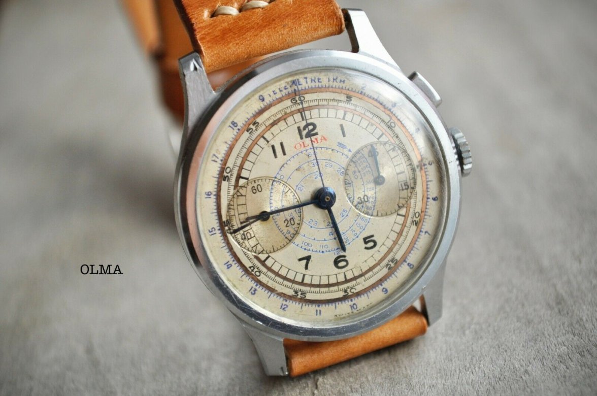
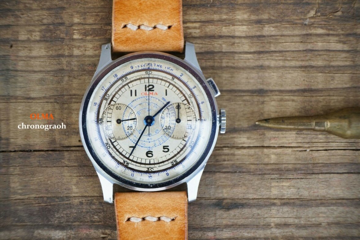
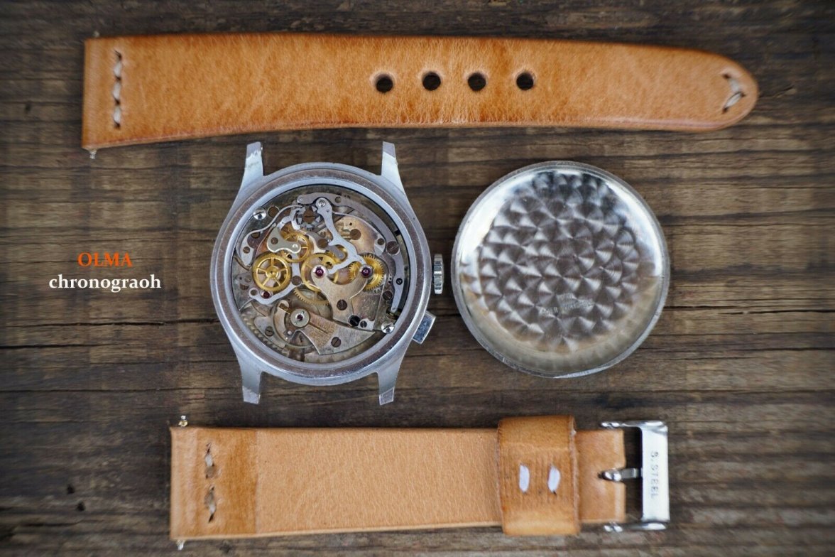
I'm infatuated with snail dial chronographs, but have never seen a red Olma logo before. Some of the second numbers also appear less than crisp, but that could be due to photo resolution and distortion from the crystal. Venus 165 movement.
Do you happen to know what year/s that Olma used the red logo?
Unfortunately, I do not know. Based on the style of the dial of these two examples I would infer the red logo was used during the late 1930s/early 1940s.