- Posts
- 745
- Likes
- 863
llvhhui
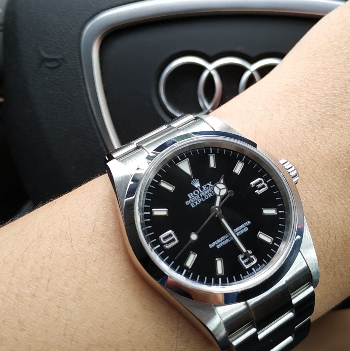
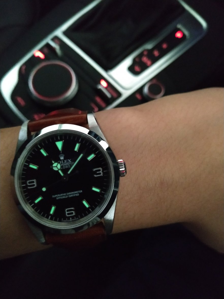
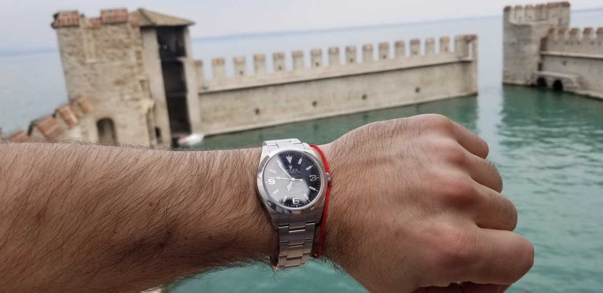
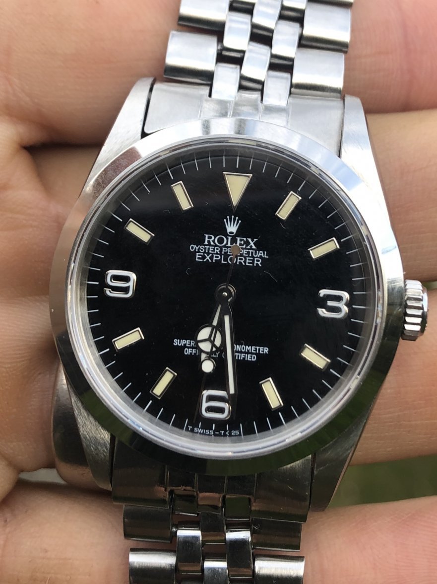
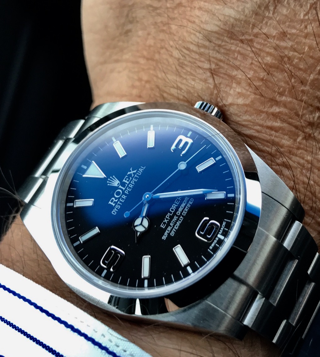
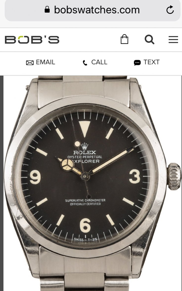
·I almost pulled the trigger on a 114270 a few times. I like the classic size and simple design, but I just can't get pass the paint filled numerals. I mean even the older 1016 had lumed numerals. What was Rolex thinking? 14270 was already messed up, when it's time to upgrade it to 114270, they decided to keep the corners cut?