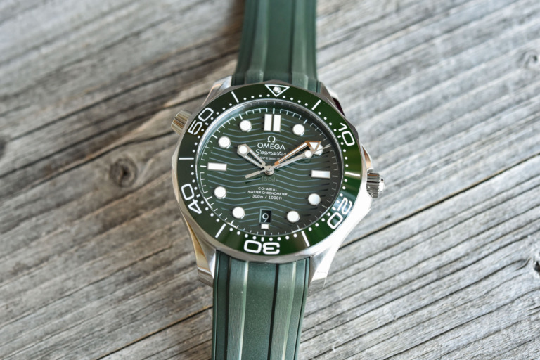
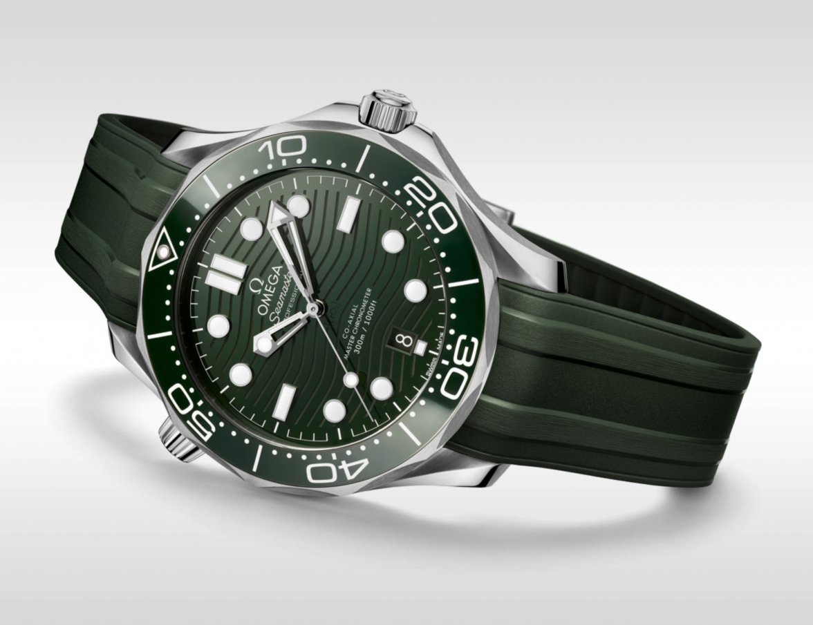
I like it. It looks good without the red accents and the green is dark enough to not look clownish.
You’re the only other person that I’ve seen point out the fact that this green version has all white dial text. No red “
Seamaster.” It’s the first one, I believe, in at least three generations of SMPs, to go back to the original all-white text.
As someone who started my watch enthusiast days wearing a 2531.80, day in and day out, for nearly a decade, I quickly noticed something about this green one that reminded me of the first gen, old-school SMP Bond, and also the beloved 2254.50. Took me a while to figure it out, but the all white dial text really tones the watch down, and gives it more tool-like feeling.
Also, at one point, I owned both the ceramic bezeled Grand Seiko SBGE255 (blue), and the SBGE257 (green). Their blue and green ceramic bezels seem to be pretty close in color and tone, to the Omega ceramic bezels. (Btw, because they were conical bezels made entirely of ceramic, they were really intricate and beautiful.) I agree with those who say the SMP will always be most natural in blue, and I also believe no one does blue watches like Omega, but if the green is anything close to the green Grand Seiko uses, then this green SMP will be very special, in person. It’s starting to grow on me a bit.
EDIT: Adding a few photos. I understand these are Grand Seikos, and not Omegas, but I really think the green ceramic might be pretty close to the new green SMP's bezel color:


GS/Seiko actually (likely) developed their green ceramic for their 2018 LE SLA019, and later also used it on the SBGE257:

And here, the blue ceramic also seems pretty close in tone to Omega's blue:


