- Posts
- 43
- Likes
- 11
Kiwi76
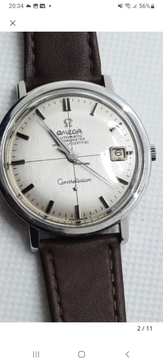
·So enjoying this learning process on Omegas. Completely to continue my education, I've seen this 168.004 crosshair Constellation and wanted to see if my thoughts are correct.
Just as initial thoughts, the lug corners look slightly rounded from polishing. I think the hands look okay, with onyx inlays that match the hour markers, but I admit I'm struggling with all the hand variations possible. Dial looks quite clean.
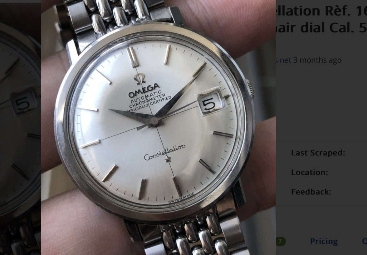
What I'm really not sure on is the vertical crosshair line and the Omega symbol and text. The symbol/text looks untidy. The vertical line looks way off center compared to the 6 o'clock marker, the Omega symbol and the star. I've seen some misalignment on threads with similar watches, and realise that there will always be some variation due to manufacturing tolerances, but it looks just too much.
Thoughts welcome, please correct me on my errors, only way I'll learn.

