- Posts
- 880
- Likes
- 1,691
PlainVanilla
·Hello everyone!
I do not intend to buy this watch, I'm just practicing.

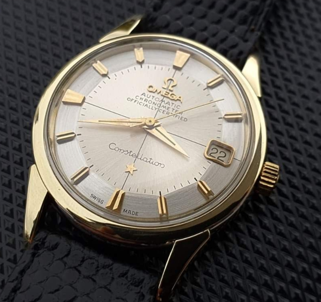
To me, it fails the MOY test, the minute markers are a bit weird and the overall finish, I'm not sure. I think this is a redial but I suck at Constellation watches. What are your thoughts?
I do not intend to buy this watch, I'm just practicing.
To me, it fails the MOY test, the minute markers are a bit weird and the overall finish, I'm not sure. I think this is a redial but I suck at Constellation watches. What are your thoughts?