Constellation Font Opinion
X350 XJR
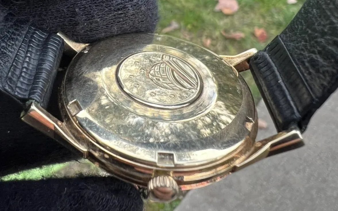
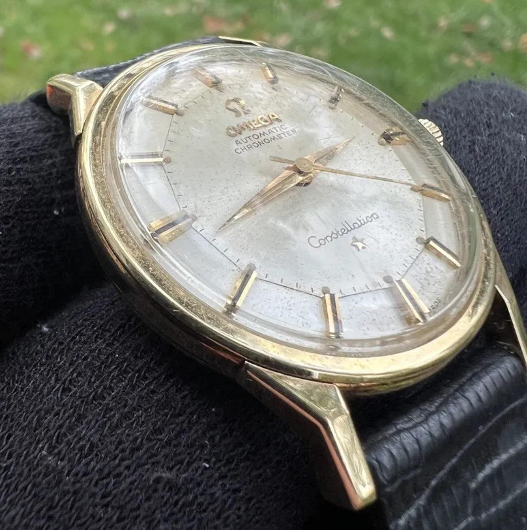
··Vintage Omega AficionadoCase is a polished mess, it would be a pass on this alone.
Bruce235
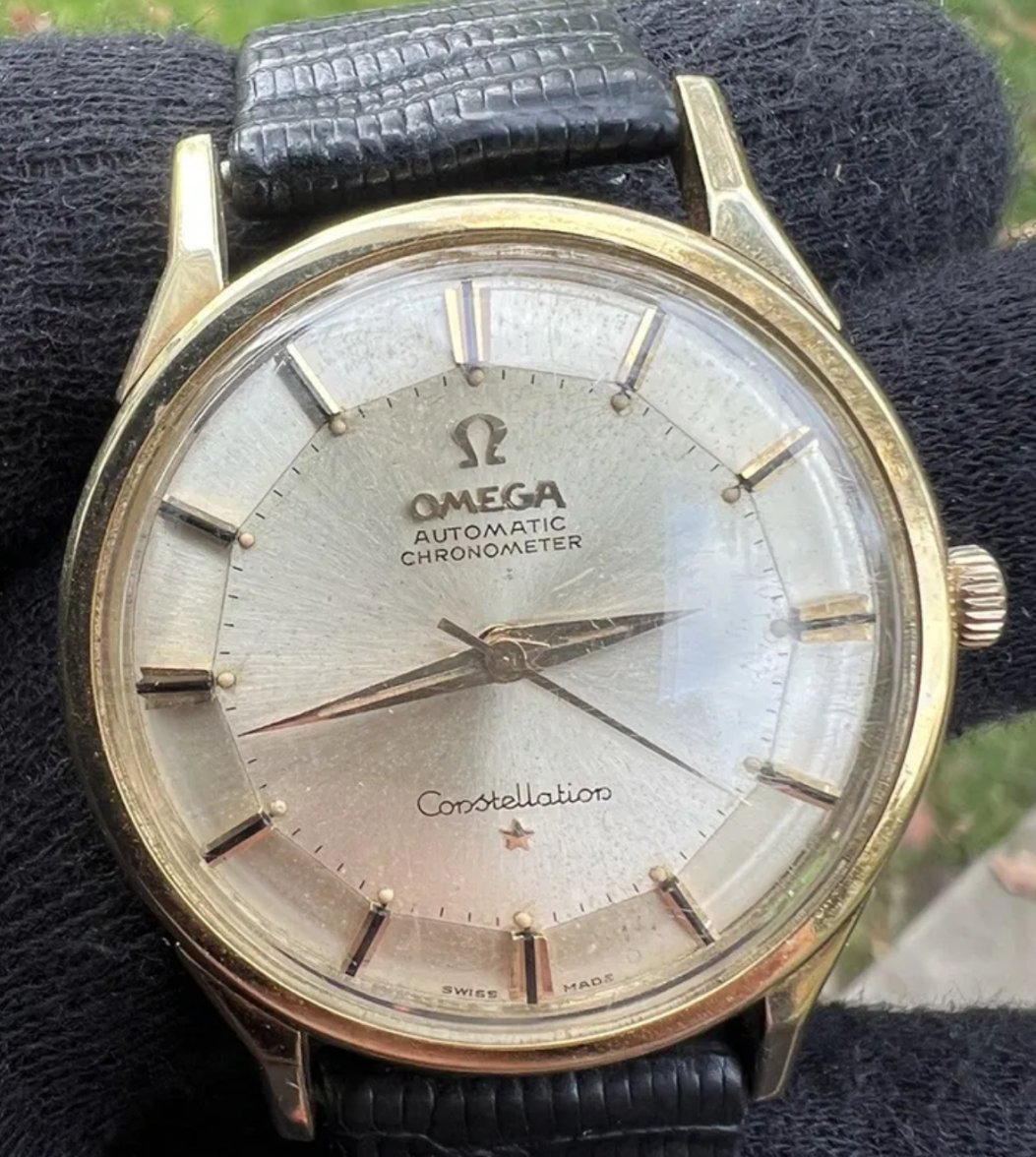
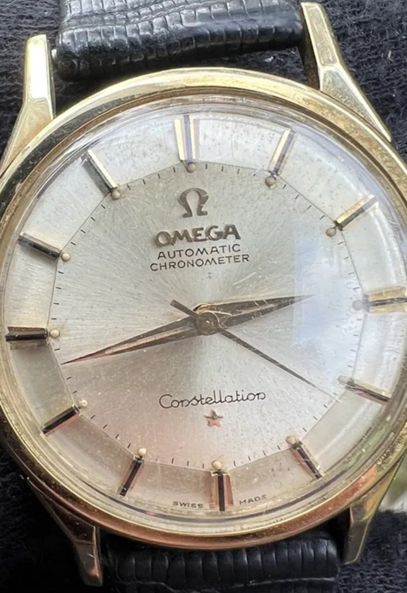
·Font looks OK compared with mine. The crown is wrong.
johnk22
·Dan S
·That case is awful. Please don't post any more photos. 🤦
johnk22
·Haha. Ok I’m moving on.
Peemacgee
··Purrrr-veyor of luxury cat box loungersFont looks fine - crystal distortion/scratches making it look funky.
Interesting bespoke lume job.
Onyx inserts dials don’t come with lume pips ( especially inside the indices) or lumed hands on a dogleg.
Only onyx/lume combo on a 60s Constellation is on a 168.010.
Interesting bespoke lume job.
Onyx inserts dials don’t come with lume pips ( especially inside the indices) or lumed hands on a dogleg.
Only onyx/lume combo on a 60s Constellation is on a 168.010.
sgk
·Those lume pips make it look really odd


