Constellation 168005

Posts
504
Likes
781
Dear OF, thanks for the advice on other watches so far. I did want to discuss another one, so opening up a new thread - hope that's the right way.

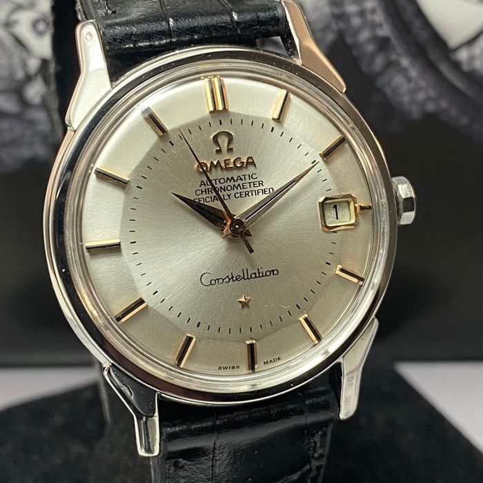
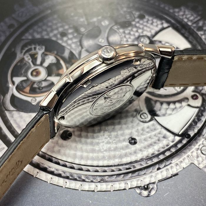
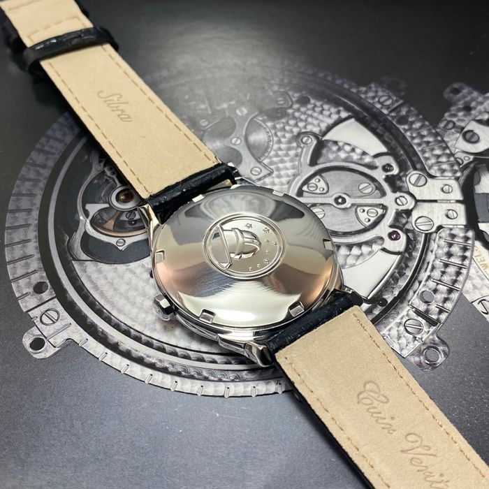
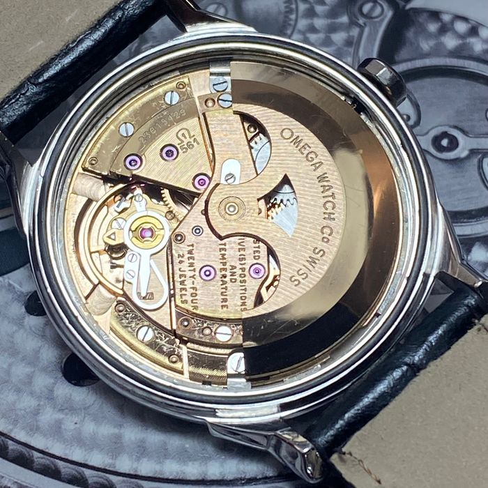
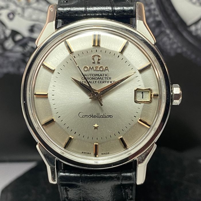
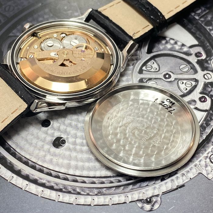
The watch below. I'd say case is quite polished, even the crown. At first hand, the dial seems correct to me, do you agree? The hands seem ok, I was only doubting about the seconds hand, as it seems too long to me. The movement seems correct for this reference.
I'm tempted to pass on this one as well, given how polished the case is. But I'm hoping to learn specifically about this dial, as I'm looking for a model like this with a steel bracelet.
 
Posts
487
Likes
1,880
Hello 馃榾

The dial is repainted : the font isn鈥檛 correct and the minute markers are off as well
The case is heavily re polished.
I would definitely wait for a better one
 
Posts
504
Likes
781
Hello 馃榾

The dial is repainted : the font isn鈥檛 correct and the minute markers are off as well
The case is heavily re polished.
I would definitely wait for a better one

Aah wait..the minute markers - they should have been positioned closer to the border, where the dial 'slopes down'? Then the seconds hand would align.

In terms of the font - are you talking about 'Chronometer' font, or the other part?
 
Posts
1,014
Likes
7,797
Hi, you are correct, it is overpolished, also I think it is a redial. The minute markers should be closer to the indices / pie pan chamfers. The chamfers also look 'soft', these should be more defined. The serifs are missing from the text under the omega too, see photo. There's better out there.
 
Posts
13,015
Likes
22,570
Dial is certainly not original. The minute track is too far from the edge. The font is also all wrong, too large too inconsistent, quality is not there
 
Posts
504
Likes
781
Hi, you are correct, it is overpolished, also I think it is a redial. The minute markers should be closer to the indices / pie pan chamfers. The chamfers also look 'soft', these should be more defined. The serifs are missing from the text under the omega too, see photo. There's better out there.

Thanks for sharing the comparable picture. I must say when looking at the text under the omega, the main difference is see is the spacing which is wider on your picture, and the font in itself which is different. The 'serif' I find more difficult to detect, on what letter do you really see that difference?

Can we also conclude the final 'n' on Constellation is wrong?
The more you look, the more things appear.. also the position of the star should be closer to the word Constellation, and aligned with the minute marker below.

Thanks everyone. Should have spotted it from the minute markers from the start, very obvious.
 
Posts
1,014
Likes
7,797
@Yves86 , serifs are the little 'ticks' at the ends of the letters in the text on the dial, I think common on all constellations, certainly on the 3 I have, pic below of one of them courtesy of @MtV . Hard to see from general photos so if there is doubt ask the seller for hi resolution close ups.
 
Posts
504
Likes
781
@Yves86 , serifs are the little 'ticks' at the ends of the letters in the text on the dial, I think common on all constellations, certainly on the 3 I have, pic below of one of them courtesy of @MtV . Hard to see from general photos so if there is doubt ask the seller for hi resolution close ups.

Thanks for explaining - I had to google 'serifs' as well! I must say that I do see it clearly on this last picture that you've added. - but less visible on your earlier photo. But that is probably the resolution.
 
Posts
3,346
Likes
13,074
The hands seem ok, I was only doubting about the seconds hand, as it seems too long to me.

Everything important regarding this specific watch was mentioned above, but a little remark on the length of the second hand: It seems too long here as the minute track was misplaced by the redialer. These can seem too long on original dials, too, though, as they were made to exactly overlap with the 5-minute-ticks, so at the edges of the pie pan dial. If a photo is taken with the second between two 5-min-ticks and maybe also at a bit of an angle, it can seem too long by a tiny margin, despite it being correct.
 
Posts
504
Likes
781
Everything important regarding this specific watch was mentioned above, but a little remark on the length of the second hand: It seems too long here as the minute track was misplaced by the redialer. These can seem too long on original dials, too, though, as they were made to exactly overlap with the 5-minute-ticks, so at the edges of the pie pan dial. If a photo is taken with the second between two 5-min-ticks and maybe also at a bit of an angle, it can seem too long by a tiny margin, despite it being correct.

Thank you for explaining. This was my biggest aha moment indeed - when I realized the minute track was placed to much towards the inside, I knew it was not the seconds hand.