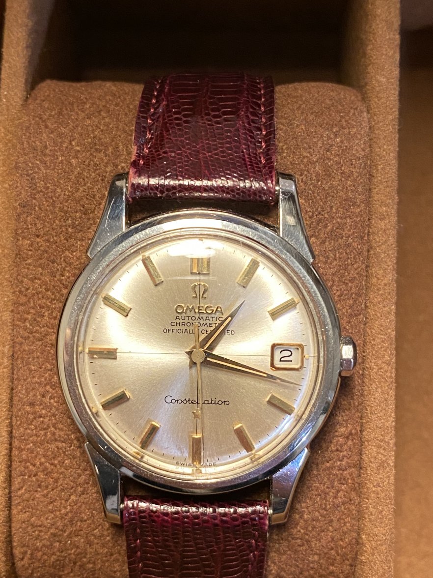
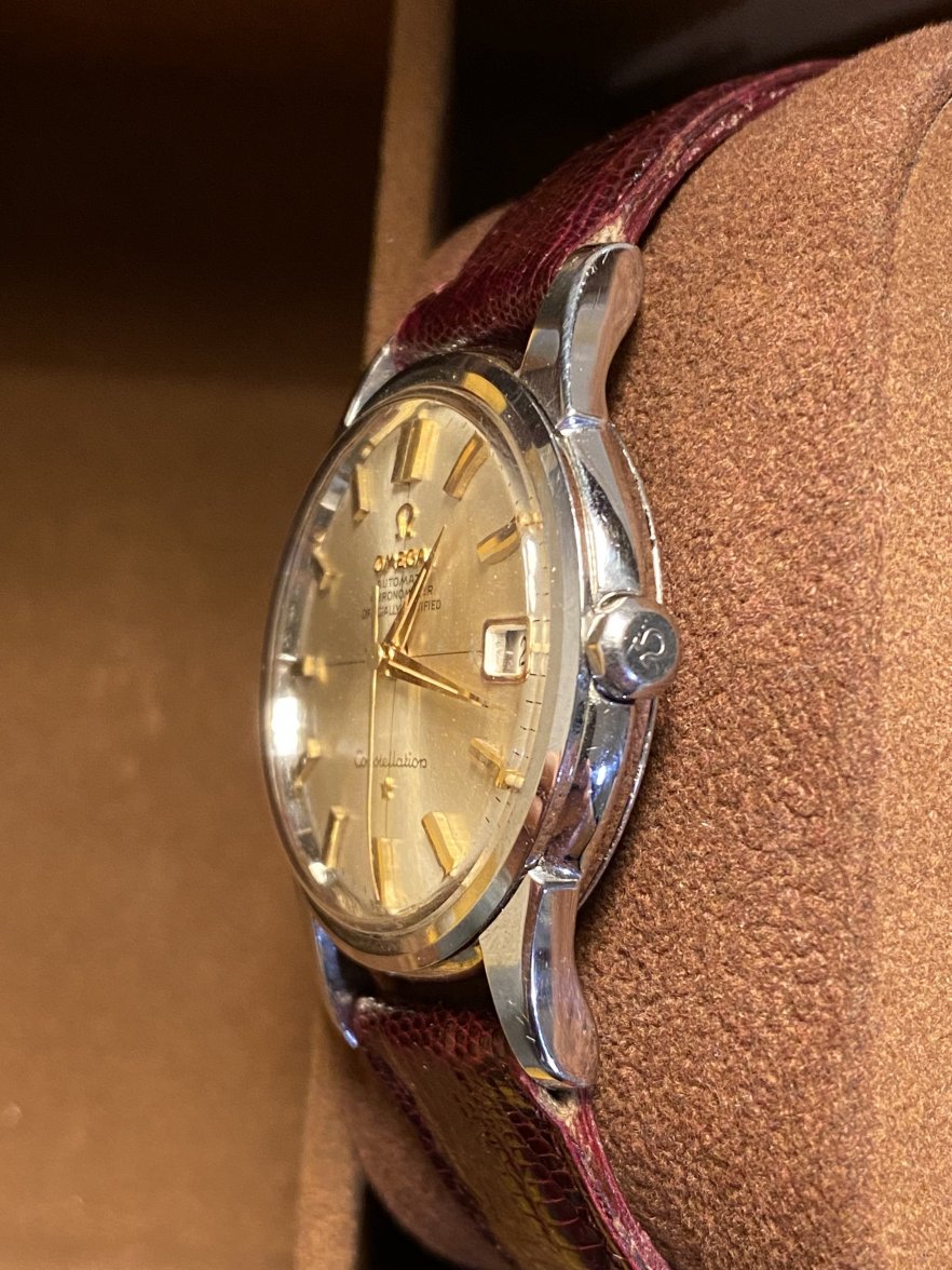
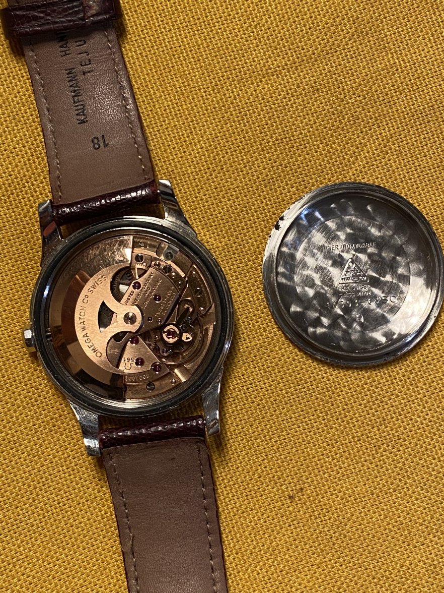
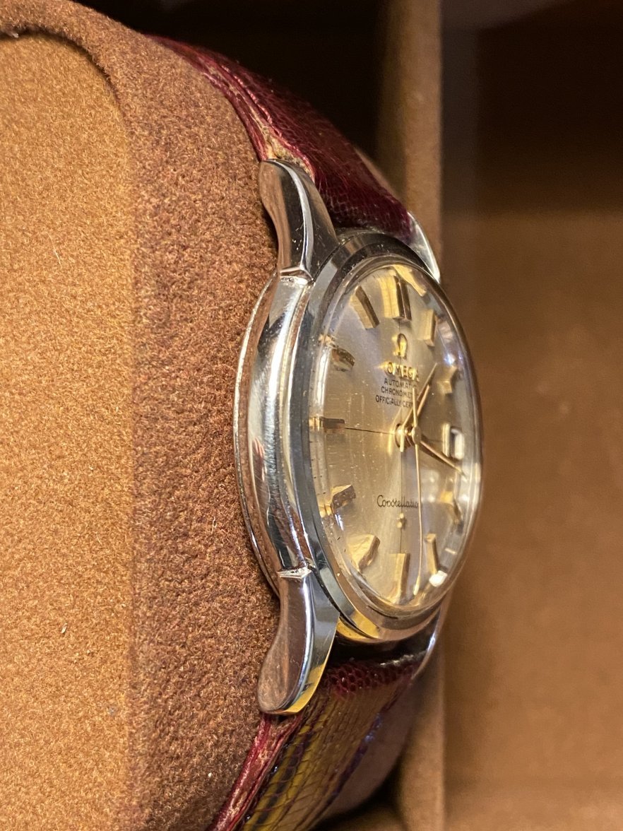
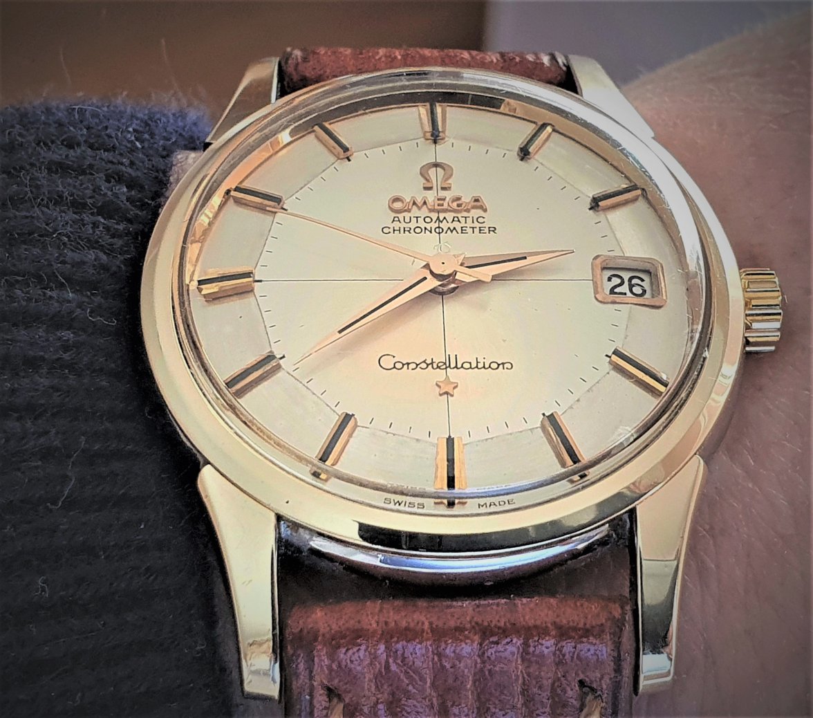
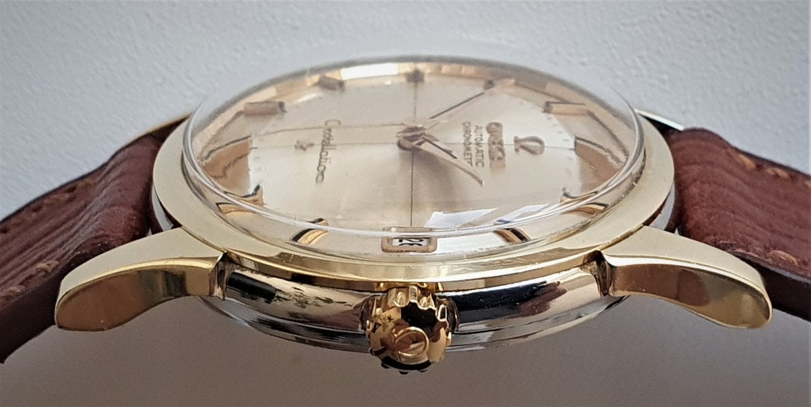
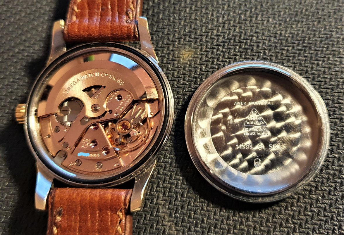
Condition evaluation of this constellation 14393

Posts
577
Likes
794
Hi
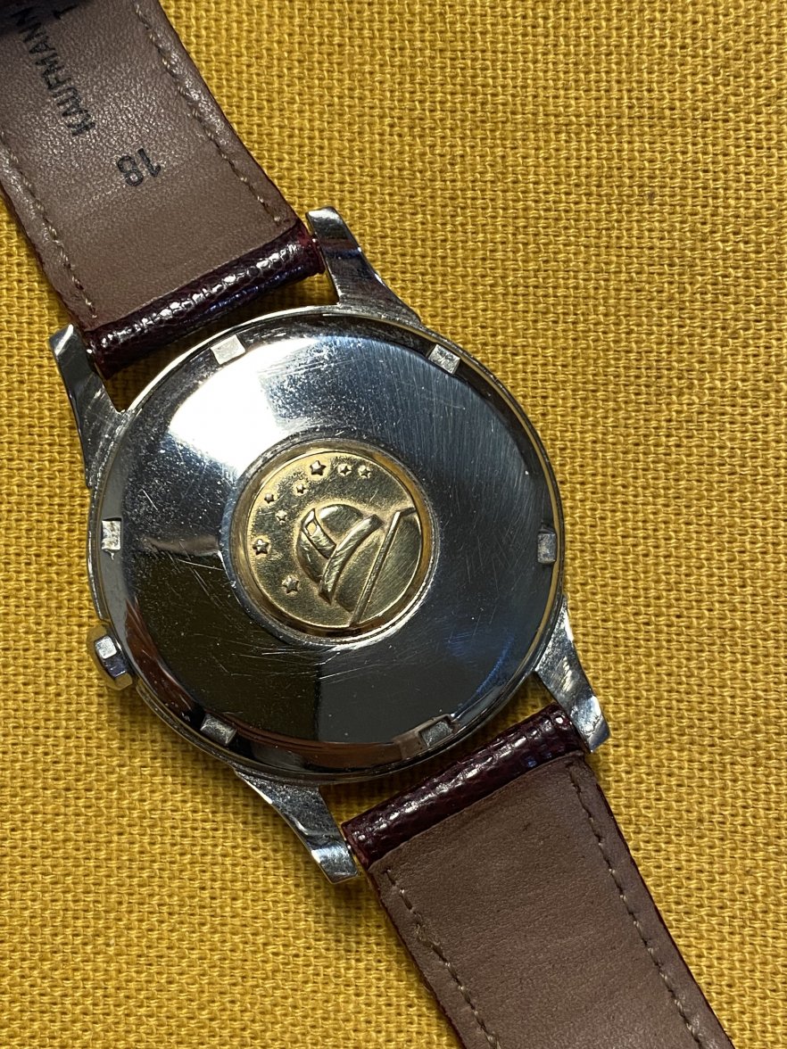
How should I assess this constellation’s condition? From what I can tell, the dial and hands are flawless (lume is perfect and reacts as it should to uv light) but the lugs seem a little softer than others I saw described as unpolished…Caseback and medallion seem ok? Original crown?
Any thoughts?
Thanks!
 
Posts
5,450
Likes
8,479
The case is a little soft but acceptable if its not being sold at a premium

It is unusual for a 14381/14393 to have a full text dial
IIRC some early ones had this dial, I didn't think later ones did.
It is also unusual for a lumed dial to have no Ts - although with a serial of 20,0XXX it does sit in and around that point where it might not have been marked with a T. (although perhaps a little late if it is mid '63)
IMHO, it is either an anomaly, being slightly too late for a 14393 or a near-enough replacement movt and dial.
Omega id some odd things when transitioning references, so tough one to call.
 
Posts
1,116
Likes
1,777
or a near-enough replacement movt and dial.
Maybe i am being sceptical but that sunburst dial colour in a stainless case doesn’t quite look right to me. I would have expected to see this in a gold/gold capped case. Also the movement serial 20 mil seems late for a 14393. Along with the full text dial there’s something not quite right here. Personally it’s not one i would risk buying.
 
Posts
577
Likes
794
Thanks for the detailed knowledge, that’s exactly what I couldn’t have seen myself (beside the soft case although the lighting in the pictures make it look worse than it is)
Many thanks! 😀
 
Posts
605
Likes
8,131
I have yet to see reference 14393 with 20million traffic..... A few hours ago 14393 came to me with a movement of 18 million... But when it comes to Omega you can never be 100% sure of anything
 
Posts
7,847
Likes
56,938
OP,

I'd be skeptical until I see that dial with the hands not perfectly placed to obscure all the fonts and spacing, top and bottom.
 
Posts
3,181
Likes
12,505
OP,

I'd be skeptical until I see that dial with the hands not perfectly placed to obscure all the fonts and spacing, top and bottom.

+1, that sunburst finish doesnt look right to me...