- Posts
- 2,520
- Likes
- 17,819
airansun
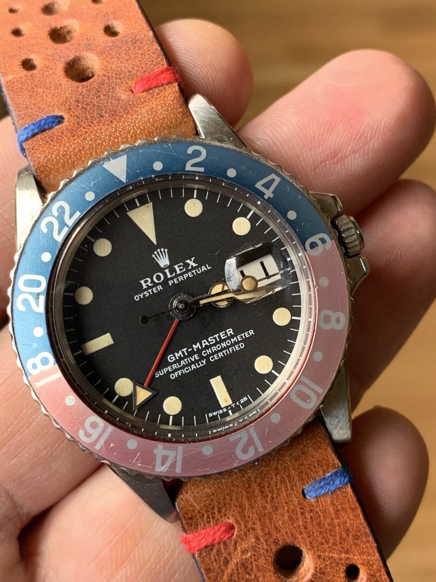
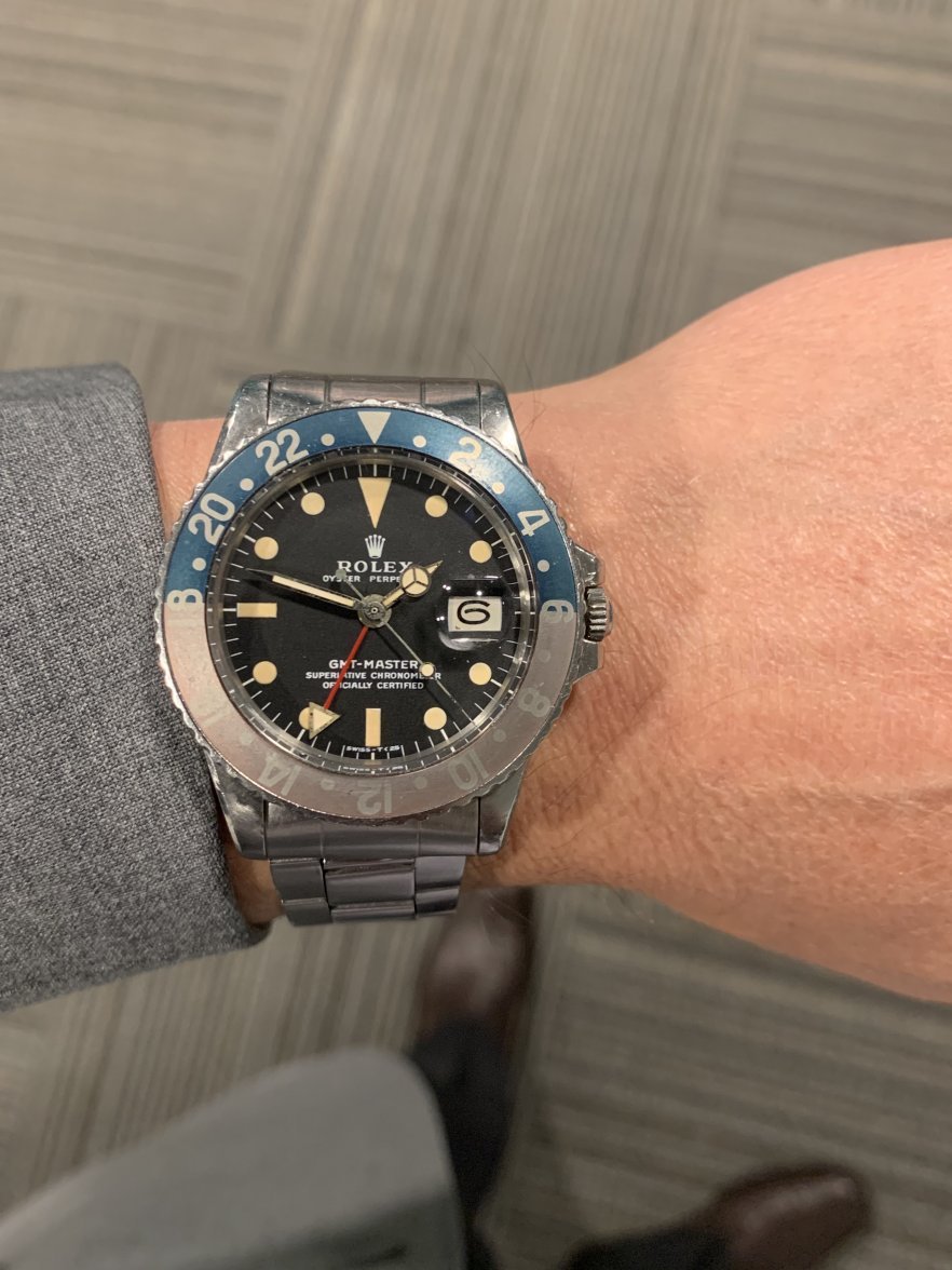
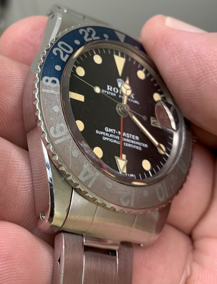
·Yeah, yeah, I’m a little bit of a bezel freak. To me, I’m amazed at how many nice watches I see that are spoiled by their bezels.
A couple of years ago, I picked up a really nice 16750 from 1986 and, a few months later, a 1675 from 1972. Both had thin font bezels. Yuck.
It’s taken me awhile, but I finally put fat font bezels on both of them — yes, a red backed bezel for the 1675 and a blue one for the 16750. I think the new bezels make both watches.
Here’s one before and two after shots.


What do you guys think?
A couple of years ago, I picked up a really nice 16750 from 1986 and, a few months later, a 1675 from 1972. Both had thin font bezels. Yuck.
It’s taken me awhile, but I finally put fat font bezels on both of them — yes, a red backed bezel for the 1675 and a blue one for the 16750. I think the new bezels make both watches.
Here’s one before and two after shots.
What do you guys think?