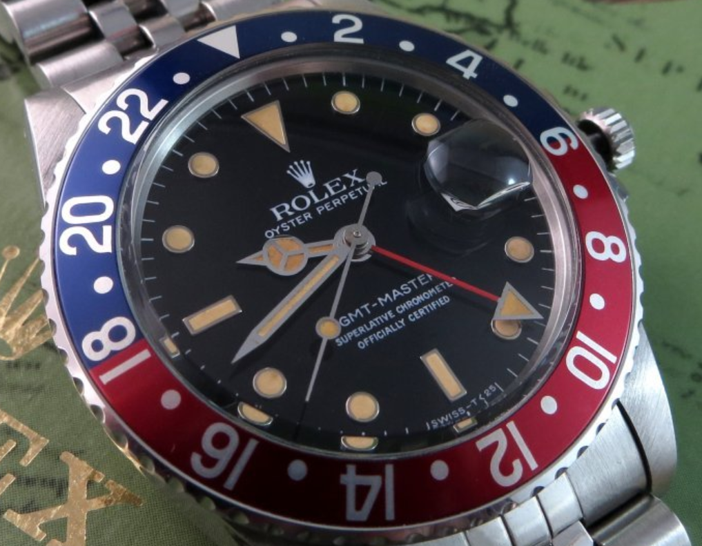
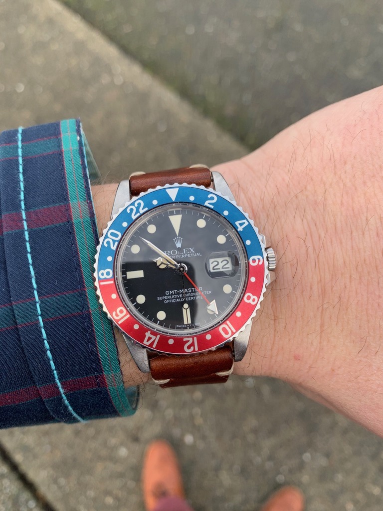
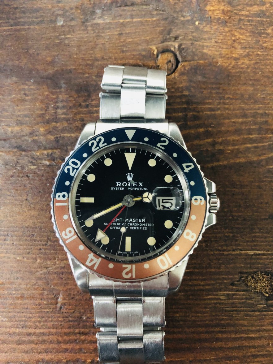
Comparing fat font bezels and thin on a 1675 and a 16750

Posts
2,162
Likes
6,712
That’s a shame. Even if I don’t agree with you, I’d be interested to hear your more experienced (than me) view.

The new 16750 bezel is blue backed and came from a reputable Swiss parts dealer. I think it’s right on my watch, but I admit that how nice it looks may prejudice me.

No worries. I just laugh at folks who claim to know with certainty the era / period correctness of each and every insert ever made. It's truly amusing, hey, to each their own.

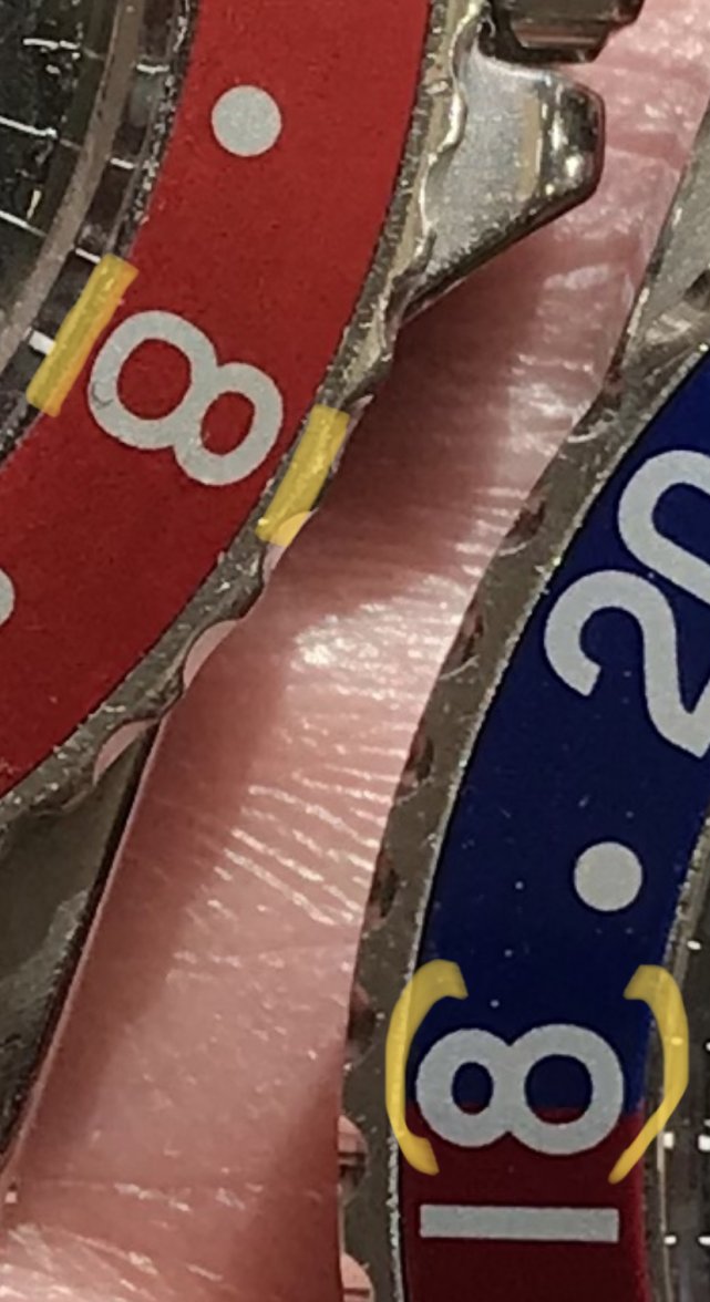
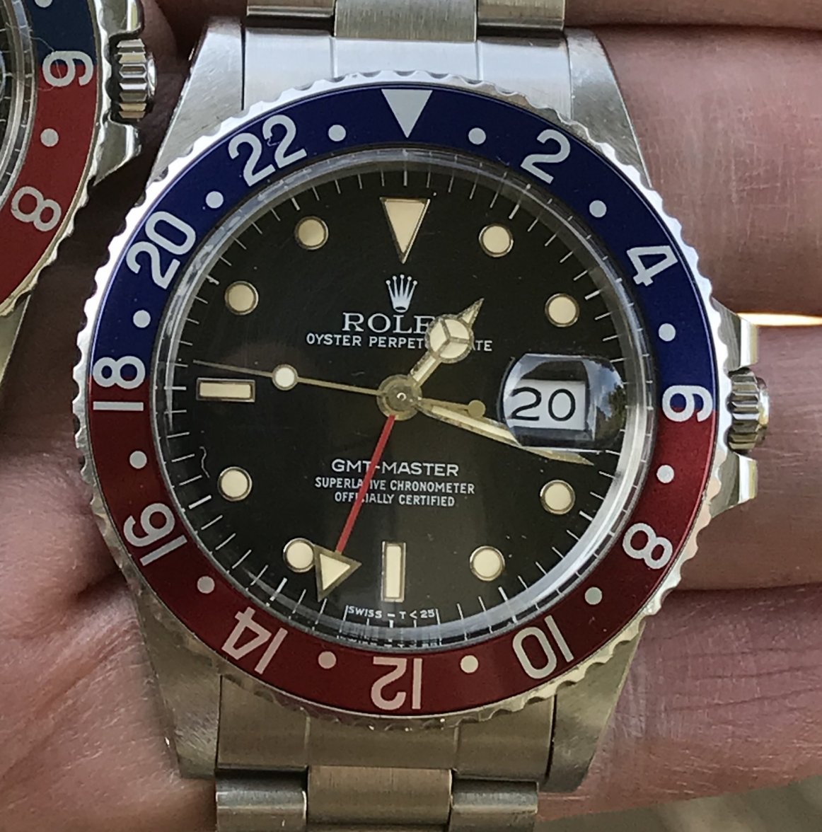
As you well know, your insert above is a genuine Rolex FF factory replacement blue back. These have popped up in recent years and are commanding a premium in the market place ($1K vs. $250.) I have seen original FF BB inserts that are slightly different than yours, which are thought to be orig. to the watch. They can be distinguished by looking at the '8', where yours is round vs. flatter on the other (see stock pic below.) These make it even harder to differentiate them from red backs. Additionally, there are thin font red backs that resemble BB's. It's really tricky and I certainly can't tell them apart even after years of handling and research.

That's my 2 cents.

Best,
-A
 
Posts
203
Likes
106
@Chris75 how can you tell that is a service insert from that batch? Is there a tell tale sign?

Yes, for example '8' is kind of more round vs. flatter on the period correct.

These are fat font service blue back insert: they look nice but they aren't really period correct, where the serif slim font ones are.
 
Posts
1,443
Likes
3,808
Thank you. I’m getting a spare mega ff that has a very even fade to compliment my current insert. Happy to have found this example with a great dial and rare unpolished case for the age. These are very comfortable pieces for regular wear.

Is the folded link bracelet comfortable?
 
Posts
1,443
Likes
3,808
Yes, for example '8' is kind of more round vs. flatter on the period correct.

These are fat font service blue back insert: they look nice but they aren't really period correct, where the serif slim font ones are.

top and bottom of the '8' ?
 
Posts
86
Likes
107
Is the folded link bracelet comfortable?
Yep, very comfortable. It’s kind of slinky and reminds me a bit of the bracelet on an older model AP Royaloak.
 
Posts
86
Likes
107
top and bottom of the '8' ?
Take a look at this close up pic of both bezel inserts. The left 8 is “flatter”, has more oval openings with a thinner font than the right, which is a thicker font with more rounded openings in the “8”. The devil’s in the details and initially difficult to spot.
Edited:
 
Posts
226
Likes
3,582
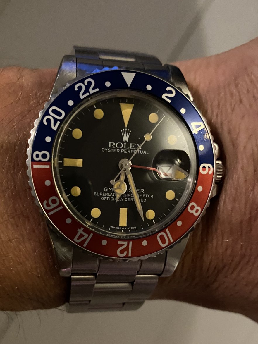
This is mine 16750 from about 1983 with the insert the watch was born with. “Little fat font serif” if I have got it correctly.
 
Posts
86
Likes
107
This is mine 16750 from about 1983 with the insert the watch was born with. “Little fat font serif” if I have got it correctly.
Looks good...think you’ve got yourself a “little” fat font serif insert! 😉
Edited:
 
Posts
1,443
Likes
3,808
Take a look at this close up pic of both bezel inserts. The left 8 is “flatter”, has more oval openings with a thinner font than the right, which is a thicker font with more rounded openings in the “8”. The devil’s in the details and initially difficult to spot.

ok I see - making sure it was top and bottom. Thanks
 
Posts
86
Likes
107
The MFFs are from the mid/late sixties to early seventies. Not originally seen on the chapter ring gilt dials, though a lot have migrated onto them because people like how they look. While the Mark 2s are seen with them, the early batch Mark 4’s with the 3.0-3.3m serials have been seen with them too, so that’s the last iteration that they’re considered period correct on.
Thanks for the clarification. Is it correct that the later Mk4's would also have a serif font, unlike the earlier MFFs?
 
Posts
581
Likes
3,654
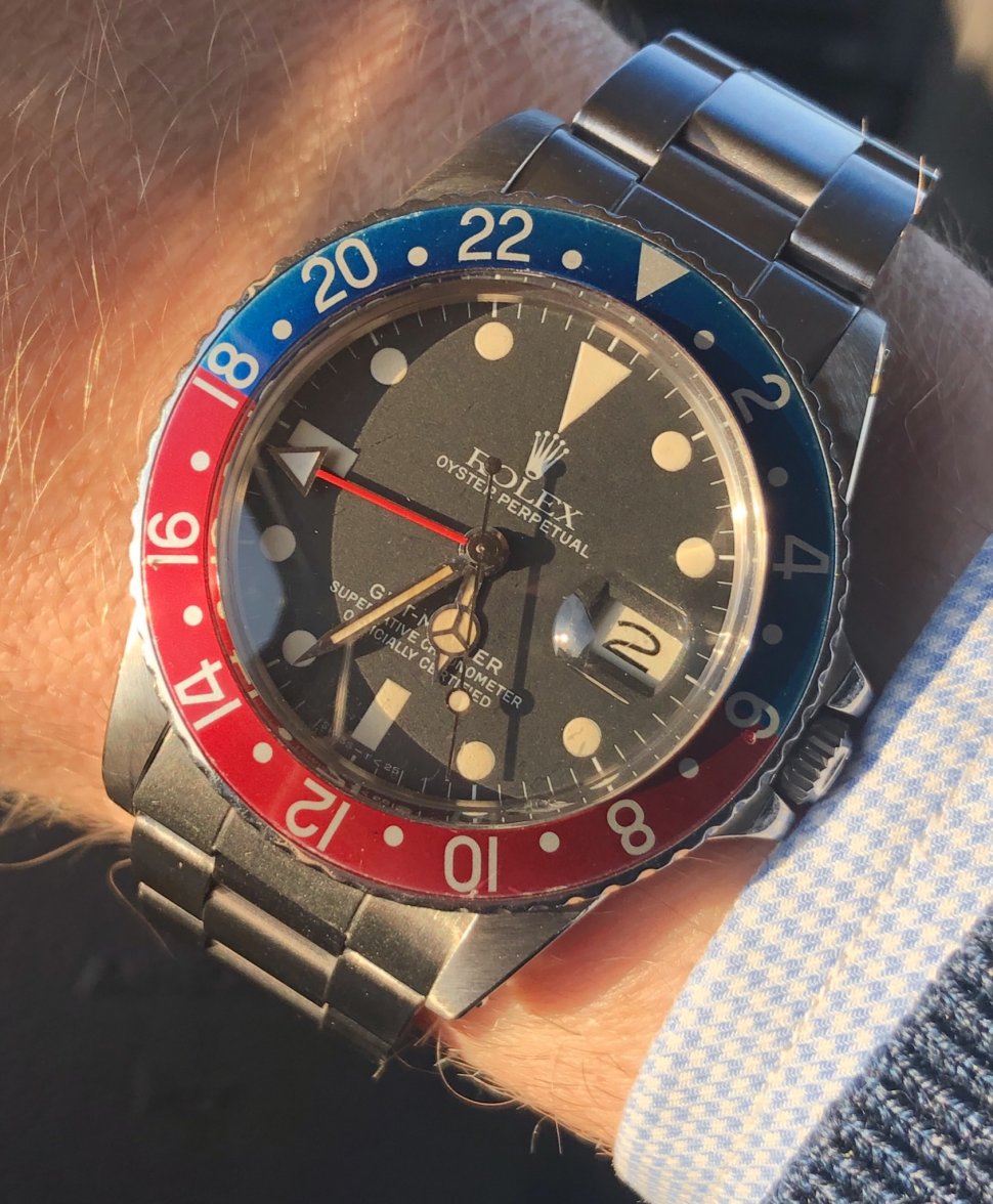
Here’s my 83-84 16750. I’m not sure of the specific bezel type other than it is a red back with thinner font:


The previous owner had put an older FF bezel on it prior to selling the watch to me (photo below of my watch with the FF bezel) but put the original bezel back on the watch prior to sale:


I do love the FF in this case - even though it’s not technically correct on my particular GMT reference.
 
Posts
603
Likes
2,566
No worries. I just laugh at folks who claim to know with certainty the era / period correctness of each and every insert ever made. It's truly amusing, hey, to each their own.

I agree that, for many red backed 1675 inserts, it's anyones guess as to when the are incorrect. I haven't seen much conclusive about the squashedness of the 8s determining age, I have yet to be convinced but would like to hear more than a just picture explaining it.

The furthest I'll go is ruling in rather than ruling out, i.e., there are a few specific iterations -- late 60s/early 70s fuchsias and MFFs, gilt era copper tones and bowed triangles -- that seem fairly consistent. That doesn't mean other kinds aren't also appropriate for those eras. Beyond that, I have yet to see anything convincing.

In my mind, if you get one that you like and meets the minimum requirements for 1675s (red back, fat font, some kind of squashed 8/18), it's a win.