- Posts
- 247
- Likes
- 88
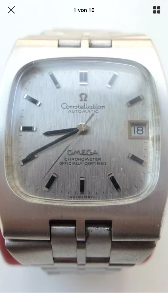
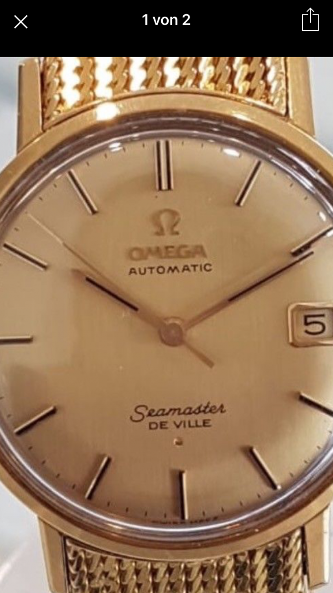
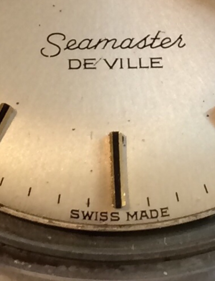
The font of the Seamaster is a little bit to thick.
Might be the photo. I've seen poor quality pictures of original dials that give that same effect.
The key for me is the SWISS MADE being in the appropriate low spot on the curve of the dial, and the entire phrase being aligned to the bottom instead of the space between the words aligning to the 6:00 indice.
Thank you!! Do you mean, it should look like this?