- Posts
- 8
- Likes
- 7
fortuneteller
·I would restore my Speedmaster, 145.022-71, at present with an incorrect bezel, a B5.type with wide C and marked E, about 90s:

I would like your advice about these 2 B2 type bezel, which match to my watch reference.
I have some doubt about one of two.
The first one, I think really original but with a dent:

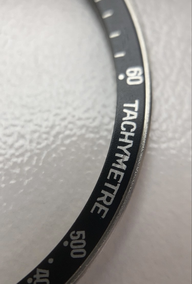
The second one, more dubious:

The second looks with more thick fonts, especially "tachymeter" (on top the first one showed) but I don't understand it could depends from picture quality


Bottom (on top, the first one showed)


Dot close to 70 (on top the firs one showed)


I would like your advice about these 2 B2 type bezel, which match to my watch reference.
I have some doubt about one of two.
The first one, I think really original but with a dent:
The second one, more dubious:
The second looks with more thick fonts, especially "tachymeter" (on top the first one showed) but I don't understand it could depends from picture quality
Bottom (on top, the first one showed)
Dot close to 70 (on top the firs one showed)