- Posts
- 1,890
- Likes
- 1,554
Drawarms
·either thats a super rare watch or questionable, however- both of those ideas ride on the line of each.
Please consider donating to help offset our high running costs.
what camera and sense are you using that everything is getting so distorted? Even the case on the last picture seems distorted to look way to thick. Or maybe because I deal with images all day i'm loosing my eye. I would recommend taking high res pics that are simple with as long a DOF as possible and that are High res enough that the experts can zoom into them.
I do not like any of it. Nothing looks right on the case, proportions are wrong, shapes and curves are wrong. It is good to stay well clear of this.
You can certainly judge the case's markings, the movement or the dial. Your opinion is very welcome on these parts.
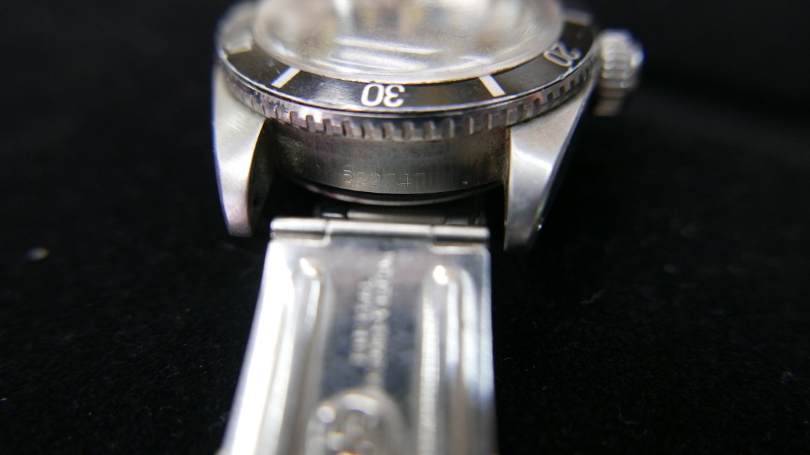
OK - I'll bite on just the case marking that is marginally useful: Serial # 562747 on the Rolex Serial Project puts this watch as manufactured about mid 1960 - or in 5510 range. I don't like the position of the style of engraving. I could be wrong buy I really don't think so. All of the photos look off. Sorry dude.
From your photo: https://omegaforums.net/data/attachments/119/119577-147a6e9897155f655f8fc714b2d1a8be.jpg
I don't think Rolex serial numbers can be that reliably pinpoint since another list puts it in around 1957. The comment about the style is reasonable, but is not really conclusive though. Do you have pictures of the serial numbers for the other 6538s?
Thanks.


Just my opinions here. I could be wrong. I have not read your VRF posts.
I do not own a 6538.
4 liner and post 1957 6538 should have Red triangle bezel insert.
This insert looks to emulate the early 6536 and 6538 style no minute hash
but the fonts do not look like what I have on my hard drive of known real inserts.
Lume is definitely NOT original. 6536 and 6538 had the 6 marker made out of different
compound and it ALWAYS looks whiter than the other markers on original dials.
The OCC serifs look way off, too exaggerated. Specifically, I don't think there
should be any detectable serif on the "C" I look through the ones I have on my
hard drive and none look like this. The "L" serif also looks unnatural and
again, I think there should be no detectable serif. The I and the C are running
into each other in OFFICIALLY and I can't find this trait on any of the dials
I have on my hard drive.
The Submariner relative spacing also does not look similar to any I have on hard drive,
but there are a lot of variation in these dials.
The rehaut doesn't bother me, I am including a picture of a 6538 with similar
rehaut but it is an early 6538. I am by no means an expert on the 6538.
I would specifically ask Eric Ku, PhilippS, Bernard on VRF. If they say it's no good, it's no good.
The flat top 4 in the serial number between the lugs also looks suspicious to me.
I'll also include some 6538 4 liners here for comparison.
Here's the one with similar rehaut, but it is a double reference 6536-6538, thin case:
This is a Vietnam dial:
Here are some real 6538 4 liners:
Serial 674xxx:
Thanks pitpro! That's almost exactly what I've found: too much serif everywhere on the dial including the word Rolex; close spacing around Submariner; wrong bezel insert and no issue with the rehaut. I've also found the movement is too beat up for the case in that good condition. That's why I did not just run, but flew away from it by the time I got the first reply to this thread. Still, I just want to have solid confirmation to prevent me from flying back to buy it 😀
Thanks everyone for your opinions and eagerness to help! It's been short but quite an exciting hunt for me.
Didn't seem.likr you where running there, for a moment it felt more like everyone had to push you a bit... I do think you made the right decision though.