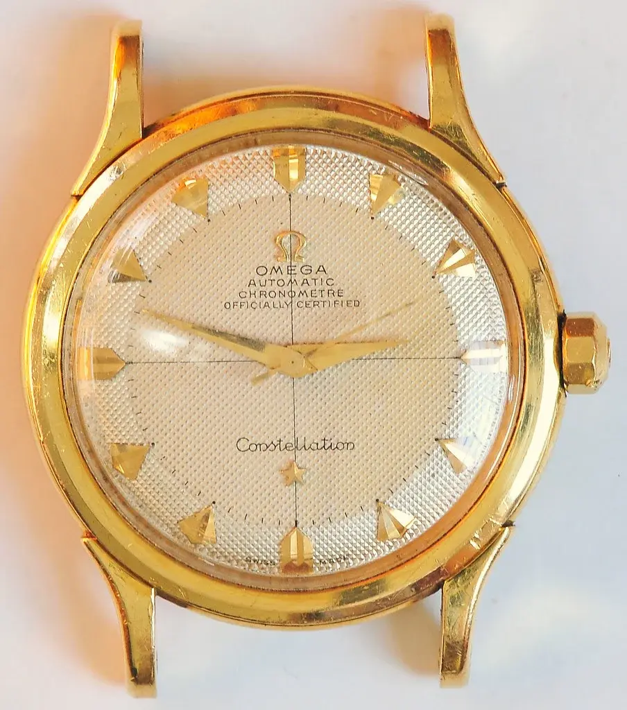
2852 Constellation Waffle redial?

Posts
61
Likes
28
Hi all,

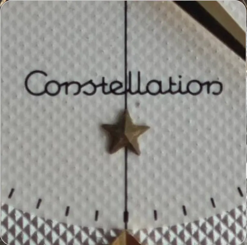
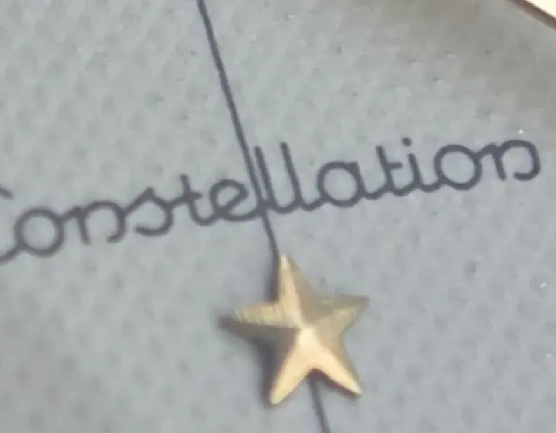
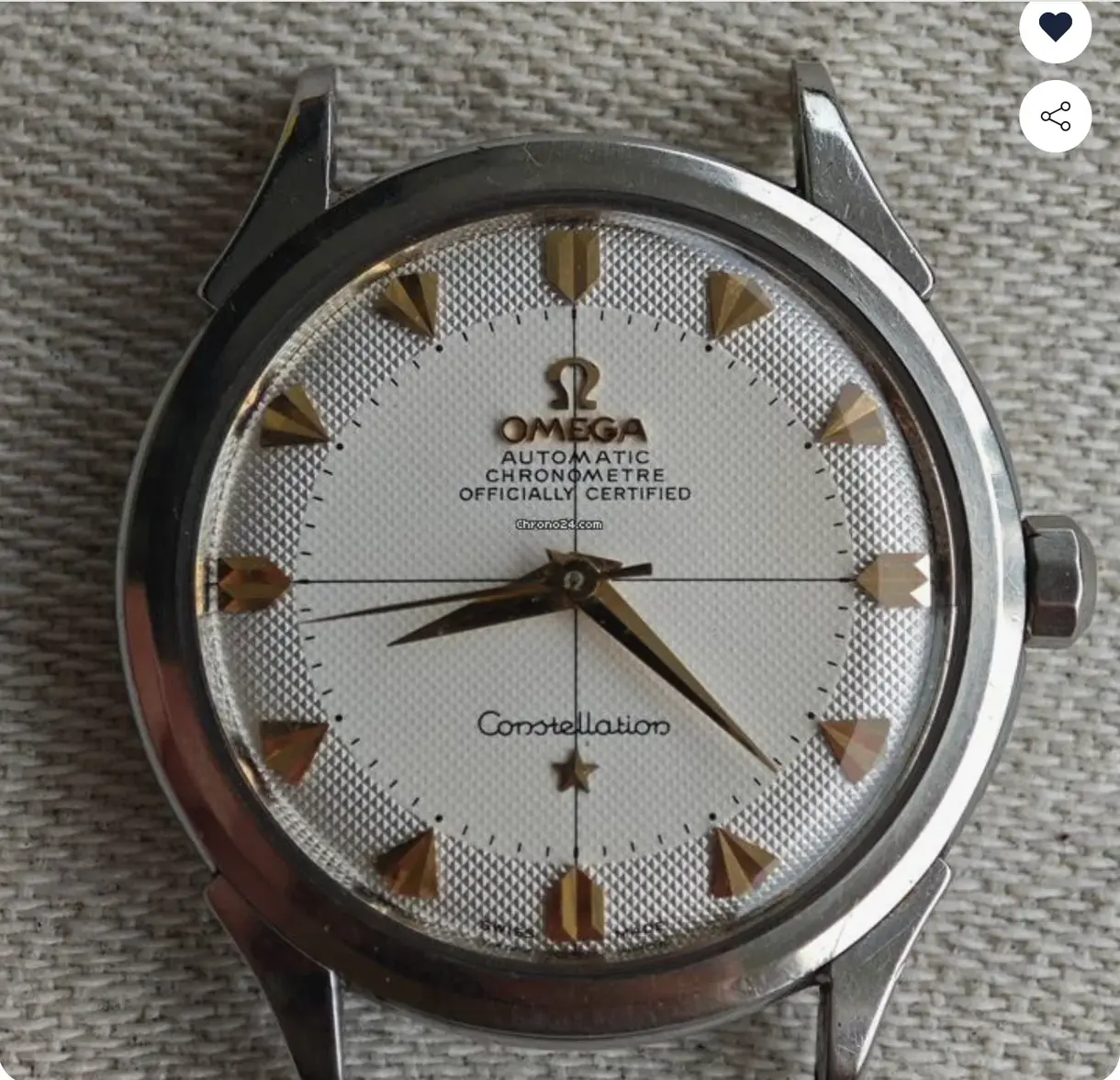
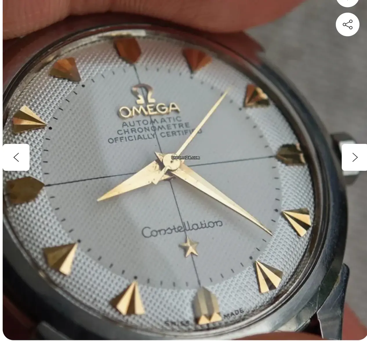
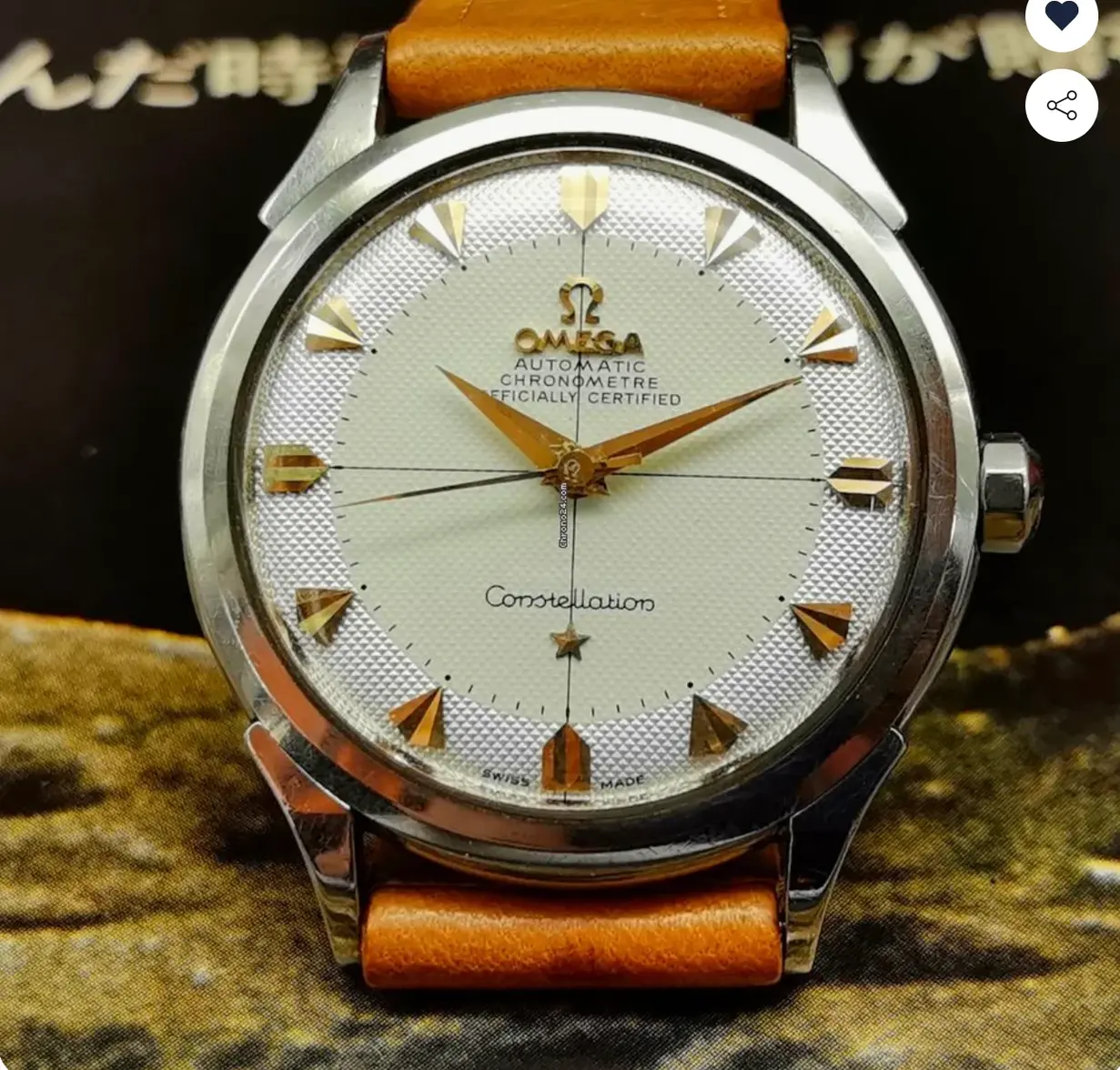
Just wanted to check and see if any expert eye agrees with my assessment that this 2852 is a redial. Dial condition is suspiciously good, especially in contrast to the wear on the lugs. I think also the lettering looks off. No flat top on the 'A's for example. That said, if this is a redial, its a very good one.

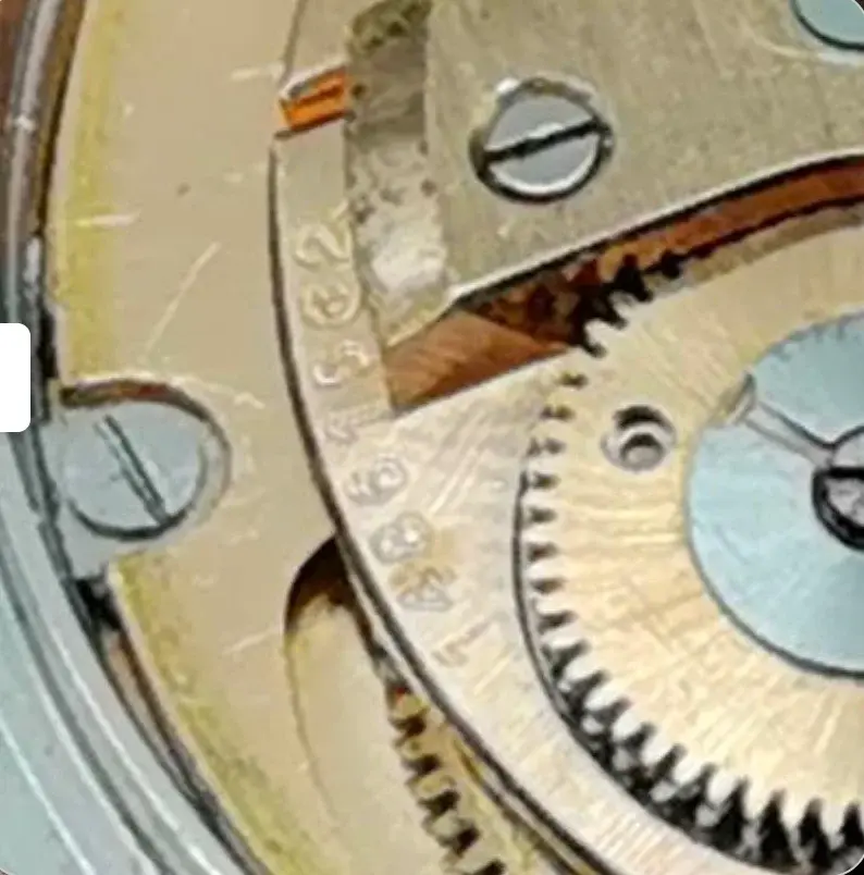
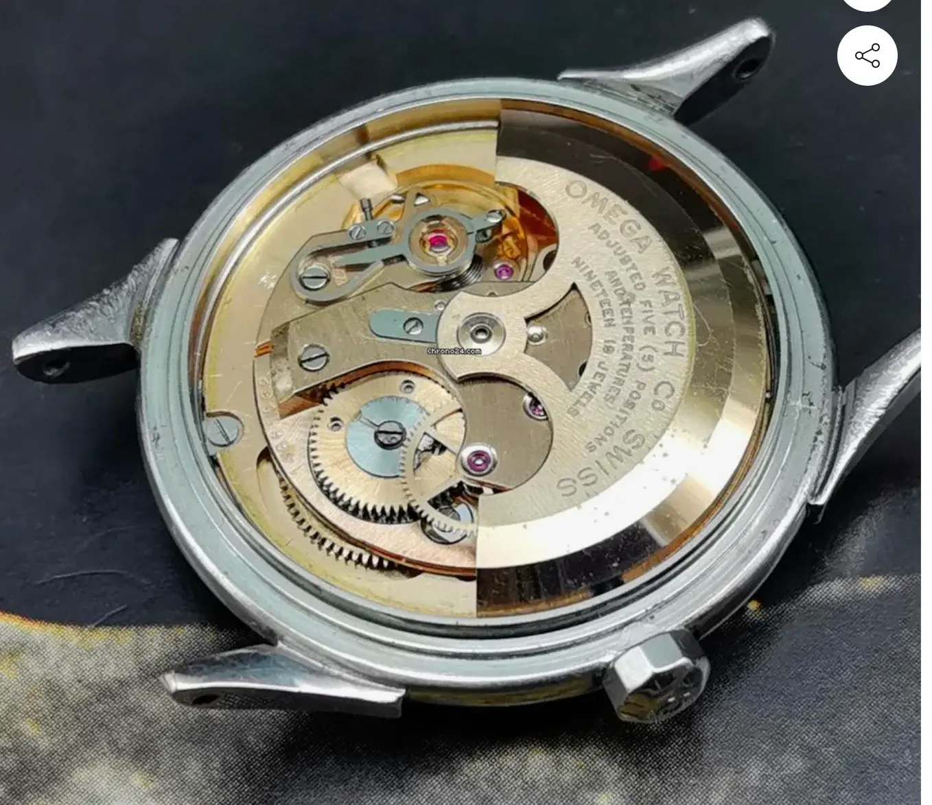
Serial number is 148... so a 19 jewel cal 501, late 50s.

Any thoughts guys? Huge thanks as always to the community.

 
Posts
34
Likes
55
Interested to hear opinions on this one, because as you say, if it is a re-dial, it's a good one. Does it all come down to the loops on the lower case "n"s?
 
Posts
8,088
Likes
58,137
Not a fan of the fonts of the "n"'s nor the thick, blunt crosshairs......maybe the manipulated/photoshopped pix.

Ask for upclose, hiRez pictures in natural light, not manipulated.
 
Posts
2,174
Likes
4,346
Hour dots appear poorly aligned with arrows at 5,4,2.
Center dial looks like heavy layer of paint filling in the waffle troughs.
Dial is incongruous with case.
Maybe trying too hard to find fault but it doesn’t look right overall.
See what experts say.
 
Posts
2,621
Likes
6,695
In my opinion, this is a redial. What stands out to me:
1) the second/minute hash marks are too short and too far from the outer edge
2) the outer portion of the dial on these two-tone waffle dials usually has a slight silver tone, not as white
3) the inner portion of the dial is too white as well and too glossy, it’s usually more matte, and it rarely lacks a slight patina/marks on st least the tips of the texture
4) the font is lacking serifs and is slightly too thick
 
Posts
6,618
Likes
11,373
It looked like a redial to me a few seconds after looking at it. I’ll leave for others to point out details but it’s too “in your face.” Especially the contrast between the center and periphery.
Edited:
 
Posts
61
Likes
28
Thanks guys. Scary how good some of these redials are to the untrained eye.