- Posts
- 3,489
- Likes
- 13,345
MtV
·Hey everybody,
a couple days ago I created a thread asking for the information provided in the Omega Extract of the Archives, as I am hunting for a black dial Pie Pan Constellation and planned on ordering the EotA for it, sort of as a final prove it’s legitimately an original black one. Unlikely, judging by the amount of redials available online... @ConElPueblo mentioned that, while the EotA wouldn’t do it, you guys were probably the safest test. So, if you’ll allow, here are 2 from the same seller I looked at today, both cal. 354.
I apologize in advance as this is going to be a lengthy post with a couple of pictures. Hope that’s fine - the light was horrible but I hope they are good enough for you to work your magic. I’ll post the pictures and add my thoughts - really excited to hear what you’ll say, even though I am in fact sceptical...
Number 1)


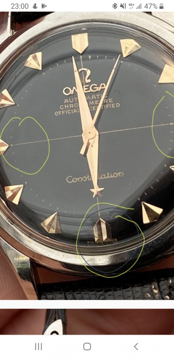
Positioning of the hands is a bit unfortunate here, I’ll add two more picture in a second. Bit of corrosion around the movement is probably not too uncommon, the dial itself looks very shiny - possibly too shiny. What puts me off is this:


The star underneath the Constellation is too close to the letters and it’s in a wonky position. That can’t be right?
Also, the Omega logo on the top is not completely in the center of the line (which I’ve spotted on a few of them on Chrono). The “Omega” seems to have been applied in an angle, too.
I might be crazy here looking at those details, but I don’t just want your verdict, I’d love to learn on the way.
Number 2)


Again, possibly a dial too good to be true? The differences are minute, I do like the extra line along the indices.
My issue here is that the line of the cross doesn’t go through the Omega Automatic Chronometer etc. at the top - scrolling through pictures of other Pie Pans, the only two I could find that didn’t have the line all the way through those words were ones even I could identify as redials. And if I look closely at the Omega logo the bottom left part seems to have a sharper corner than the bottom right part, it’s not symmetrical.
Last but not least: it has the same issue with the star underneath the “Constellation” which seems to close and at an angle.
To highlight that, here a comparison:


Alright. Hope I didn’t lose you on the way - I know it’s a long post. Thanks in advance for everything I might learn from these!
a couple days ago I created a thread asking for the information provided in the Omega Extract of the Archives, as I am hunting for a black dial Pie Pan Constellation and planned on ordering the EotA for it, sort of as a final prove it’s legitimately an original black one. Unlikely, judging by the amount of redials available online... @ConElPueblo mentioned that, while the EotA wouldn’t do it, you guys were probably the safest test. So, if you’ll allow, here are 2 from the same seller I looked at today, both cal. 354.
I apologize in advance as this is going to be a lengthy post with a couple of pictures. Hope that’s fine - the light was horrible but I hope they are good enough for you to work your magic. I’ll post the pictures and add my thoughts - really excited to hear what you’ll say, even though I am in fact sceptical...
Number 1)
Positioning of the hands is a bit unfortunate here, I’ll add two more picture in a second. Bit of corrosion around the movement is probably not too uncommon, the dial itself looks very shiny - possibly too shiny. What puts me off is this:
The star underneath the Constellation is too close to the letters and it’s in a wonky position. That can’t be right?
Also, the Omega logo on the top is not completely in the center of the line (which I’ve spotted on a few of them on Chrono). The “Omega” seems to have been applied in an angle, too.
I might be crazy here looking at those details, but I don’t just want your verdict, I’d love to learn on the way.
Number 2)
Again, possibly a dial too good to be true? The differences are minute, I do like the extra line along the indices.
My issue here is that the line of the cross doesn’t go through the Omega Automatic Chronometer etc. at the top - scrolling through pictures of other Pie Pans, the only two I could find that didn’t have the line all the way through those words were ones even I could identify as redials. And if I look closely at the Omega logo the bottom left part seems to have a sharper corner than the bottom right part, it’s not symmetrical.
Last but not least: it has the same issue with the star underneath the “Constellation” which seems to close and at an angle.
To highlight that, here a comparison:
Alright. Hope I didn’t lose you on the way - I know it’s a long post. Thanks in advance for everything I might learn from these!