- Posts
- 24
- Likes
- 10
Doug G
·Hello.
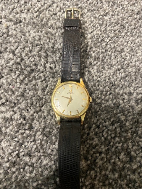
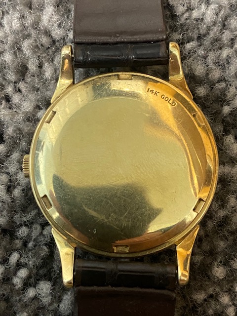
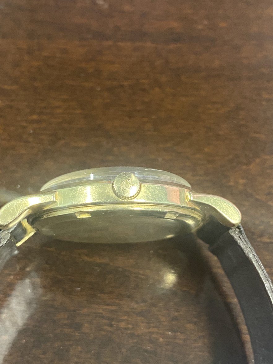
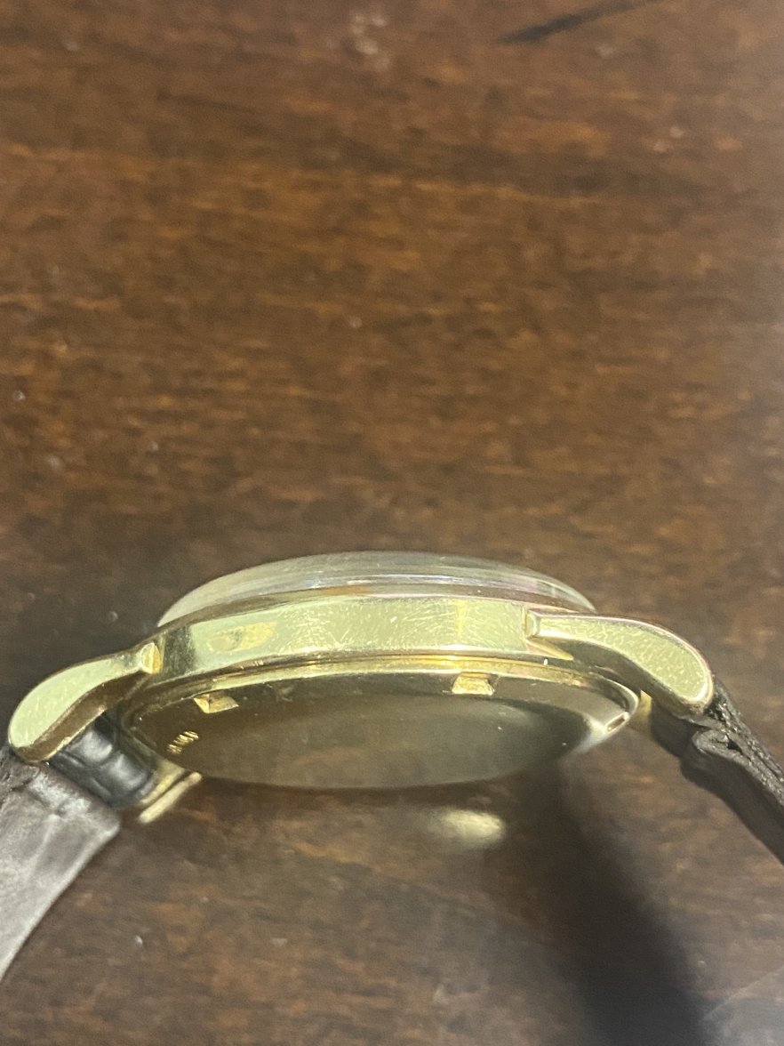
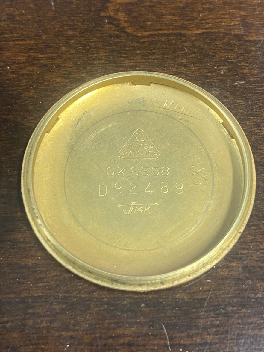
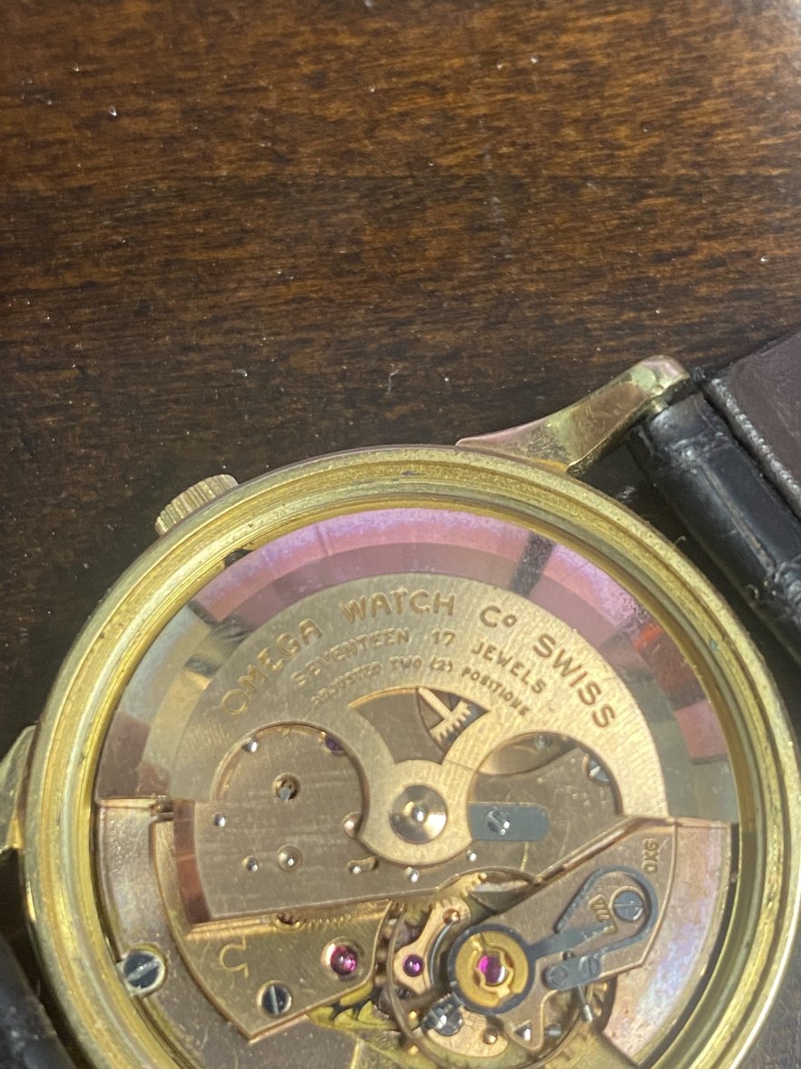
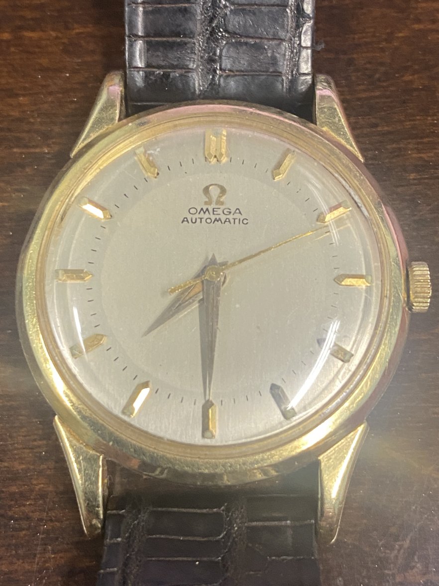
I am new to this forum and my family and I were going through my dad's jewelry case and we found two watches. I will post the other one on the modern forums. I have a case and backing plate that are stamped in 14K gold and I know the band is not original and the clasp on the band is corroding. I am just trying to get more information on it and there are no markings or serial numbers that I can find on it. Does anyone have any idea or any information would be greatly appreciated and Thank you in advance.
I am new to this forum and my family and I were going through my dad's jewelry case and we found two watches. I will post the other one on the modern forums. I have a case and backing plate that are stamped in 14K gold and I know the band is not original and the clasp on the band is corroding. I am just trying to get more information on it and there are no markings or serial numbers that I can find on it. Does anyone have any idea or any information would be greatly appreciated and Thank you in advance.