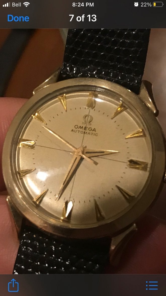
I have read this, but its extremely hard to make a call
The first step I usually take is to find another example of the watch in question (more examples are better). In this situation that is a challenge, because the details on US-cased watches can be subtly different from watches produced entirely in Switzerland, and those subtle differences are the things we look for in an orginal dial versus a redial.
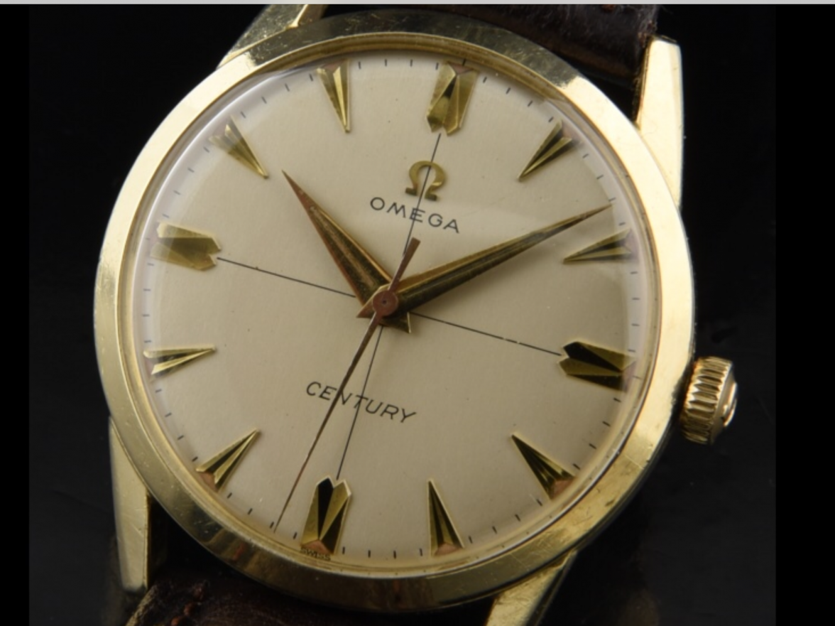
Fortunately, your watch dial bears a resemblance to another US-market watch from that time period, known as the Century. There is a likelihood that the dial on your watch and the Century were printed by the same subcontractor, so there should be some similarities that you can look for.
Here is a
thread on the Century model, and a picture from that thread to look at:

Now that you have another example to study, compare the length and thickness of the most prominent feature on the dial: the crosshair. Note on the Century where the line breaks (or not) at the hour markers and at the Omega logo, and compare them to yours. A redialed watch might have the crosshair carelessly printed on top of the markers, or might print the crosshair too thickly. How does your example compare to the Century?
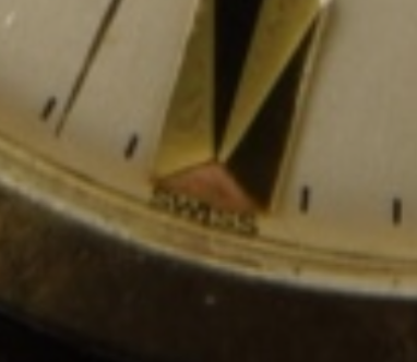
A US-cased watch typically says "SWISS" centered at the very bottom of the dial, rather than "SWISS MADE." The SWISS can be hard to see on some dials, as it can be printed beyond the dial's curved edge. A redial watch might miss this feature. On the Century, you can find it here:
Can you find the SWISS on your example?
On your example, the minute markers are located inside the hour markers. This was a common dial feature, and on your watch, that feature matches the shortened length of both the minute hand and the second hand, suggesting that the hands might be correct for your watch. You should study the minute markers on your example to verify equal spacing between each printed marker as well as between the printed marks and the hour markers. Sloppy redials often don't get the registration quite right, and you'll find minute markers are printed unevenly.
But be careful: A poor photograph sideways through a crystal can also distort what you see.
Next, compare the typeface used in the Omega logo on your watch to that of the Century. Note the little serifs on the letters; the shape of the "O" in Omega; study where the crosshair crosses the "E"; look at the slanted lines in the "M." Redials often use the wrong typeface. How does your example compare?
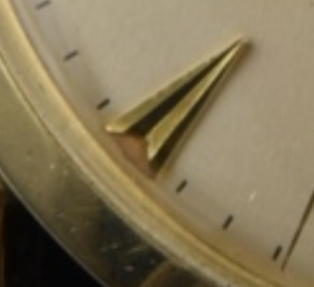
Finally, review the hands. As noted above, they might be the right size but are they the right style? The hands on your example are lumed, so look for little dots of aged lume at the outside ends of the hour markers. If they are present, that's a good sign the dial has been untouched. A redial will erase those dots. Sometimes the lume falls out on its own, but it usually leaves a trace behind. On the Century, those lume dots are here:
The next step is yours: Based on the above, can you see any signs of a redial? Or does everything check out?
