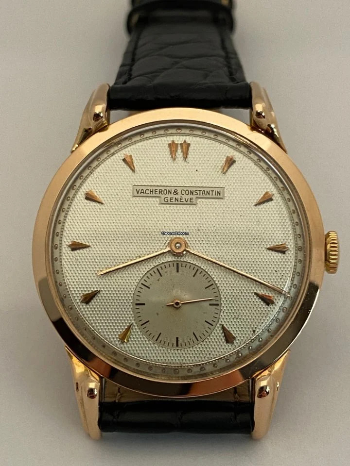
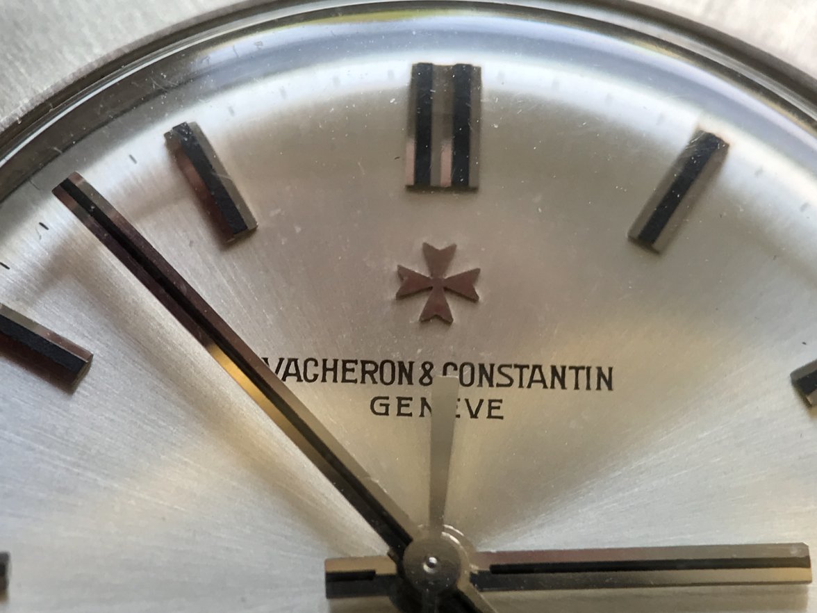
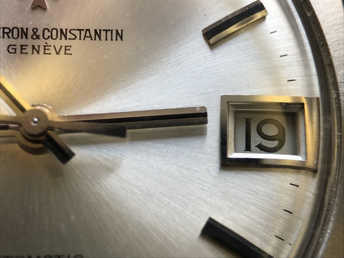
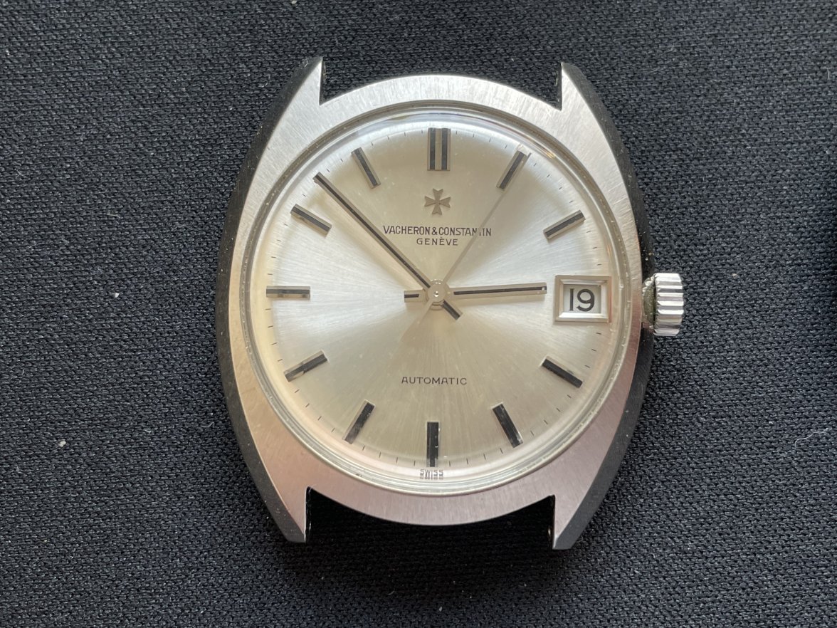
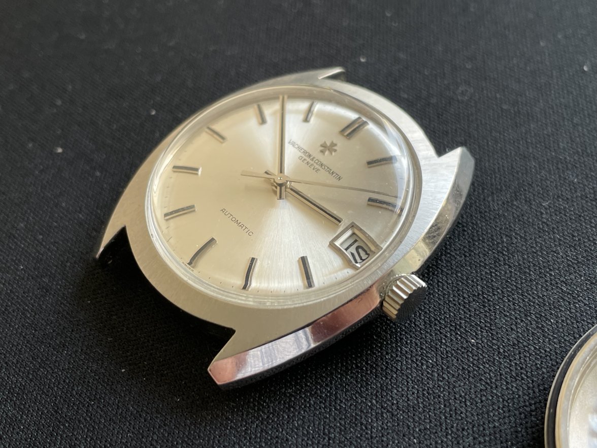
Very likely original, especially given the apparent condition of the rest of the watch. While it may seem odd, neither V&C nor AP, despite being two of the "Big Three" early/mid 20th century manufacturers, employed particularly high quality or consistent dial signatures.