unusual seamaster dial?

Posts
8
Likes
0
Greetings,
A newbie here.....
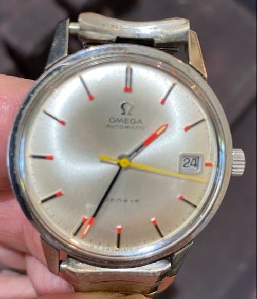
Can anyone give me more information than the obvious regarding this Omega Seamaster?

It has unusual unusual markers and hands; I have not seen this model in all the 50+ years handling Omegas.

It is a model # 166.002, cal. 565, 24 jewels, auto date with the seahorse on the caseback.

I thank any and all for their input.
 
Posts
33,019
Likes
37,792
Yea someone really liked Baywatch and wanted to style their Seamaster like the show. Can’t say I’m a fan.
 
Posts
8
Likes
0
somebody pimped it

DON
That was my first guess, but, nope, all original……..
Even the crystal is original
 
Posts
23,022
Likes
51,470
That was my first guess, but, nope, all original……..
Even the crystal is original

So you think that the orange paint is original? What makes you say that?
 
Posts
8
Likes
0
I know the quality of the picture is not all that great, but I’ve examined the “paint” under 10x magnification and it is definitely factory.
 
Posts
16,852
Likes
47,841
I know the quality of the picture is not all that great, but I’ve examined the “paint” under 10x magnification and it is definitely factory.

No Omega ever came out of the factory with that paint. Looked at thousands of Omega watches from this era and hundreds on here have looked at thousands more than me…
May be done well by a watchmaker at some time but factory….Not a chance


But still a nice looking watch by the way if you like the splash of colours 😀
 
Posts
23,022
Likes
51,470
Yeah, I've never seen anything remotely like that from Omega, and it's especially jarring on a dressy Geneve. And respectfully, I have to disagree that it looks professional. Even from the blurry photo I can see that the various markers all have different amounts of orange paint applied. The hands also make no sense, the way they are painted.
 
Posts
8
Likes
0
With all due respect, that is exactly why I posed the question.

I’ve been handling not only Omegas, both new and old, but other makes as well for over 50 years. I learn something new every day and never assume to have “ seen it all”.
What appears to be different size applications of paint (in the picture) is simply distortion due to the crystal.
I concur that the color of the hands doesn’t make sense, but I can assure you that none of the several dial refinishers I have known over the years would not have done as good a job. In addition.

Do you perhaps know of any other tell-tale way to discern an original from a “pimped” dial?

I will try to upload a better picture………
 
Posts
2,091
Likes
1,280
And I just noticed. Hour and minute hands not the same.

One wider and silver and other is black

DON
 
Posts
10,586
Likes
51,511
Speaking as an amateur I gotta agree with the more knowledgeable guys. I went nuts with vintage seamasters and geneve early on. For some reason I thought they were the thing to get, plus I kept running into them. I actually have now got rid of everyone, sold, traded or given as gifts (three lost in transit to China which still irks me)
Now that doesn’t make me an expert of course but if I saw that sitting anywhere I would figure it was a fun project or something someone undertook. IMO they don’t mod well. Having said that if someone likes a splash of color more power to them. If you are 100% this came out of the factory and it’s a “common” or more than one reference I’d love to see it but it seems to fly in the face of what omega was doing at that time.
 
Posts
23,022
Likes
51,470
What appears to be different size applications of paint (in the picture) is simply distortion due to the crystal.

Are you sure? For example, look at the 4 o'clock marker, it seems to have a very small cap of orange compared to many of the others. And the orange paint seems to be uneven on the double marker at 12. Of course, it's possible this is all due to artifacts in the photo, and you have it in hand so you have a much better view.
 
Posts
33,019
Likes
37,792
Ive got a Gruen somewhere that has similarly painted red and green hands and markers and it looks perfect. It was done by a watchmaker in the 50s to help the owner who was a tram conductor with poor eyesight and a need for better contrast.
 
Posts
631
Likes
788
Ive got a Gruen somewhere that has similarly painted red and green hands and markers and it looks perfect. It was done by a watchmaker in the 50s to help the owner who was a tram conductor with poor eyesight and a need for better contrast.
I initially thought it might be for someone who was visually impaired. But it seemed like an odd choice of watch for such a thing. Perhaps it was sentimental to them, or they just wanted a nice dress watch they could read. I even googled "watches for visually impaired" but they were all read by touching the dial with one's fingers.
 
Posts
631
Likes
788
That theory might also explain why the minute and hour hands are so different.
 
Posts
137
Likes
105
I initially thought it might be for someone who was visually impaired. But it seemed like an odd choice of watch for such a thing. Perhaps it was sentimental to them, or they just wanted a nice dress watch they could read. I even googled "watches for visually impaired" but they were all read by touching the dial with one's fingers.
That's what I thought as well.
 
Posts
3,307
Likes
12,915
Ive got a Gruen somewhere that has similarly painted red and green hands and markers and it looks perfect. It was done by a watchmaker in the 50s to help the owner who was a tram conductor with poor eyesight and a need for better contrast.

"A tram conductor with poor eyesight" - now that got my hackles up slightly 😁
 
Posts
33,019
Likes
37,792
"A tram conductor with poor eyesight" - now that got my hackles up slightly 😁
It was my grandfathers watch, he was a cook in the army during WW2 then a tram conductor later on, so he needed a watch that worked well and was accurate as well as easy to read. From memory he worked the trams until around the time they closed.

https://en.m.wikipedia.org/wiki/Trams_in_Brisbane
 
Posts
2,008
Likes
3,386
That looks like an early incarnation of a Swatch watch 🙄