LOGO
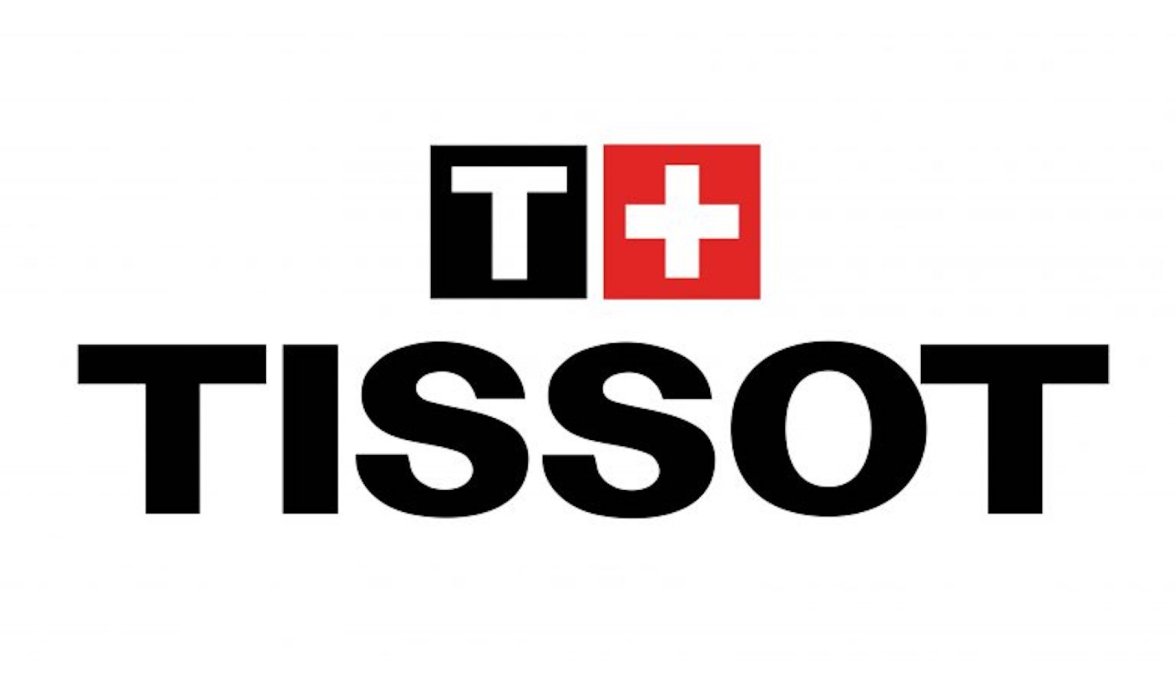
1978 - 1998: The brand for twenty years and became a basis for the current iconic insignia the whole world recognizes today. The logo was executed in a monochrome color palette and featured composition of a bold sans-serif inscription with the uppercase letters perfectly balanced, and an emblem, placed above it - the serif letter “T” with the elongated tails of its horizontal bar, pointing down. It was a very elegant yet pretty simple logo, which brilliantly reflected the essence of the label.