72c
·I recently picked up a replacement Speedmaster bezel and to me it looks a bit suspect, what do you think?
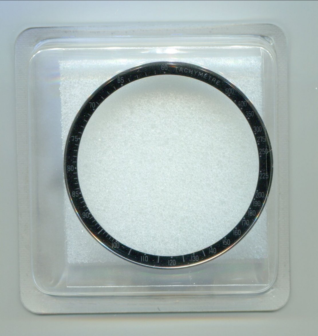
The first thing that made me wary was the off-centre logo on the packaging. Up close it's a little pixelated too, strange.
Here's a packaging comparison with a legitimate one I had (on left). Part # correct, but I wonder why this latest one would be missing the date code?
View attachment 294105
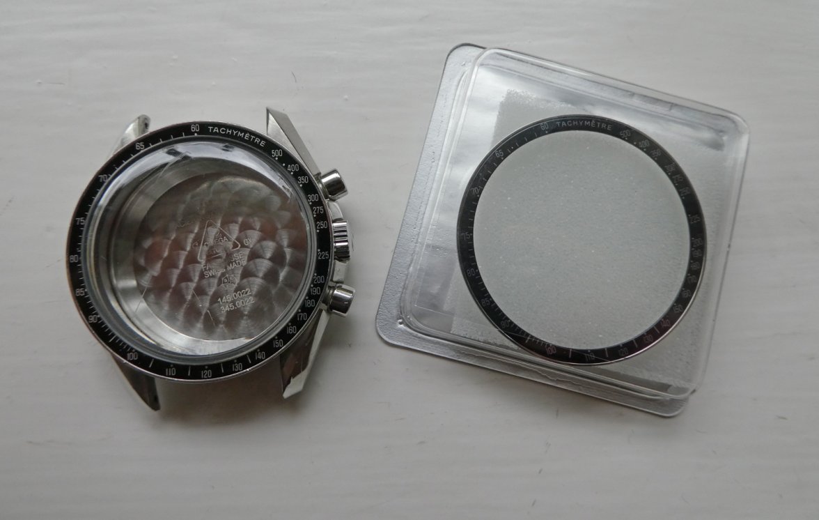
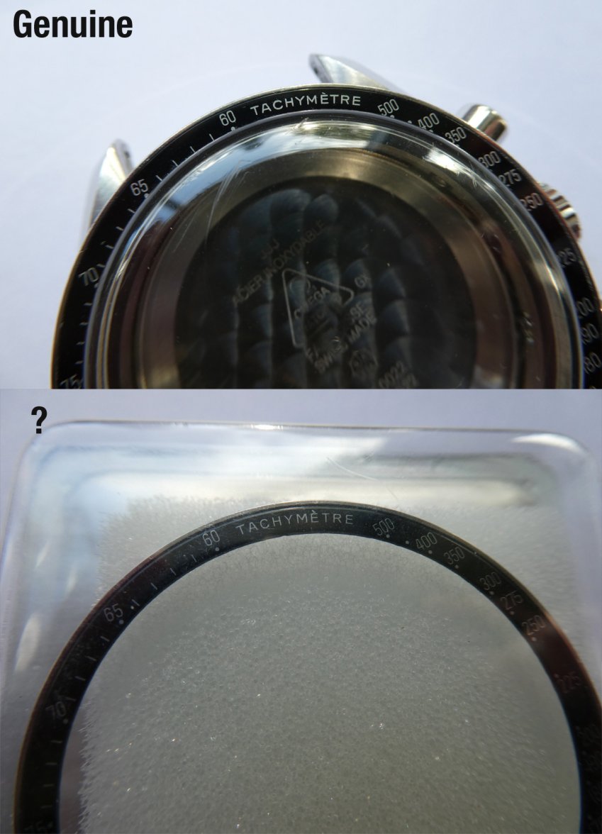
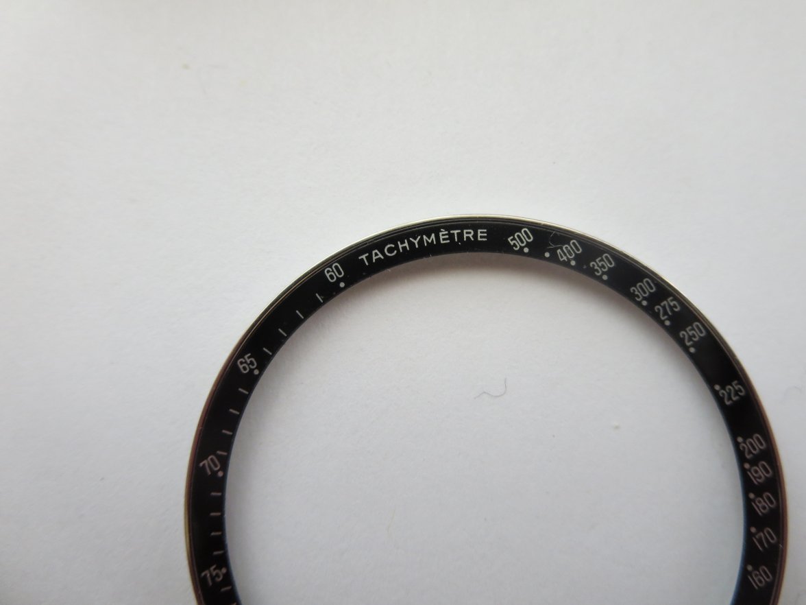
More significantly the fonts on the bezel itself seem a bit off compared to this 1450022 case. The difference might not be that clear in this pic as I haven't opened the packaging in case I need to return it, bear with me.
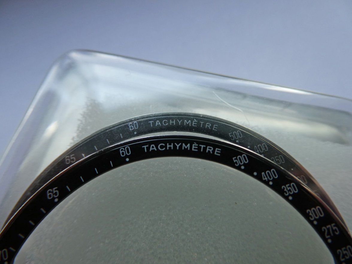
Another comparison, definitely a different tachymetre.
A few differences I noticed with the new bezel
accent on E is a shade nearer to the letter
letters a shade taller
whole typeface a bit more feint
'A' bit more pointy
The lighting isn't great in the lower half so you might just have to trust me when I say they're visible differences 😉
We've all seen those replica inserts only on ebay and this definitely isn't one of those, but still it doesn't feel quite right.
We all know the tell tale signs on vintage bezels, modern ones I assumed stayed effectively the same from 3570.50 onwards, but maybe they did vary as much as this over the years and Omega were having an off day when they packaged this. Thoughts?
Edited:
