- Posts
- 45
- Likes
- 142
SpeedyMW2103
·Needs to say also that a picture (which is in 2D) is a different story from the reality of the thing, seen with binocular vision.
Have a magnificent day!
Please consider donating to help offset our high running costs.
Needs to say also that a picture (which is in 2D) is a different story from the reality of the thing, seen with binocular vision.
I agree 😀 One of my favorites (the 2 tone Sedna) is actually quite poor legibility, since the hand color matches the non-subdial part of the dial.
White/Black speedies are obviously both great legibility.
All that said, I can still tell the time. If it takes a few extra seconds to read, it isn't a problem. Particularly with my 2 tone, I'm going to spend a few seconds staring at the dial for another reason anyway, mind as well use that time to figure out the time 😁
People are not buying Snoopys to tell time, just saying. I think the hands are great and putting polished white gold hands in would ruin the look. Just my opinion. Will not buy the Snoopy either way.
Yes, that’s what put me off with the new FOIS.
And the faux-patina is too overly executed. Just a cream colour like those on the Ed White 321 is perfect.
Beautiful Speedmaster Collection!
Thanks. I have a hesalite 3861 also. Next is a 321.
Have you seen this one?
https://omegaforums.net/threads/omega-speedmaster-321-ed-white.185655/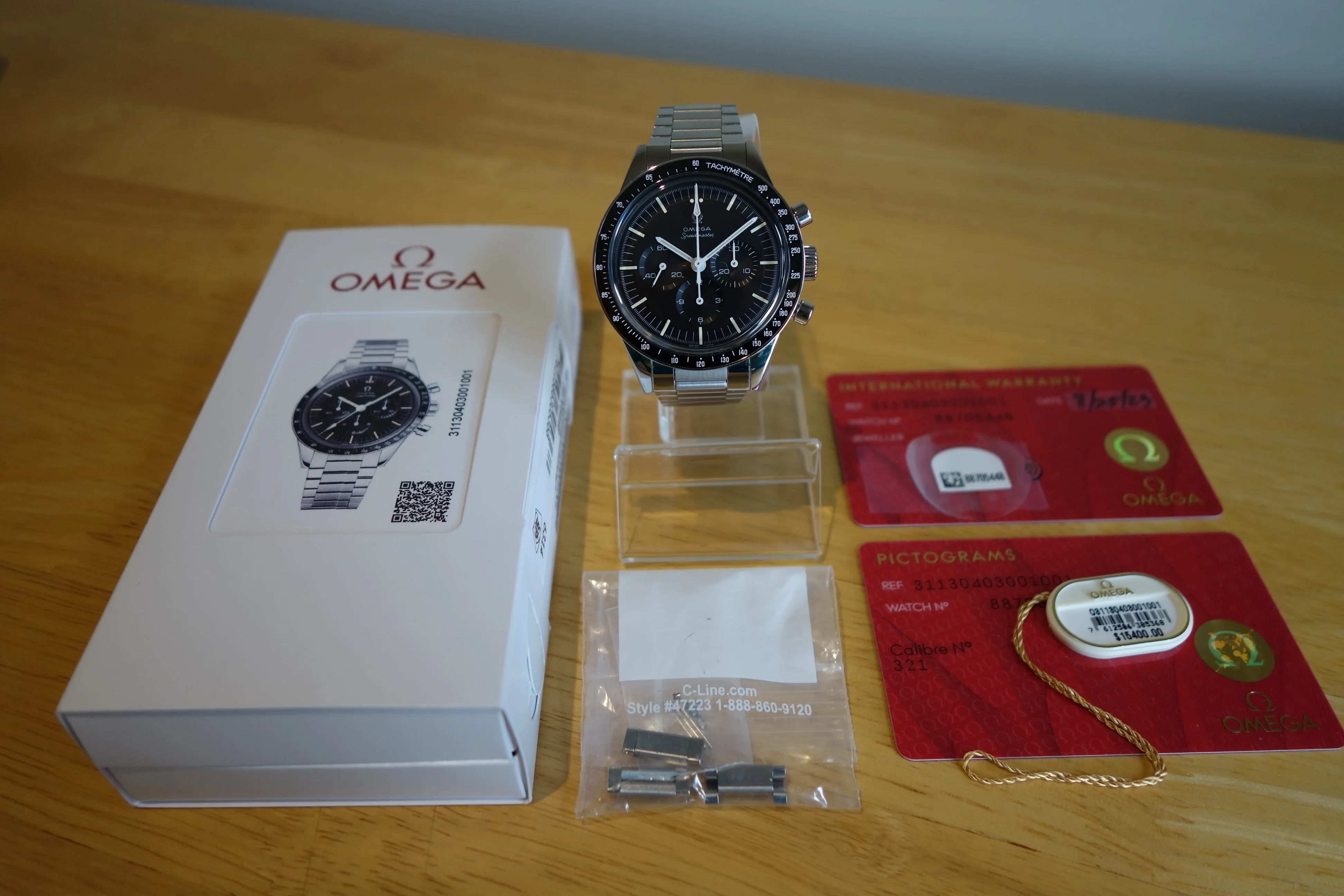 Thread 'Omega Speedmaster 321 Ed White' ·Hi,
I'm pleased to offer my Omega Speedmaster 311.30.40.30.01.001
Purchased by me at a US OB in 2023 and worn occasionally since. Good condition, showing minor scuffs around clasp and bracelet...WITHDRAWNG-Web ·$ 14500 USD
Can you tell what time it is in the picture?
Did you look at the White Speedy for your answer? If yes, then I am with you.
Look at how the blue hour and minute hands disappeared over the blue sub-dials.
I understand the collectibility of the Snoopy because of its story, the design colour-way, the funny animated case back….. But as an instrument to tell the time and read the Chronograph, it fails quite miserably, in my point of view.
P.S.: I stop seeing the Snoopy animation on the case back after 2 days of ownership.

Look at how the blue hour and minute hands disappeared over the blue sub-dials.


If you want illegible, try a black Rolex Daytona:
Or a Longines Master Chronograph in blue:
Or a Rolex Datejust in blue from the 5 digit era. At one time this 16200 was my dream watch. But once acquired I discovered it was nearly illegible unless the watch was turned just so toward the light. You can see in this photo the indices are nearly invisible and this photo was taken in a light box!
I’d like to know what motivated you to buy this DSOTM.
Honestly, you don't really have to ask if you've seen it in person. It is a VERY handsome watch that if it is your vibe, is absolutely perfect. Not my cup of tea, but absolutely stunning.
Honestly, you don't really have to ask if you've seen it in person. It is a VERY handsome watch that if it is your vibe, is absolutely perfect. Not my cup of tea, but absolutely stunning.
As far as the FOIS: I didn't really/don't really see the legibility problems. Nice bright shiny hands on a black background is pretty clear to me.
I WILL say those sword-type hands have REALLY bad lume though, to the point they are quite hard to read in the dark. At least on my CK2998, the minute lume is pretty much invisible at night.
That said, the bezel lume is super bright/cool, to the point I forget I was trying to figure out what time it is 😀
I’d like to know what motivated you to buy this DSOTM.

