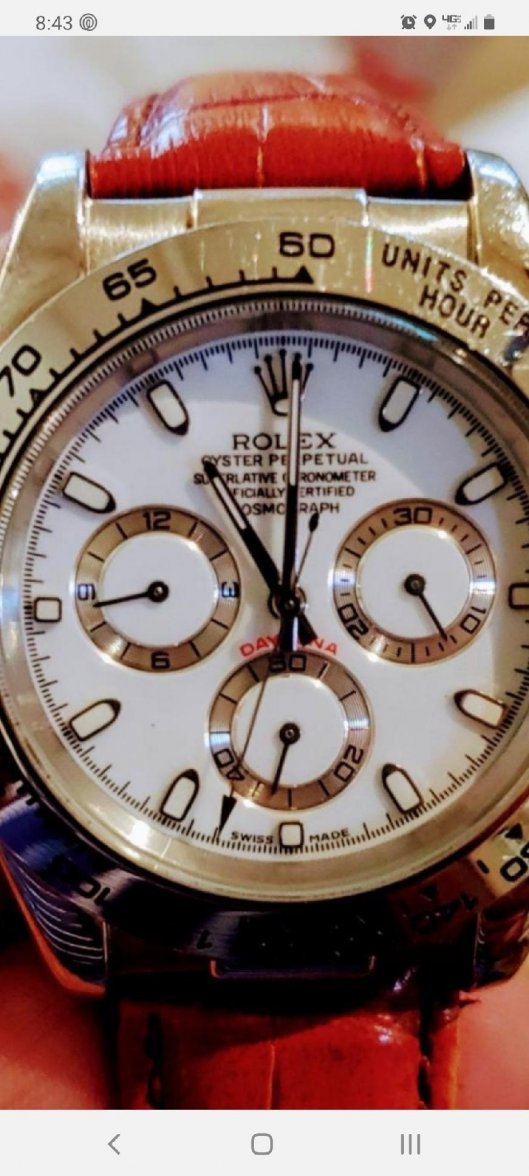
Do you know the reference number of the watch in question? Is it a 116518? Usually I see the yellow gold Daytona with a leather strap with Arabic markers, but I do know they made with baton hour markers. Regardless, the dial doesn't look correct... the font, the numbers, etc. nor does the clasp. Airansun, I know in older references the sub-dials were centered at the 3 and 9, but in the newer models the subdials are centered slightly above. For comparison, see the images below... look at "20" in sub-dials for example among other issues; the top of the numbers do not touch the edge of the sub-dial. See bottom image of older stainless steel model where the sub-dials are centered.
Plenty of things look off with that, dial printing is a bit sketchy, the 'daytona' text looks to be too light a colour
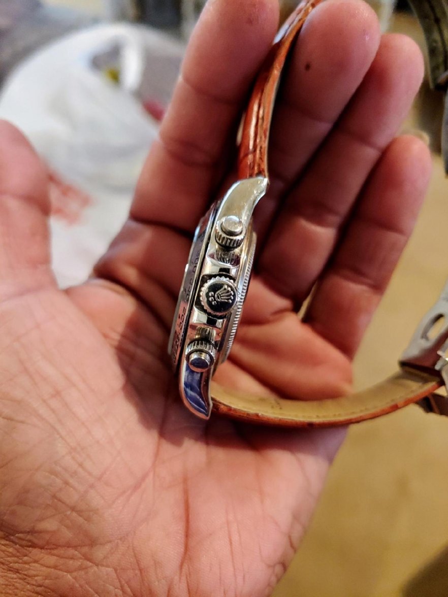
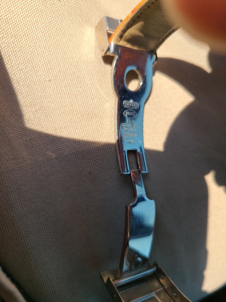
The clasp is the exact replica of a poor fake I got some years ago, before I knew better, and the finishing to the underside of the case is a bit rough
Here is a thing every collector needs to be able to do, spot a fate in 5 seconds or less. Rick Harrison from Pawn Stars has a great principle: to paraphrase...Rolex is about perfection. If it isn’t perfect, it isn't real. That watch is a horror.
This is the deep end of the pool. If you are posting a watch like this, you are about to drown. Do your homework. Kudos for having the presence of mind to post.
Any high ticket item that comes with bad pics = red flag and pass. If you're selling such a watch, the least you can do, if your not hiding anything, is to provide clear, crisp scans.
Any high ticket item that comes with bad pics = red flag and pass. If you're selling such a watch, the least you can do, if your not hiding anything, is to provide clear, crisp scans.
Seriously! To add a ridiculous example to that- I was perusing watchrecon and found this listing. This is the only photo provided and the complete listing description. It has 261 bumps on top of that... I greatly appreciate the rules OF has for sales here.