Aludic
··@SpeedyBirthYearHi all,
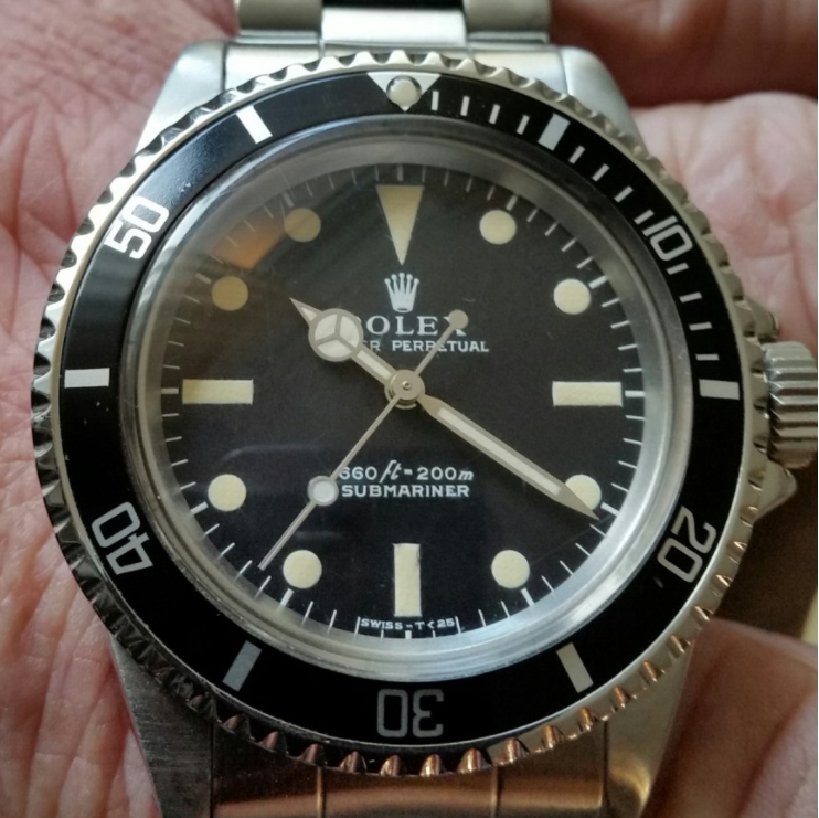
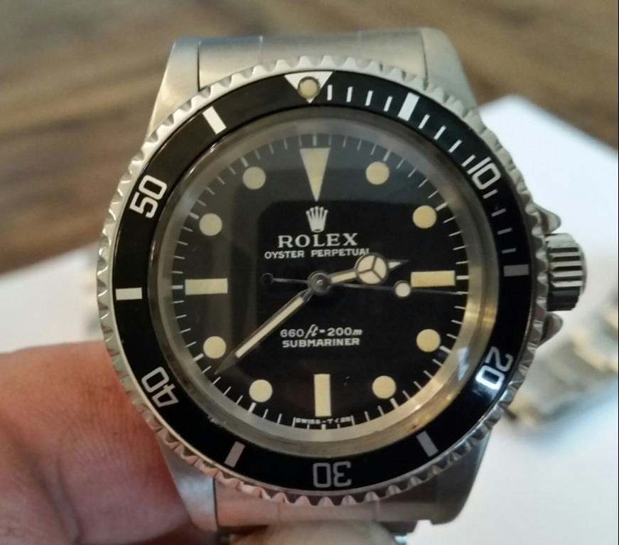
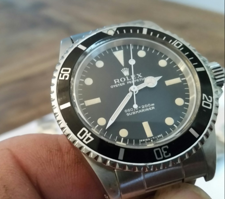
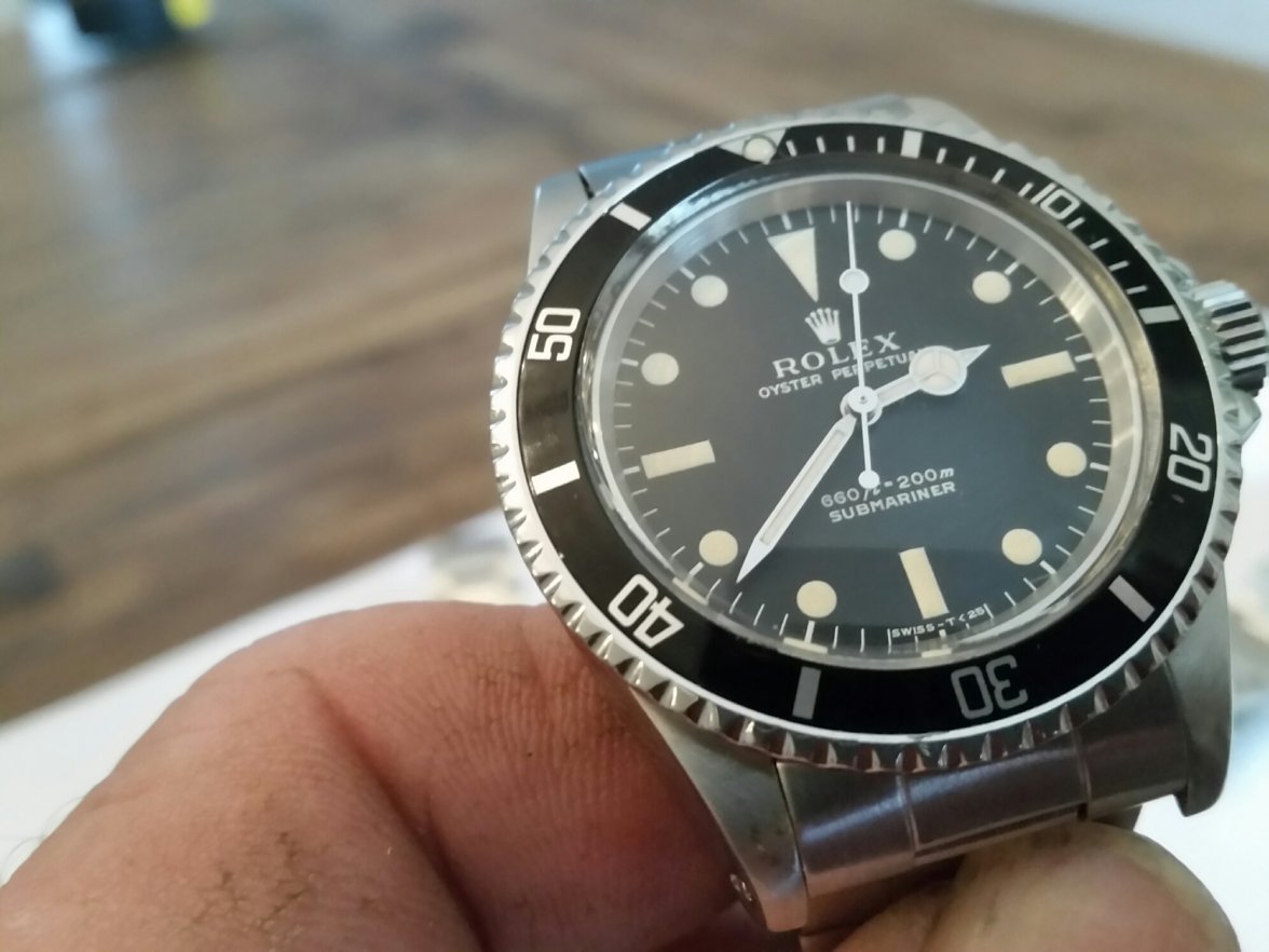
Next to Speedmasters, all roads seem to lead to Rolex (for me), and I have recently found myself browsing for vintage no-date Subs. I might have found an interesting one at what might be a reasonable price. Yet, looking at the pictures of this 1970s (2.57mil) 5513, something keeps bugging me about the dial.
It seems like the indexes show some serif, but the positioning of the P in Perpetual does not seem to align to the L in ROLEX as it does on some serif dial examples I have seen online and in real life before.
Some background: the bracelet certainly isn't original (ref. 93150) and neither is the bezel insert. The colour of the lume on the hands and dial seems to match pretty well.
What do you think, is the dial original?


