Forums Latest Members
  1. JohnSteed Nov 10, 2016

    Posts
    4,402
    Likes
    5,763
    :eek: What time capsule did you find :thumbsup: :thumbsup:
     
    khmt2 and yako54 like this.
  2. khmt2 Nov 13, 2016

    Posts
    1,627
    Likes
    14,499
    29x group shot

    20161113_152935~01.jpg
     
  3. JohnSteed Nov 13, 2016

    Posts
    4,402
    Likes
    5,763
    D. I. B. S. :whistling:
    :D
     
    khmt2 likes this.
  4. yako54 Nov 18, 2016

    Posts
    284
    Likes
    1,050
    That is a nice quartet! I recently also managed to lay my hands on a really nice Conquest ref. 9024 and thanks to the forum I also got the matching box :)
     
    20161109_225040.jpg 20161109_224915.jpg
  5. Greatpa Nov 18, 2016

    Posts
    481
    Likes
    944
    Beatiful! Wear it well @yako54 :thumbsup:
     
    yako54 likes this.
  6. DirtyDozen12 Thanks, mystery donor! Nov 18, 2016

    Posts
    2,686
    Likes
    4,618
    The following query is the result of a certain paranoia and a substantial lack of knowledge but I am curious. The printing on your ref. 9024 appears slightly thicker than on the one above. Is this normal? Nice crown by the way.
    conq.JPG
     
  7. Darlinboy Pratts! Will I B******S!!! Nov 18, 2016

    Posts
    8,736
    Likes
    69,169
    Donko1100, ARP488, Mark020 and 9 others like this.
  8. Hijak Nov 18, 2016

    Posts
    7,225
    Likes
    24,337
    Syrte and Darlinboy like this.
  9. khmt2 Nov 18, 2016

    Posts
    1,627
    Likes
    14,499
    Looks to me as within acceptable tolerance - even across my quartet the thickness of the printing varies slightly.
     
    BartH, JohnSteed and Jwit like this.
  10. DirtyDozen12 Thanks, mystery donor! Nov 18, 2016

    Posts
    2,686
    Likes
    4,618
    Thanks for the response. I appreciate your insight.
     
    khmt2 and Jwit like this.
  11. yako54 Nov 19, 2016

    Posts
    284
    Likes
    1,050
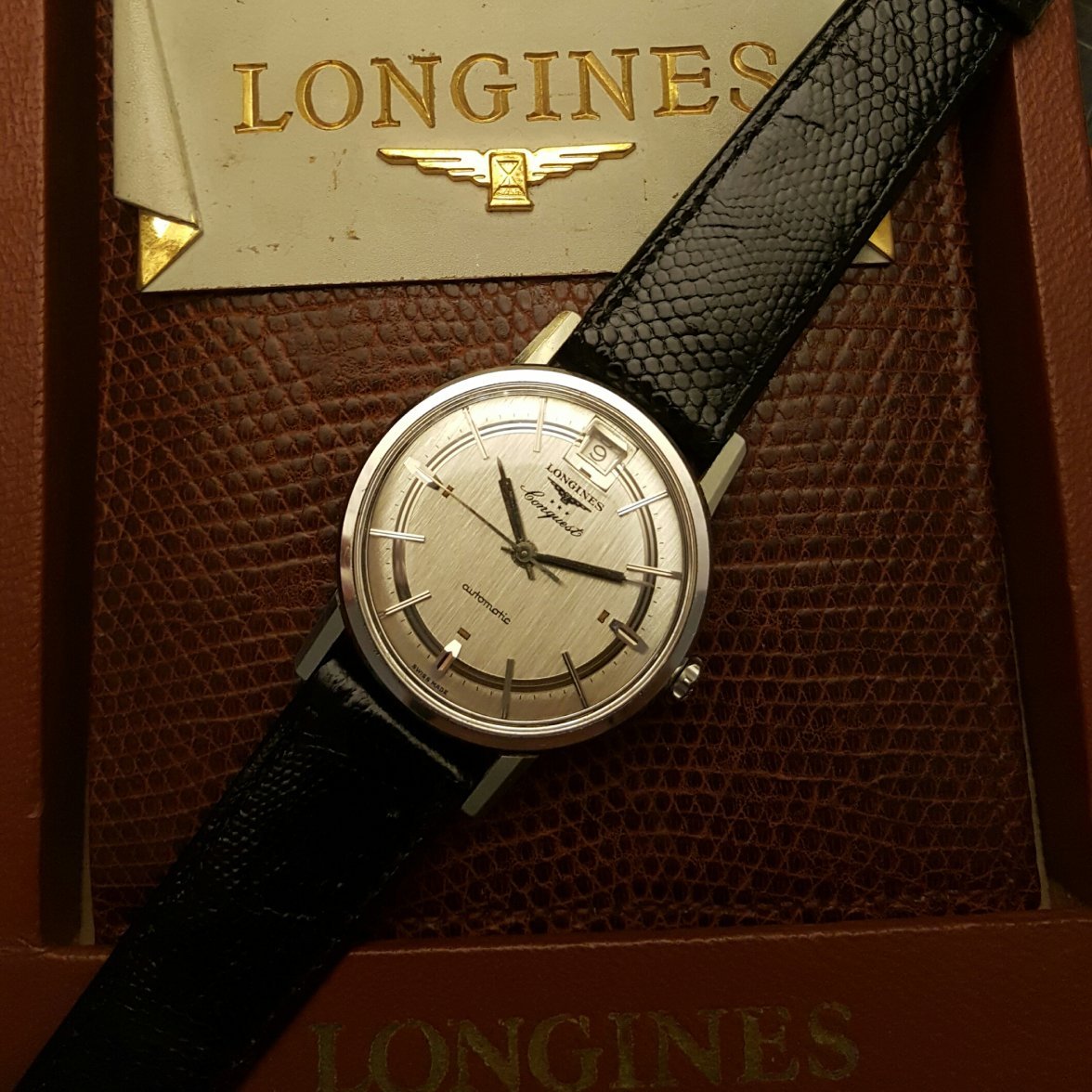
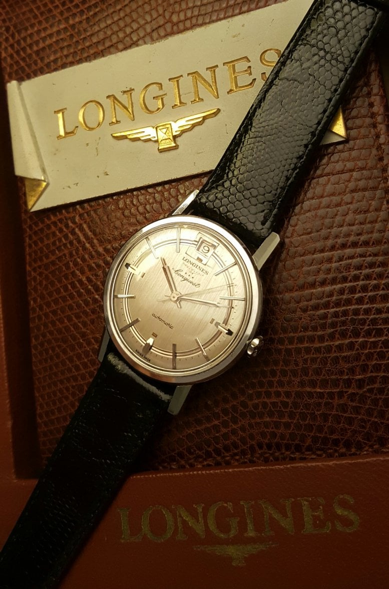
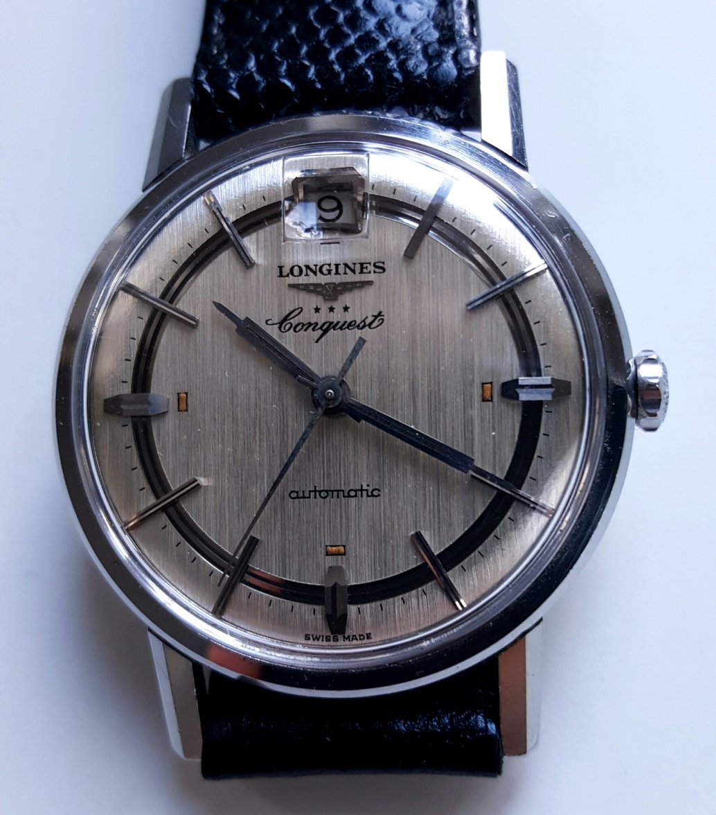
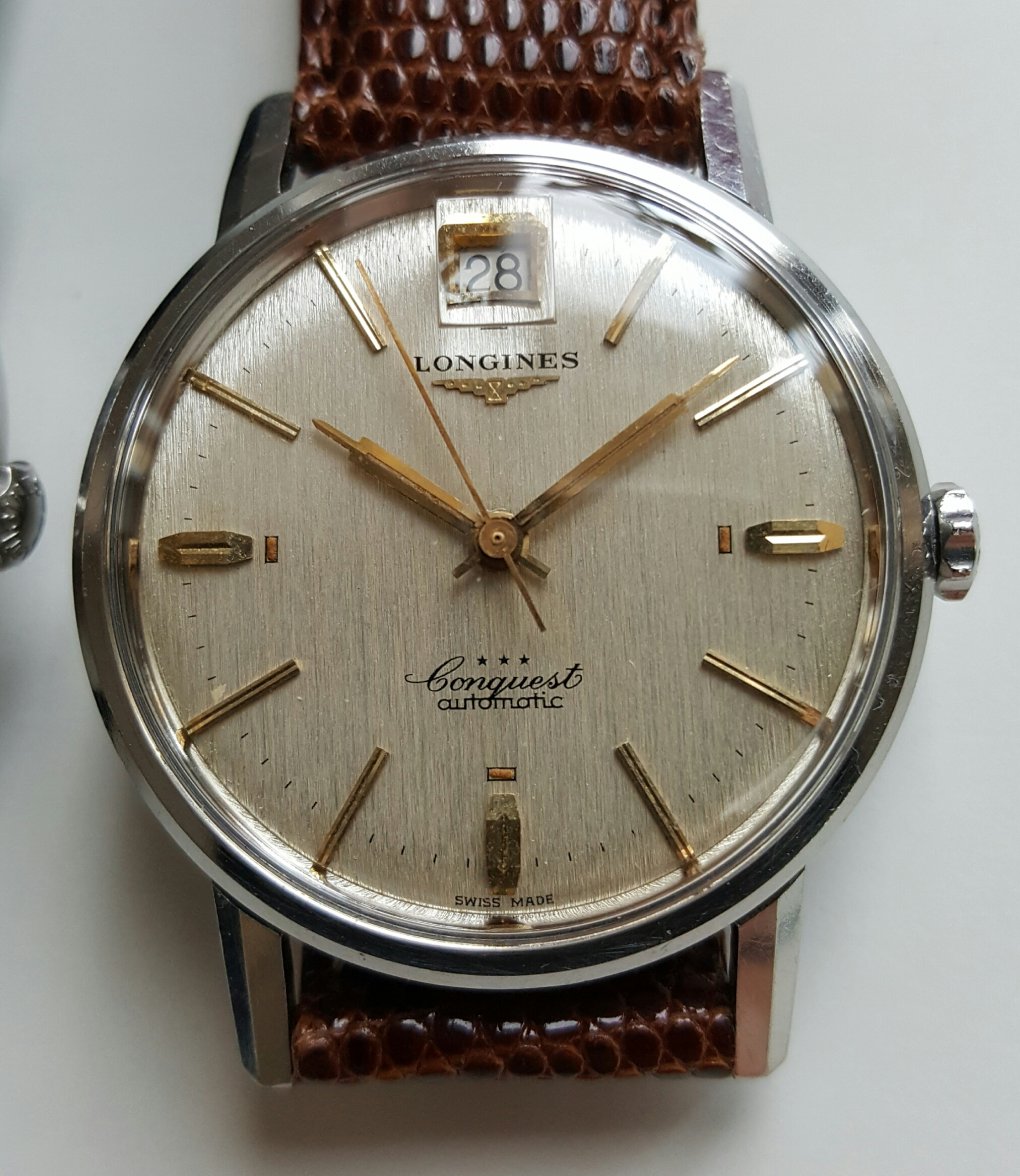
    Yes the printing thickness is varying slightly across these references. Another point is that I took the pictures with my mobile. Cropped at 100% they are always somewhat blurry which might increase the effect. I can also add a close-up of the dial later.
     
    DirtyDozen12 likes this.
  12. JohnSteed Nov 19, 2016

    Posts
    4,402
    Likes
    5,763
    Well @yako54 I think I'm gonna need a closer look. Send it to me and I'll ensure it's well taken care of in the inspection. Could take a little while to complete ... the um ... inspection

    :D
     
  13. yako54 Nov 19, 2016

    Posts
    284
    Likes
    1,050
    Hehe :D

    Attached two close-up pics. In direct comparison the printing on my silver 291 is clearly thicker than on the one with golden furniture. It is also not that crisp when you examine it with a loupe. I blame it on the "linen" dial structure. Longines printed their fonts under the varnish on these models as far as I know.
     
    20161119_114349.jpg 20161119_130601.jpg
    BartH, Andsan, Larry S and 3 others like this.
  14. Rman Nov 19, 2016

    Posts
    2,416
    Likes
    9,563
    Here's mine for comparison... Finer print
    Screen Shot 2016-11-19 at 7.11.52 AM.png
     
    JohnSteed and DirtyDozen12 like this.
  15. Hijak Nov 19, 2016

    Posts
    7,225
    Likes
    24,337
    another for comparison...
    Wrist Shot, 04.JPG
     
  16. JohnSteed Nov 19, 2016

    Posts
    4,402
    Likes
    5,763
    Sweet watches
     
  17. Mr.Cairo Nov 27, 2016

    Posts
    521
    Likes
    2,549
    :eek: some nice conquests up in here...!
     
  18. primabaleron Nov 29, 2016

    Posts
    430
    Likes
    5,463
    khmt2 and DirtyDozen12 like this.
  19. Mapearso Dec 9, 2016

    Posts
    183
    Likes
    326
    This here chronograph ...


    longines 2.jpg
     
    primabaleron likes this.
  20. aap Dec 19, 2016

    Posts
    3,065
    Likes
    23,658
    I'm assuming this has been posted here before, considering @ulackfocus and @dougiedude used to own this, but I'm wearing it today and realized I've never posted it here myself. I've owned this for almost a year now, but I still can't get enough of this Admiral. Aside from the arrowhead markers and sunburst silver dial, I also love the lines and triangle that help you set and tell the time.

    FullSizeRender.jpg
     
    Andsan, dougiedude, khmt2 and 3 others like this.