Paging insert experts
ATWG
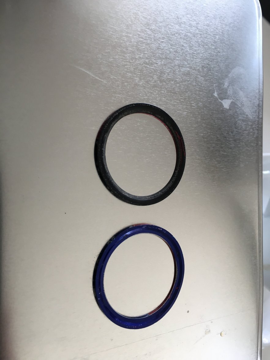
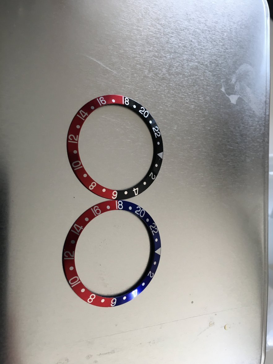
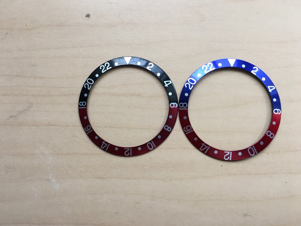
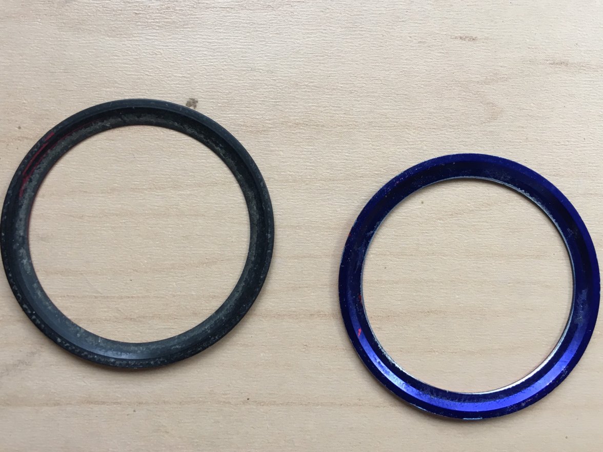
·Looks good to me, although the pics are taken at an odd angle that distorts the fonts. They have the groves on the back which confirms they’re the correct inserts for reference mentioned above. Additionally, the 2s and 4s both appear to be proper script
Good luck.
Good luck.
Faz
·Looks good to me, although the pics are taken at an odd angle that distorts the fonts. They have the groves on the back which confirms they’re the correct inserts for reference mentioned above. Additionally, the 2s and 4s both appear to be proper script
Good luck.
Cheers
Faz
Togri v. 2.0
··Wow! Custom title... coolIf you should want to sell the pepsi at one point let me know 😗😗😗
Faz
·77deluxe
·Authentic.
Faz
·I didn't have the original packaging...
Linesiders
··Stripers, not snook.They look OK - the one on the right is washed out by the light but what I see is OK
- Posts
- 25,980
- Likes
- 27,689
DirtyDozen12
·- Posts
- 25,980
- Likes
- 27,689


