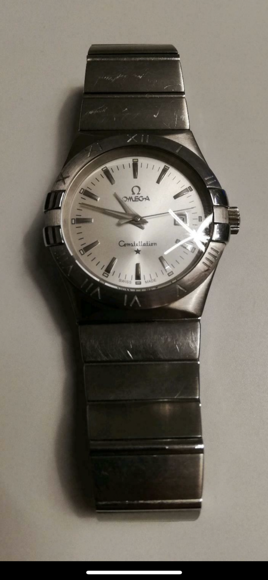
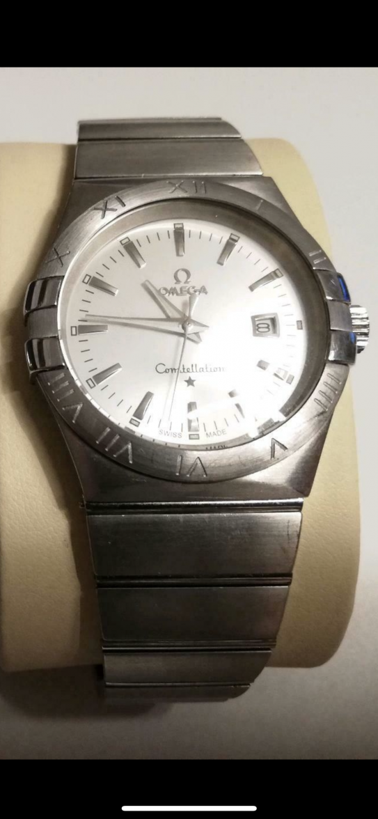
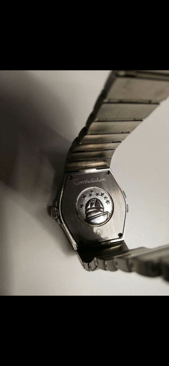
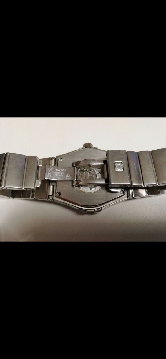
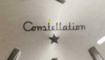
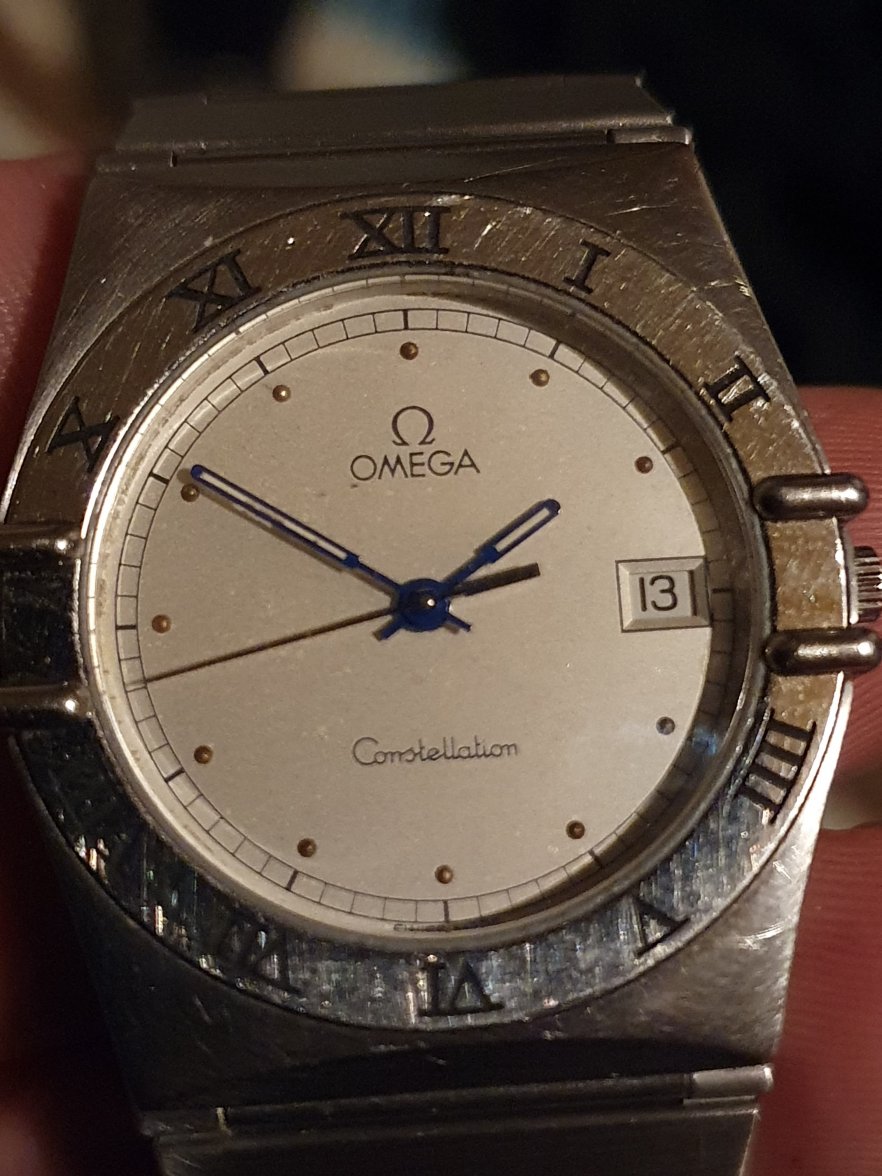
Can you find us a comparison photo? I agree the text looks a little thick and clumsy but I have handled an original of these and I am not convinced the font is wrong. I wouldn't dismiss that based on one slightly out of focus photo. Don't forget, this is not a 1960s model so all that knowledge doesn't really apply, these just aren't as nice as the classic models.