Omega Celebrates The Seamaster’s 75th Anniversary In Style With New Seamaster 300 And Diver...

Posts
1,540
Likes
5,575
Omega-Seamaster-300-M-75th-Anniversary-Ref-210.30.42.20.03.003-and-210.32.42.20.03.002-1.jpg
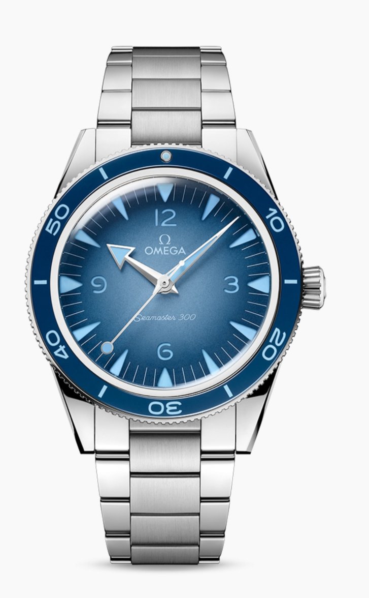
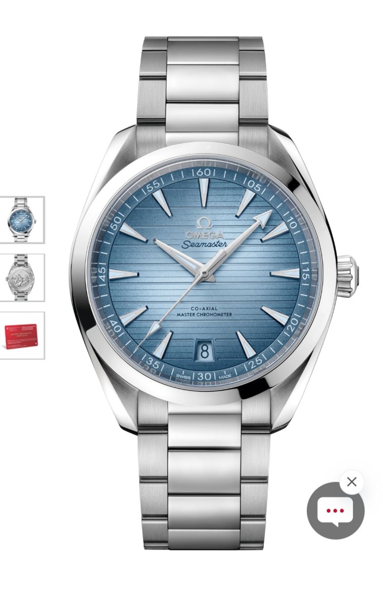
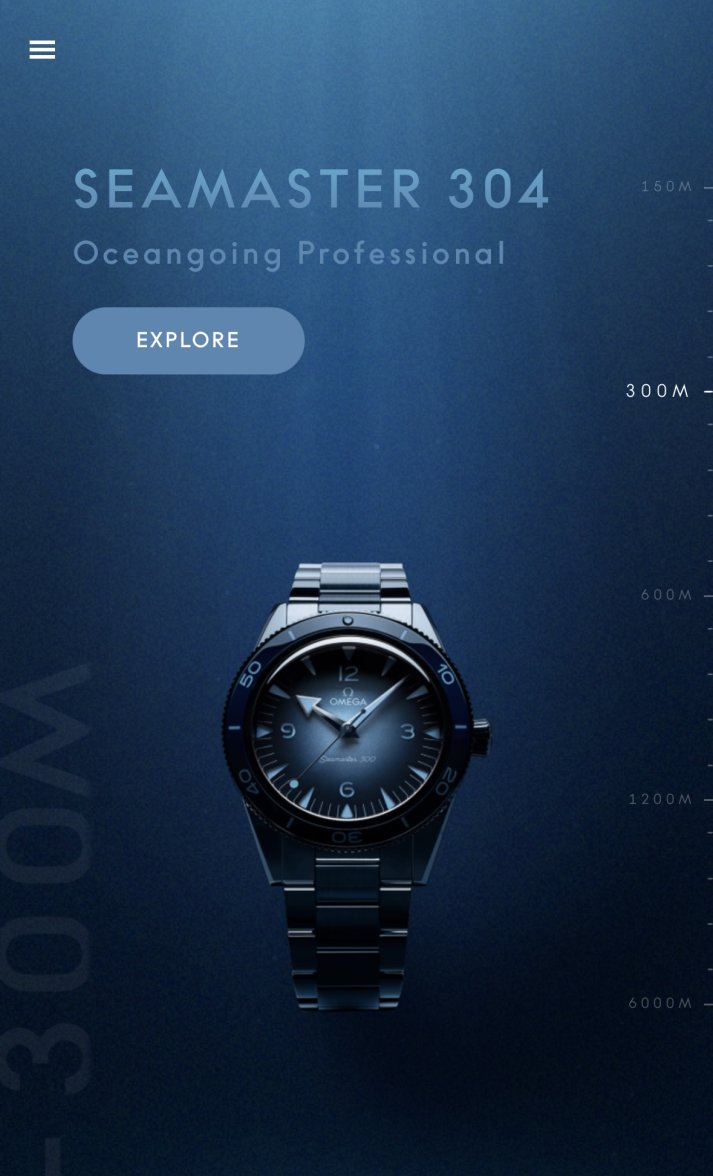
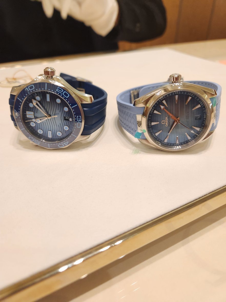
It’s the 75th anniversary of the Seamaster this year, and to celebrate, Omega is releasing 11 new Seamaster references. All of these watches feature beautiful “Summer Blue” dials that get increasingly darker depending on each model’s increased water resistance. It starts with a light blue dial for the Seamaster Aqua Terra models and goes to […]

Visit Omega Celebrates The Seamaster’s 75th Anniversary In Style With New Seamaster 300 And Diver 300M Editions to read the full article.
 
Posts
9,957
Likes
15,636
It starts with a light blue dial for the Seamaster Aqua Terra models and goes to […]

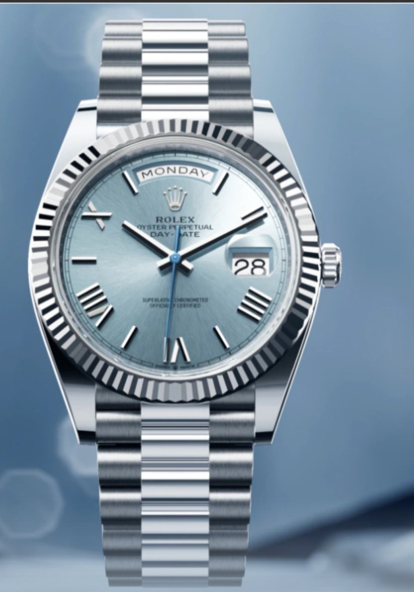
Copy the Tiffany dial Datejust much Omega? The rest are better and less derivative but none are exactly earth shattering. It is just a nicely presented set of graduated colourways across the entire SM range.
Edited:
 
Posts
2,748
Likes
12,685
I'm not sure how I feel about the printed logo and text on the diver. It just kind of hides, which I guess is the intent. Gives the dial a clean look and maintains the color gradation. But I just love the applied logo on the diver.
 
Posts
5,381
Likes
18,716
Copy the Tiffany dial Datejust much Omega? The rest are better and less derivative but none are exactly earth shattering. It is just a nicely presented set of graduated colourways across the entire SM range.

Even if derived from Rolex blue, the Omega blue is a bit less jarring, imho. Both are nice, but the Rolex seemed a little too 1970's baby blue, like a color you'd paint a new born's room. Nice, but a hint off.

This new Omega seems like the blue you'd repaint the room when the kid grows up a little. It works more (for me), at least based on pics. I'm sure it'll be different in real life, side by side. Still, if Omega was inspired by the Rolex, Omega did it better.

Not sure it's worth approximately an extra grand, though.

(Not the DJ)
 
Posts
4,833
Likes
31,660
I do like that the Ploprof is closer in size to the original. But I'm wondering how the blue lume looks in real life. Love the SM300 too. Hopefully the blue lume looks different in real life.
 
Posts
684
Likes
2,720
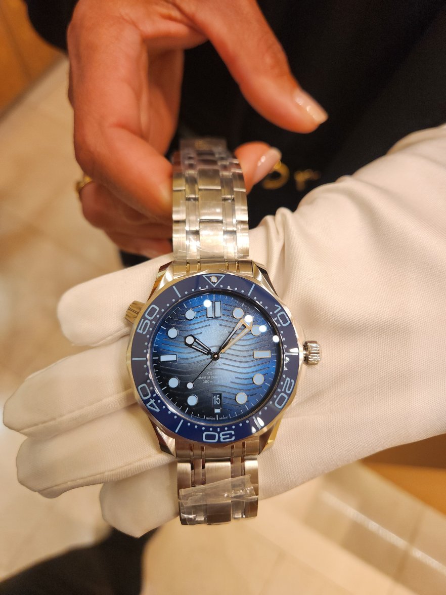
Just got back from my local OB. The display models arrived today and I put in the first order for the Diver 300 on the bracelet (not the 304, lol).

I went in for the Aqua Terra but I didn't like it at all. The color - especially on the rubber strap is too light and pastel. The color scheme makes it looks like a ladies' watch.

The engraving on the case back looks very nice.

I took a deep breath when they presented the pricing but went for it after they agreed to comp me the strap

 
Posts
5,381
Likes
18,716
Just got back from my local OB. The display models arrived today and I put in the first order for the Diver 300 on the bracelet (not the 304, lol).

I went in for the Aqua Terra but I didn't like it at all. The color - especially on the rubber strap is too light and pastel. The color scheme makes it looks like a ladies' watch.

The engraving on the case back looks very nice.

I took a deep breath when they presented the pricing but went for it after they agreed to comp me the strap


Congrats! Looking forward to wrist shots in WRUW.
 
Posts
684
Likes
2,720
Will do! Don't know how long it will take though. I was told it could be 2 weeks or 2 months, but I'll be getting the first one that arrives.

I opted for the current generation AT strap though
 
Posts
1
Likes
0
When I saw the originally leaked ad I really liked the look of the diver but the more pictures I see of it the less I like it. I think the dial is actually too light for my taste
 
Posts
3,192
Likes
6,410
Well, the pictures you share here are way more appealing than the pictures in the advertisements and online... can't wait to see more of it but it's likely not for me.

Just got back from my local OB. The display models arrived today and I put in the first order for the Diver 300 on the bracelet (not the 304, lol).

I went in for the Aqua Terra but I didn't like it at all. The color - especially on the rubber strap is too light and pastel. The color scheme makes it looks like a ladies' watch.

The engraving on the case back looks very nice.

I took a deep breath when they presented the pricing but went for it after they agreed to comp me the strap

 
Posts
206
Likes
169
Copy the Tiffany dial Datejust much Omega? The rest are better and less derivative but none are exactly earth shattering. It is just a nicely presented set of graduated colourways across the entire SM range.
not at all.
 
Posts
11
Likes
15
Copy the Tiffany dial Datejust much Omega? The rest are better and less derivative but none are exactly earth shattering. It is just a nicely presented set of graduated colourways across the entire SM range.
I forgot that Rolex owns the patent for blue dial watches. Oh wait... they don't ;-)
 
Posts
3,192
Likes
6,410
I do like that the Ploprof is closer in size to the original. But I'm wondering how the blue lume looks in real life. Love the SM300 too. Hopefully the blue lume looks different in real life.

@Taddyangle I had the same concern about the blue originally, but it really works and definitely doesn't impact visibility. I picked up an SMH in this color and it is just as legible as my first generation heritage. They suffer from the same visibility issues in terms of how small the markers are really early in the morning ( when a loom has totally worn off and there's almost no ambient light) but even a small amount of ambient light catches the rhodium hands and more than makes up for it. Any visibility issues that there are, under these specific circumstances, have nothing to do with the color of the indices.

I know it's different, about a couple of days in to owning this thing and I can say that the incredibly airy, light sky-blue markers and hands absolutely make this watch.