- Posts
- 550
- Likes
- 3,957
Plees
·Hi all,
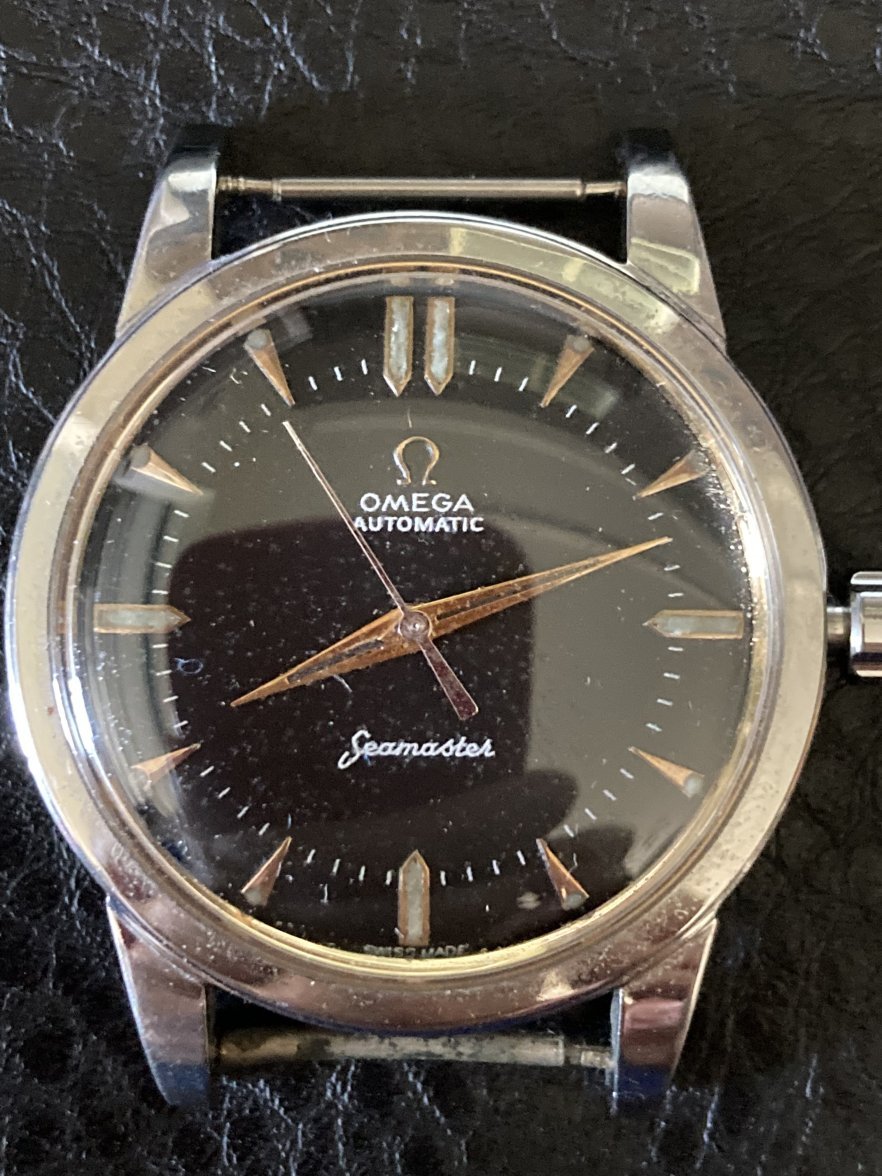
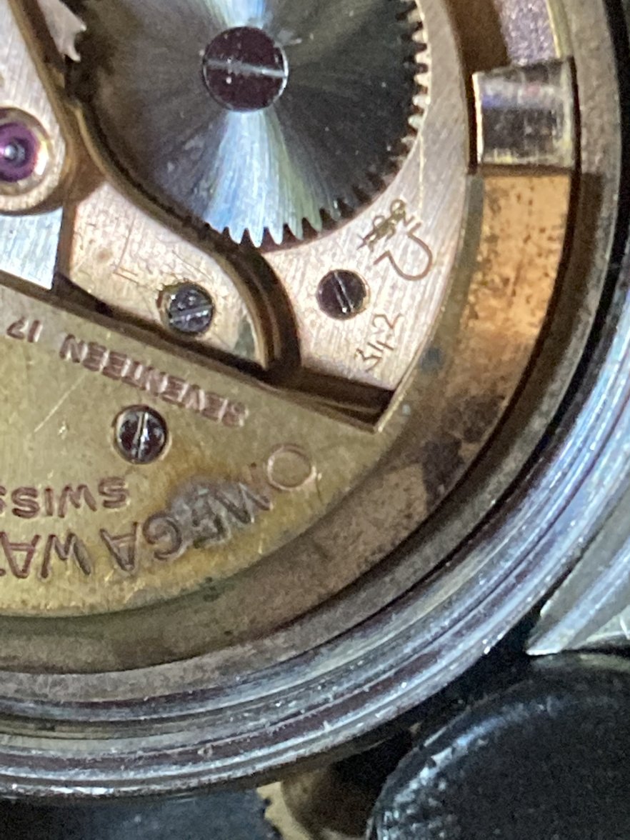
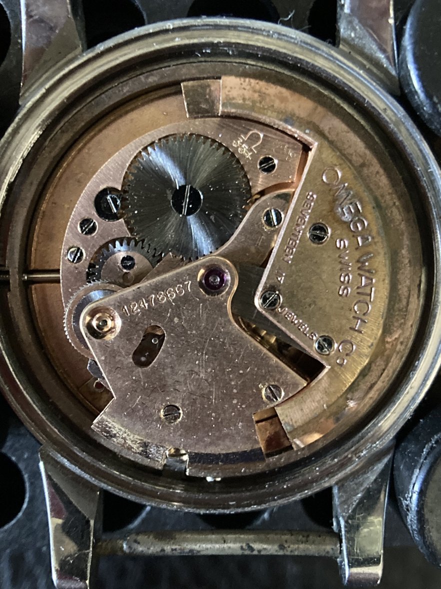
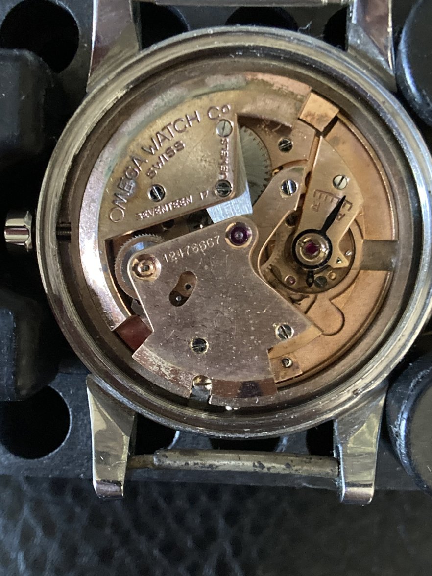
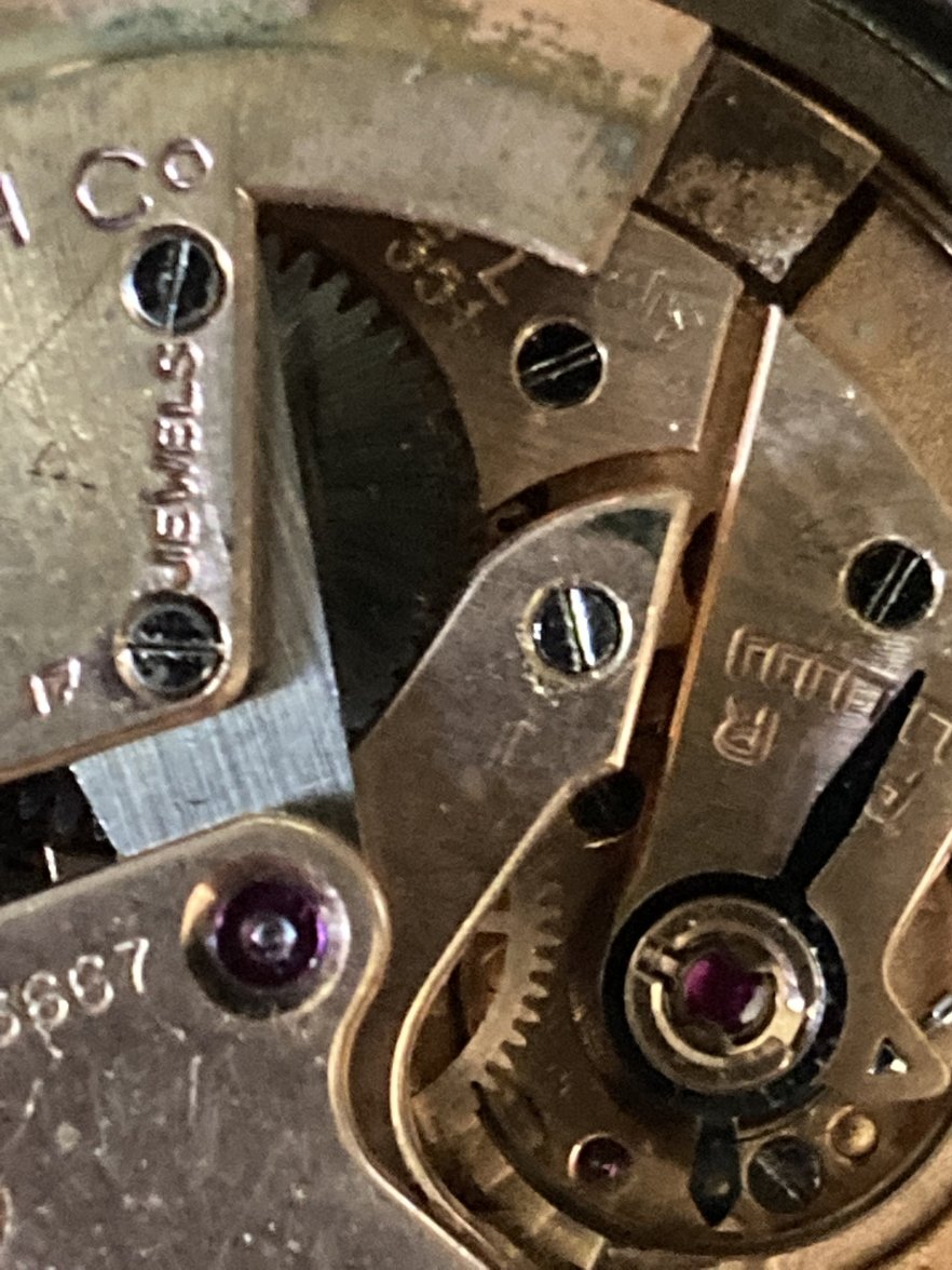
Recently I have bought above watch for parts. Most probably redial, the reason it was cheap") .
.
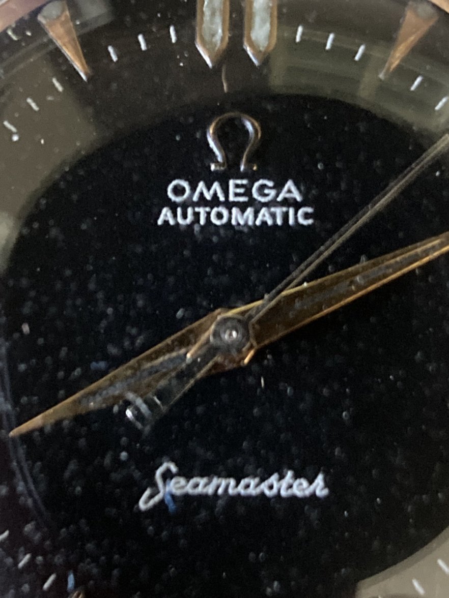
But still questions keep lingering. There are some oddities that I can’t explain. Like why the heck someone crossed out the original cal. nr. and replaced it with 342. It makes no sense to me. Also: the 12 markers are placed too wide apart?
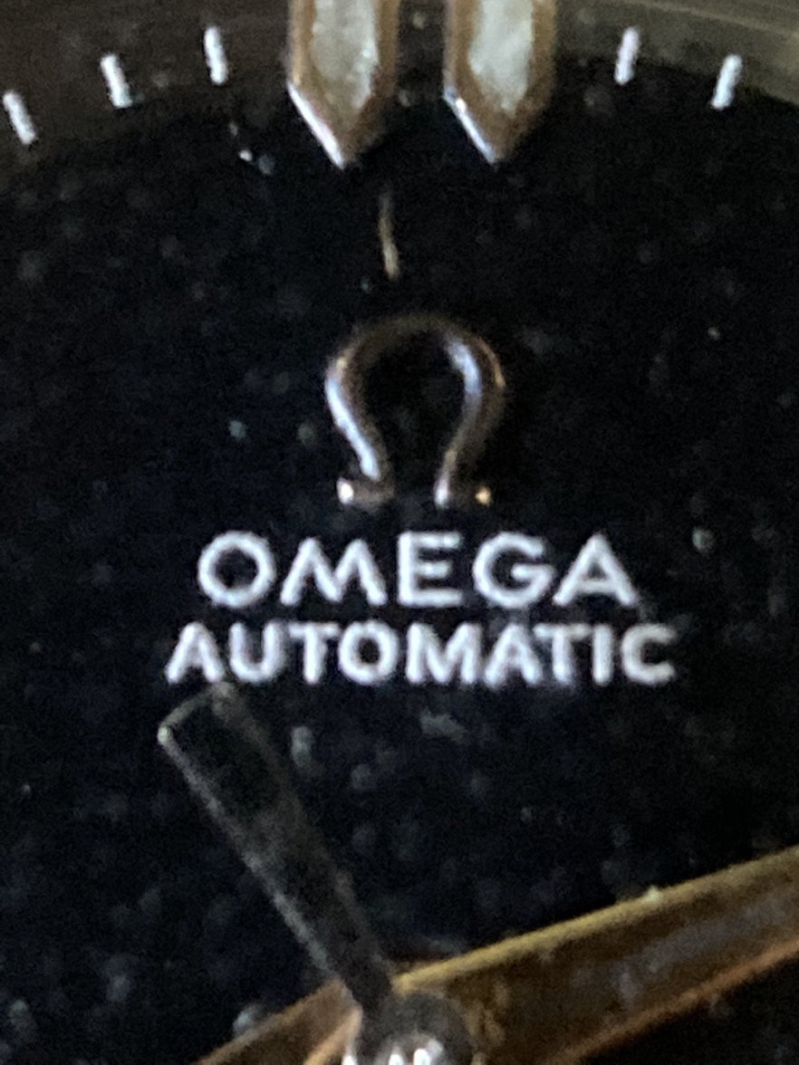
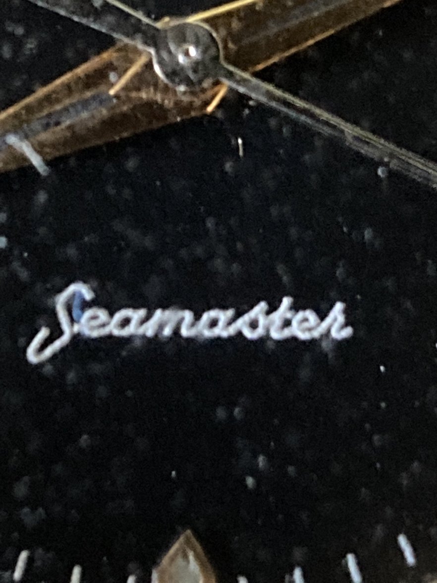
The script on the dial looks original but a little bit fat?
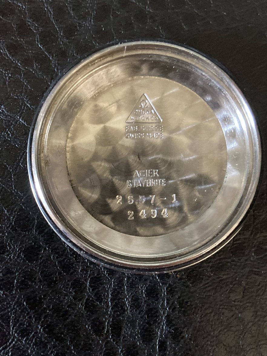
Why the double ref engraving in the caseback?
I’ve seen period dials with Swiss and Swiss made both appearing on the dial, but never somewhat straight?
Previous “watchmaker” also abused the movement I guess, considering the amount of scratches on the mainplate.
Anything else someone wants to add that I have overlooked? Thanks for joining in!
edit: title should have been 2657/2494
Recently I have bought above watch for parts. Most probably redial, the reason it was cheap
.But still questions keep lingering. There are some oddities that I can’t explain. Like why the heck someone crossed out the original cal. nr. and replaced it with 342. It makes no sense to me. Also: the 12 markers are placed too wide apart?
The script on the dial looks original but a little bit fat?
Why the double ref engraving in the caseback?
I’ve seen period dials with Swiss and Swiss made both appearing on the dial, but never somewhat straight?
Previous “watchmaker” also abused the movement I guess, considering the amount of scratches on the mainplate.
Anything else someone wants to add that I have overlooked? Thanks for joining in!
edit: title should have been 2657/2494
Edited:
")

