New Tudor Ranger
Bourne1984
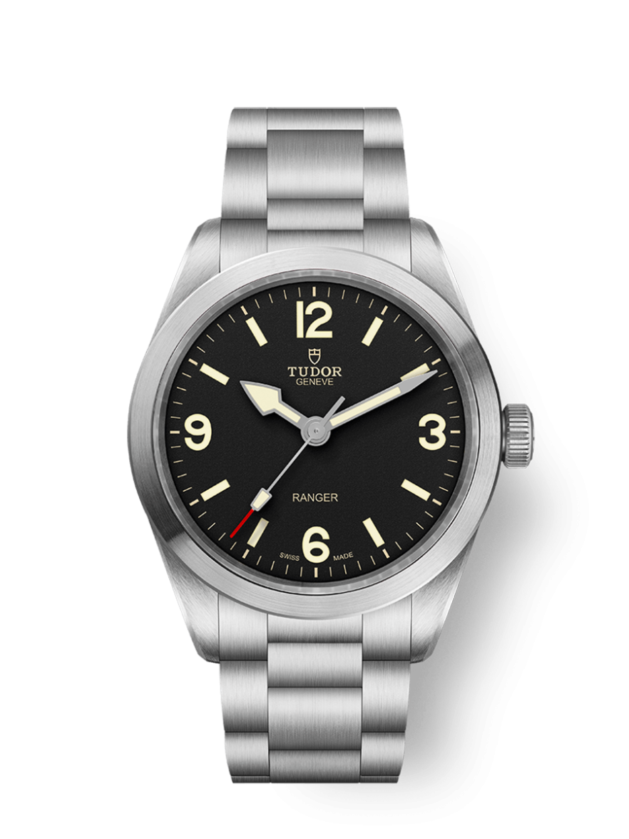
·I tried this on yesterday and it did nothing for me and I thought I would like it. The proportions felt of. Maybe if it was 36mm it might have appealed more. The dial also has in my opinion little dynamism in the metal which also surprised as some of the images show texture and a bit more interest.
RI Omega Fan
·I tried this on yesterday and it did nothing for me and I thought I would like it. The proportions felt of. Maybe if it was 36mm it might have appealed more. The dial also has in my opinion little dynamism in the metal which also surprised as some of the images show texture and a bit more interest.
Jockywilson1
·I think I like it, @Bourne1984 is it the same width as a bb58?
Bourne1984
·I think I like it, @Bourne1984 is it the same width as a bb58?
Jockywilson1
·Not sure about the black bay 58 proportions but this seemed a bit large. I should add that I own a DateJust 36 and for me smaller is always more attractive and I’m on the AD list for an op 34 which for me wven with a 7 1/4” wrist is a great size and my current collection ranges from 33 to 36.
stevec14
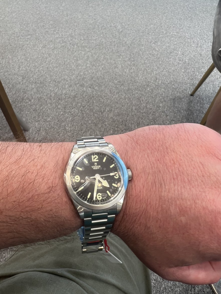
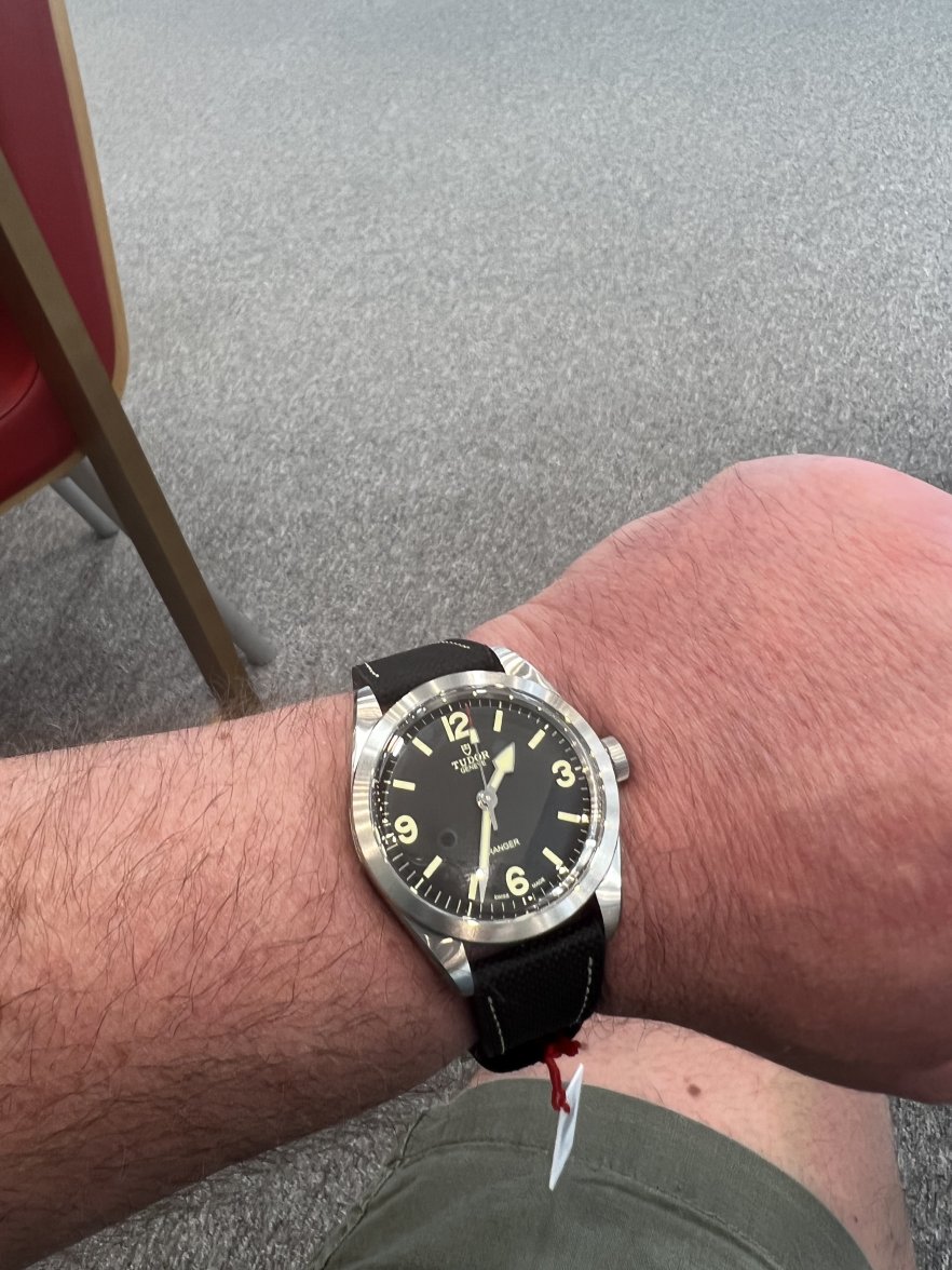
·I had it on at release time on Friday. I tried both the bracelet and hybrid version (the nato wasn’t available). I thought the size was fine, and overall there’s quite a lot to like about it if you are in the market for a no frills field type watch.
I’m on the fence personally, as I’m not sure when I’d wear it, but if this type of watch floats your boat then I don’t think it’s badly priced. My same AD had a longines spirit 37, which I also liked.
despite its 39 size, I didn’t feel like it wore particularly big - just right I’d say.
there are lots of plaudits for the bracelet and it looks nice, the clasp is good and it tapers niceley (along with no rivets). However I felt it was a tiny bit thick for the watch - I expected a rattle jangle bag of a bracelet. My preference was the hybrid, but I think it also looks terrific on the nato.
It has been confirmed that the bracelet fits the BB58 which may be good news for some.
Samp
·To me, the new Ranger feels like a perfect daily wearer for people who primarily enjoy and collect vintage tool watches.
I tried one on today. First Tudor I have considered buying. Was a bit hesitant regarding the size due to with my small wrists. The 1016 is one of my favorite watches, but perhaps not suitable for every occasion due to fragility.
In my opinion, the Ranger has a lot going for it. These are the points I like the most with the watch:
- the domed crystal
- lume not with white gold surrounds (this makes the current Explorer too blingy imo)
- lume colour is well weighed, light yellow hue but not extreme faux-tina. Reminds me of the colour of 1016 (and vintage Ranger) lume
- case is brushed (therefore not blingy)
- the size works even with my tiny (CA 16cm) wrists
- matte dial has a really nice texture, which appears primarily when sun hits the dial
- I like the case shape, not as bulky as the BB Pro
Edited:
- Posts
- 259
- Likes
- 364
petay993
·Tried it on last night, did nothing for me as expected, it's a superbly built watch that, unfortunately, looks like the sort of thing a 12 year old gets as their first "wristwatch"
Samp
·As a side note - it would be interesting to see it on a brown leather strap!
- Posts
- 259
- Likes
- 364
petay993
·It needs the (excellent) new Oyster to even work imho.
Dan S
·I think that watches with these very empty and spare dials don't always look very good when they are scaled up. That was exactly my problem when the Explorer was upsized from 36mm to 39mm. I like 39mm as a size in general, but not for that dial. Fortunately, I found someone who liked it and made a good trade. Unfortunately, I had already sold my 36mm Explorer, and I wish I hadn't.
Bourne1984
·I think that watches with these very empty and spare dials don't always look very good when they are scaled up. That was exactly my problem when the Explorer was upsized from 36mm to 39mm. I like 39mm as a size in general, but not for that dial. Fortunately, I found someone who liked it and made a good trade. Unfortunately, I had already sold my 36mm Explorer, and I wish I hadn't.
- Posts
- 42
- Likes
- 57
bitterspeak
·I agree. The empty space with the slightly undersized logo looks off. As previously mentioned I tried it on and it looks unbalanced to my eye.
Exactly, the "Logo/Tudor/Geneve" text group sits high on the dial in a very standard location. However, the single "Ranger" line sits very low and it gives you this vast empty space above "Ranger. The design feels awkward and visually unbalanced.
Rolex did a great job re-imagining and modernizing the Explorer I. This just seems like a lazy cash-grab from Tudor.
ALEJANDRO BOVONE
·i like it. but it feels a little victorinox all in all
Jockywilson1
·I think the criticism is a bit unfair. In fairness I haven’t seen it in the flesh but I like Tudor’s direction, first with the bb58, then the pro and now the ranger. It’s a re-imagining of classic designs (mostly Rolex) but keeping to the ethos of the original. Considerably less blingy than Rolex’s updates of the same model. Plus they are at an affordable price, long may it continue.
- Posts
- 42
- Likes
- 57
bitterspeak
·I think the criticism is a bit unfair. In fairness I haven’t seen it in the flesh but I like Tudor’s direction, first with the bb58, then the pro and now the ranger. It’s a re-imagining of classic designs (mostly Rolex) but keeping to the ethos of the original. Considerably less blingy than Rolex’s updates of the same model. Plus they are at an affordable price, long may it continue.
Tudor did a fantastic job with the BB58 and the BB Pro. But the Ranger is pretty much a reissue and replica of the 90200/220 with an awkward dial and a new case size. There is nothing imaginative about it.
Jockywilson1
·Tudor did a fantastic job with the BB58 and the BB Pro. But the Ranger is pretty much a reissue and replica of the 90200/220 with an awkward dial and a new case size. There is nothing imaginative about it.
Twocats
··Married... with childrenI read on another forum today where someone commented that the hour hand looks like a "Butt Plug" after googling it I can not un-see this feature.
Edited:
Similar threads
- Posts
- 0
- Views
- 1K
Tudor Pelagos FXD GMT Titanium - 42mm - 2542G267NU ( new / 2026 )
Location: US
FSOT
mdgrwl
Watches For Sale
$4995USD
- Posts
- 0
- Views
- 124
Tudor Black Bay Heritage 79220R - 41mm - Red ( excellent / 2015 )
Location: US
FSOT
mdgrwl
Watches For Sale
$2995USD
- Posts
- 2
- Views
- 93


