Forums Latest Members
  1. Riviera Paradise Jan 16, 2020

    Posts
    2,152
    Likes
    3,650
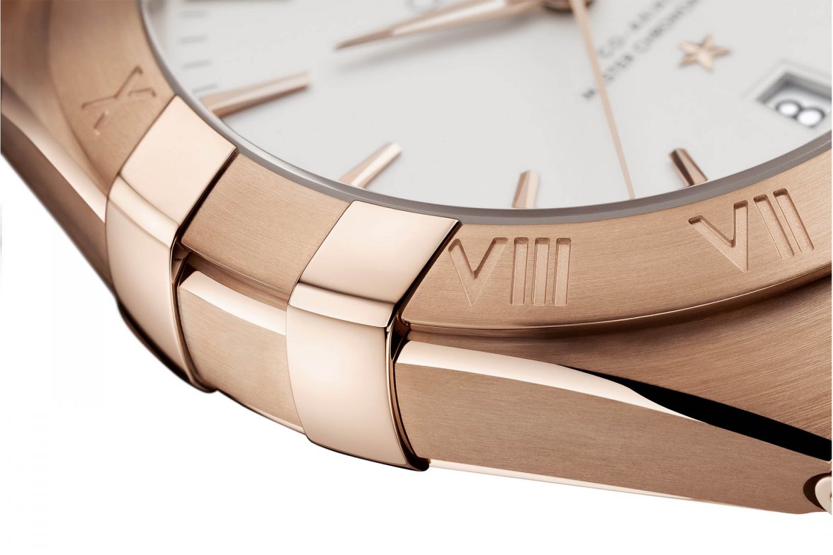
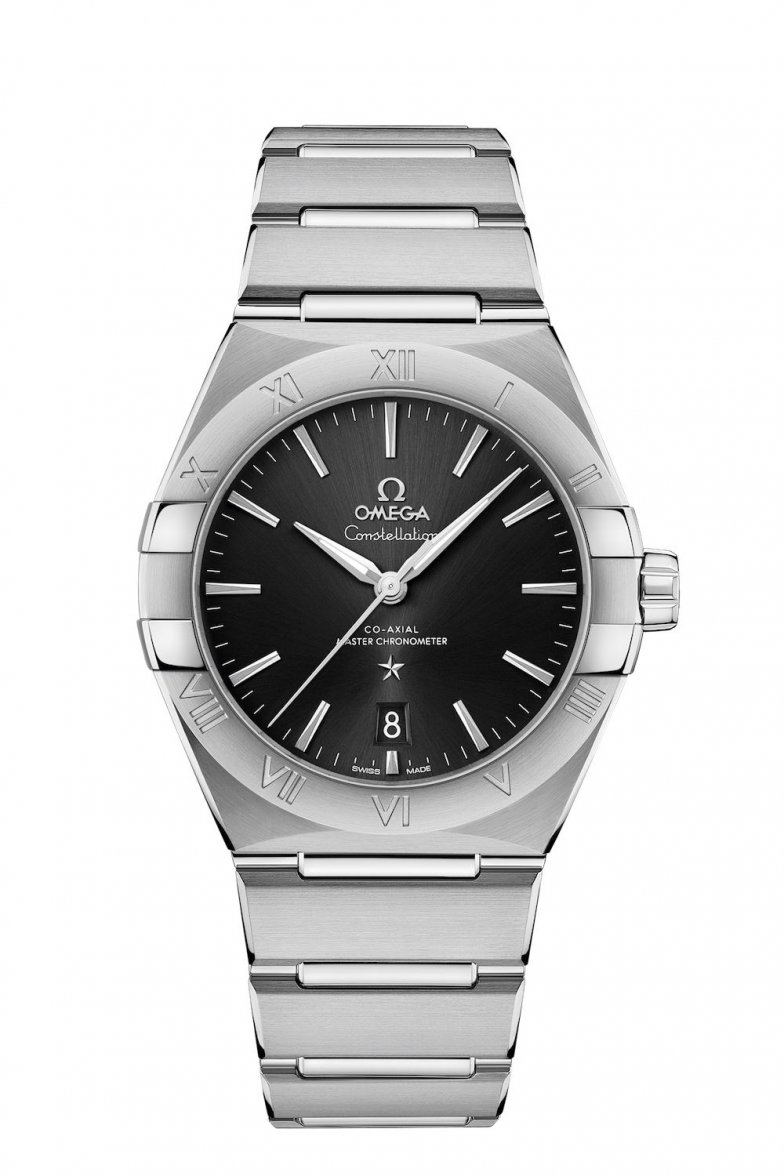
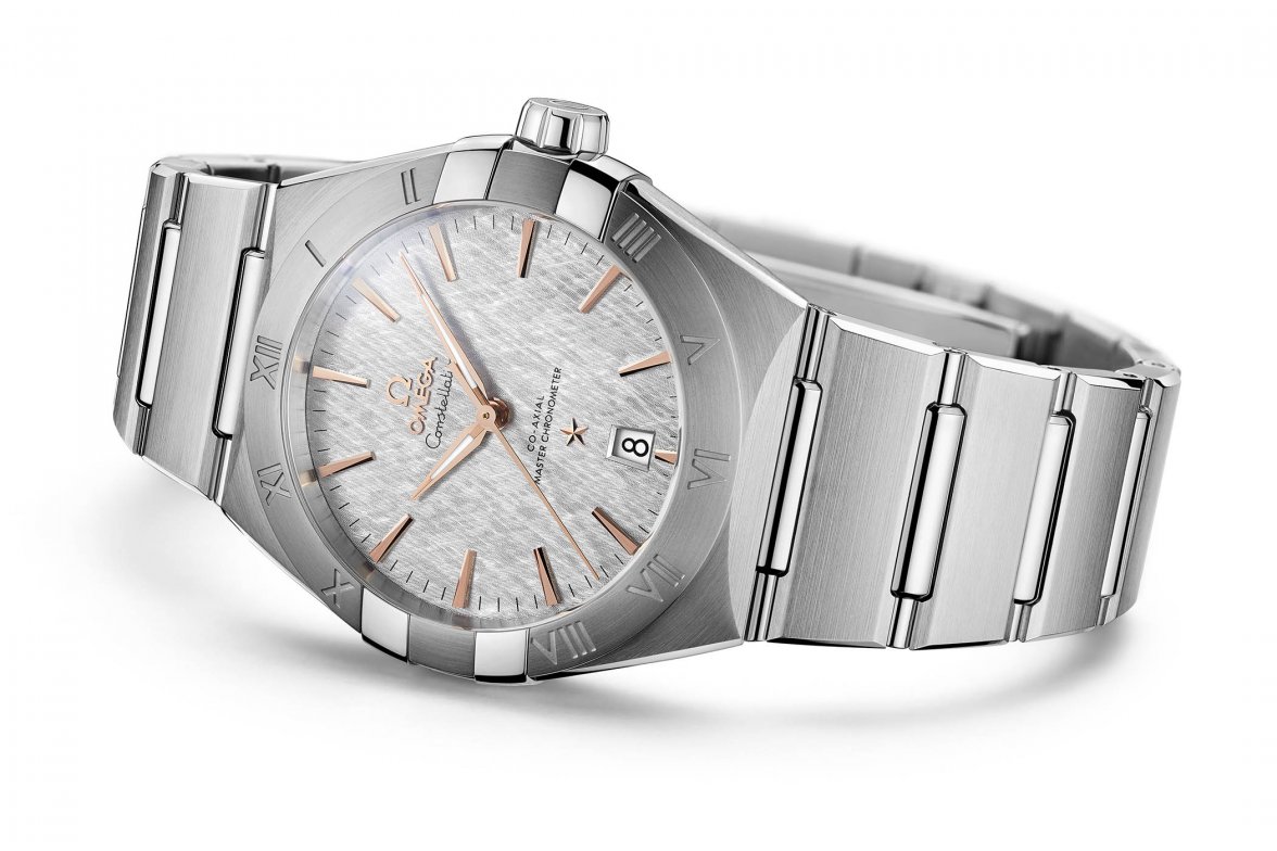
    Not sure I would consider buying a Constellation, but I certainly prefer these updates to the previous version. Design looks well balanced and case finishing looks quite nice.

    METAS movement and pricing for stainless steel + bracelet pretty competitive at EUR5.700.

    I think these will be a huge success with Omega's Chinese customer base.
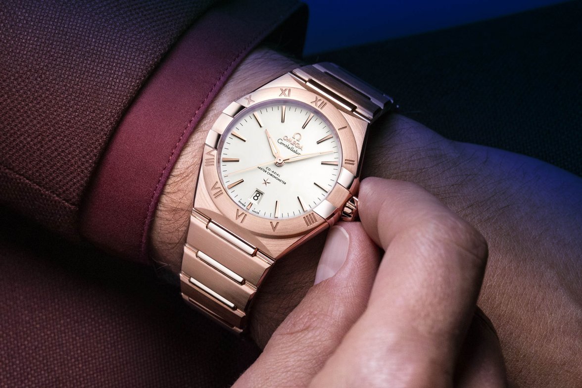
    2020-Omega-Constellation-Gents-Collection-39mm-4.jpg 2020-Omega-Constellation-Gents-Collection-39mm-3.jpg omega-constellation-13110392001001-1-product-zoom.jpeg 2020-Omega-Constellation-Gents-Collection-39mm-11.jpg
     
    Katana likes this.
  2. guwipa Jan 16, 2020

    Posts
    314
    Likes
    737
    For me the SednaGold one. Completely unaffordable to me but I love it so desparately ::love::::love::
     
    Riviera Paradise likes this.
  3. JeremyS Jan 16, 2020

    Posts
    135
    Likes
    142
    I appreciate the update to the clasp, but I kinda like the old ones more. The newer versions have an 8800 movement--which is a great movement. However, it has a lower power reserve and is also smaller than the 8500 movement. Moreover, despite fitting these new Constellations with a smaller movement, Omega put them in an even larger case.

    Conversely, the previous version had the larger 8500 series movements in a smaller case, which is a better fit. I think the thickness is pretty close to the same in both watches. Moreover, the water resistance inexplicably dropped from 100m to 50m in the new version. So, lower specs almost all the way around, with a slightly higher price tag.

    I like the balance with the date at 6, however.
     
    Edited Jan 17, 2020
    Wetworks and Riviera Paradise like this.
  4. avidmark Jan 16, 2020

    Posts
    233
    Likes
    224
    Very nice looking watch. Probably often over looked.
    However the block sections at the 3 and 9 o'clock don't appeal to my tastes
     
  5. Wetworks Jan 16, 2020

    Posts
    996
    Likes
    1,789
    The Manhattan Connies have grown on me over time, but I just can't move past the Roman numeral bezels. Otherwise, I think these look terrific
     
    TimeODanaos and Donn Chambers like this.
  6. ama98 Jan 16, 2020

    Posts
    430
    Likes
    385
    Steel on steel looks great...
     
  7. Kippax Jan 17, 2020

    Posts
    33
    Likes
    36
    Like that
     
  8. Donn Chambers Jan 17, 2020

    Posts
    2,244
    Likes
    3,043
    Agree 100%. If they’d just remove those numerals, it would look so much nicer.
     
    TimeODanaos and Wetworks like this.
  9. dinexus Jan 17, 2020

    Posts
    662
    Likes
    1,176
    These are rad, but I'd go for a Globemaster first.
     
    TimeODanaos and Katana like this.
  10. Katana Jan 17, 2020

    Posts
    164
    Likes
    273
    I agree that these would do great in the Chinese market. There this 1990's? elegance about them that seems to really appeal to Chinese tastes. My sister-in-law, whose Chinese, own an older version with a similar aesthetic, and I've seen a lot of them in the flesh around Hong Kong.

    The Sedna gold one seems to really make the most of the aesthetic for me. Though I've always loved the Globemaster (I'm biased being an owner) I've come to really appreciate Omega's dress watch models.

    When it comes to constellations however, like dinexus, the Globemaster comes first for me.
     
  11. osc Jan 20, 2020

    Posts
    64
    Likes
    39
    +1, prefer without the Roman numerals for a cleaner look.
     
  12. janice&fred Jan 20, 2020

    Posts
    4,593
    Likes
    10,441
    I believe the case and bracelet design, roman numerals and bezel side ribbings are part of the art-deco "Manhattan" look Omega was shooting for when these things first came out. the watches do have that sort of appeal when taken in their entirety.
     
  13. Wetworks Jan 21, 2020

    Posts
    996
    Likes
    1,789
    I adore Art Deco design, and I definitely do see it in the watch, but not with the Roman numerals. In my experience, the numbers used in AD design are typically stylized Arabic like below, something that would also be a turnoff for me if it radiated the bezel. For me, it's the numbering itself that kills it. I feel (to a lesser degree) similar about the AT numbering on the dial as I feel it takes away from the dial without having a real purpose. Again, JMO.

    [​IMG]
     
    scapa likes this.
  14. Mauzer Jan 21, 2020

    Posts
    195
    Likes
    1,105
    That’s exactly what I thought. Though these models are nice, I really love the globe master!
     
    Longbow likes this.
  15. ckamp Jan 21, 2020

    Posts
    67
    Likes
    108
    I wish the globemaster said "constellation" on the dial instead of "globemaster"
     
    EauTerre and TimeODanaos like this.
  16. TimeODanaos Jan 21, 2020

    Posts
    1,566
    Likes
    3,221
    Chacun à son goût always of course. But...
    [Bienne, morning]
    "Let's have Roman numerals on the bezel."
    "OK - but some people want baton markers."
    "Sure, those too. The first Manhattans put them on the bezel."
    "Put the batons on the dial and the Romans on the bezel, and you got a deal."
    "Wait, guys, you said we could have the claws."
    "There's still room - put 'em on!"
    Two out of three, and you have style. If one of the elements is the claws, you have a distinctive look, copyright Omega. But the whole shebang ("no-one said diamonds yet, where do I put 'em?"), and you have, frankly, a messy smorgasbord of Omega visual cues put together by the marketing department.
    [Bienne, some time later]
    "This Globemaster's awesome - why don't we do something like that?"
    And so on...
    :D
     
    Edited Jan 21, 2020
    Wetworks likes this.
  17. osc Jan 21, 2020

    Posts
    64
    Likes
    39
    Funny that's usually how "product design" goes ::facepalm2::
     
    TimeODanaos likes this.