Greetings, so I heard back from Longines on this discussion. A fellow Longines enthusiast had put me in touch with their chief historian, Stéphanie Lachat, and I had asked her if there had been a sans-serif font used
on dials for the American market.
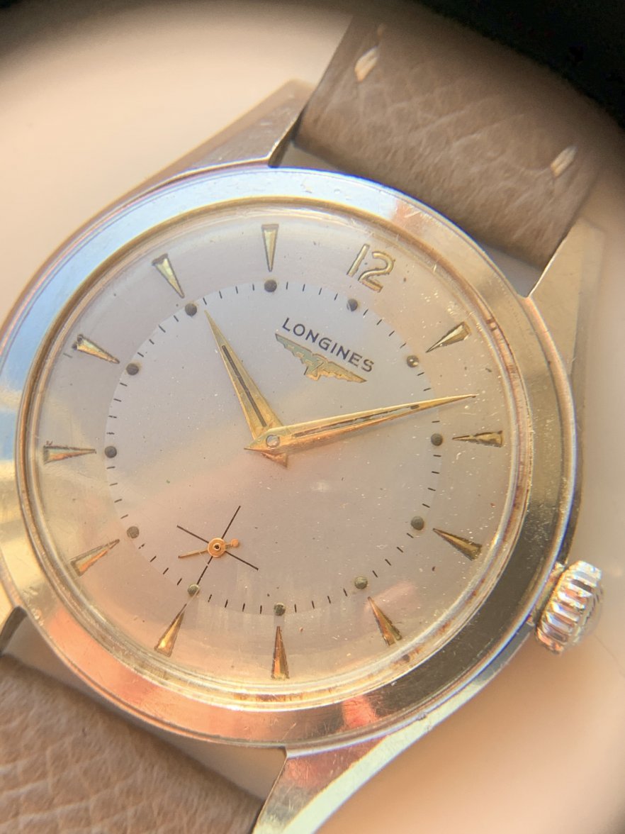
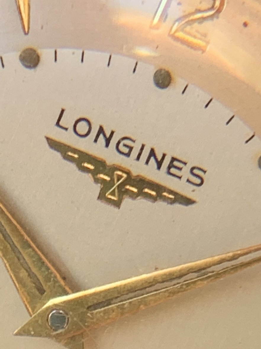
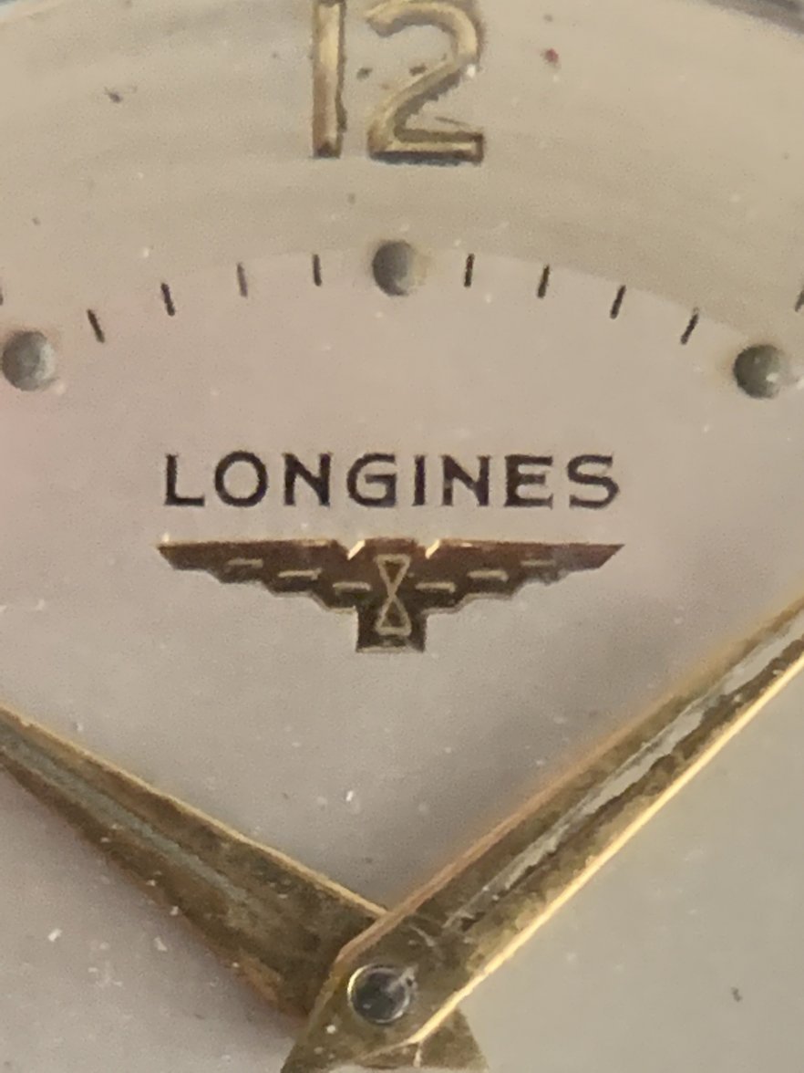
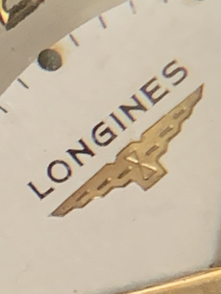
We had a couple backs and forths about it, and the short answer confirms what Tony C. was essentially saying: the sans serif font comes from the 1940 Longines logo as it was registered with "WIPO" (World Intellectual Property Organization) - "OMPI" in French (Organisation Mondiale de la Propriété Intellectuelle).
What's interesting is that Ms. Lachat said the logo was then used on "
ALL Longines watches" - without a specific distinction for the US market.
I then asked her whether one must assume their apparently high number on the US market simply means that new watches during those war years were predominantly marketed on the US market. I also asked her, how come one finds so many dials with serifs on so many watches throughout the 1940s. Her answer is in her latest email below.
I'm including both - French original with my translation.
However I'm not sure how to do a screen grab of the page - so the formatting got lost in the shuffle.
I've edited out a couple of sentences on an off point subject -- and the emphasis added is mine.
Sujet :RE: Re : Typographie logo Longrines
De :Lachat, Stéphanie
A :XXX
Cc:Cattin, Marion
Date :Je, 25 Aoû 2016 17:13
Chère Madame,
La typographie sans sérifs que vous évoquez est celle du logo Longines tel qu’il est enregistré auprès de l’Organisation mondiale de la propriété intellectuelle (OMPI) en 1940. Elle est alors utilisée sur toutes les montres Longines, sans spécificité pour le marché américain.
Je vous envoie par message séparé un historique de notre logo.
Avec mes meilleurs messages,
Stéphanie Lachat
International Brand Heritage Manager

Compagnie des Montres Longines Francillon SA
rue des Noyettes 8, Case postale 298
CH-2610 Saint-Imier, Switzerland
Phone +41 32 942 54 xx - Fax +41 32 942 52 39
Join us on
Facebook,
Twitter,
YouTube
TRANSLATION /The sans serif font you are evoking is that of the Longines logo as it is registered with the World International Property Organization in 1940. It is then used on all Longines watches, without a specificity for the American market.
I am sending via separate message a history of our logo.
Best regards, xxx
RE: Typographies Longines
De : Lachat, Stéphanie
Cc:Cattin, Marion
A : XXX
Date : Ve, 2 Sep 2016 10:43
Chère Madame,
Effectivement, comme vous le suggérez, l'adoption du logo de 1940 "sans serifs" ne s'est pas répercutée immédiatement sur toutes les montres. On peut raisonnablement penser que des cadrans en stock avec l’ancien logo sont écoulés même après l’adoption du nouveau logo.
Vous avez pu constater que le logo de 1940 "sans serifs" se retrouve aux Etats Unis, sur des montres produites pour l'exportation. A cette heure, nous n’avons pas pu trouver dans nos archives d’indication sur un usage du logo sans sérifs qui serait limité aux marché américain. Par contre, il est vrai que les Etats-Unis constituent le marché dominant de la marque à partir de la fin des années 1930 et durant toutes les années 1940 qui nous intéressent ici en particulier.
Avec mes cordiaux messages,
Stéphanie
Stéphanie Lachat
International Brand Heritage Manager

Compagnie des Montres Longines Francillon SA
rue des Noyettes 8, Case postale 298
CH-2610 Saint-Imier, Switzerland
Phone +41 32 942 54 xx - Fax +41 32 942 52 39
Join us on
Facebook,
Twitter,
YouTube
TRANSLATION/
Dear Madam, indeed, as you suggest, the adoption of the 1940 "sans serif" logo was not immediately carried over on all watches.
One can reasonably think that existing dial stocks with the older logo were put to use even after the adoption of the new logo.
You have observed that the 1940 "sans serif" logo can be found in the United States on watches produced for export.
At this time, we have not been able to find in our archives any indication relating to the sans serif logo being used in a way restricted to the US market. However, it is true that the US market constitutes the dominant market of the brand starting at the end of the 1930s and throughout the 1940s we are more specifically considering here.
Best regards,
XXX
Ms. Lachat sent me a logo history consistent with the one
@Tony C. posted (not sure how to post a "tif" file).
What's interesting is that it suggests the 1940 logo registration with WIPO is still active.
This is consistent with the fact it can be found on more recent watches.
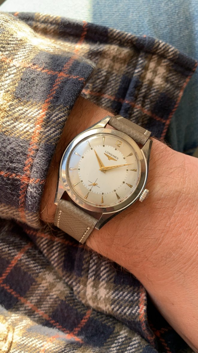
For example in Goldberger there's a gold-filled chronograph with 1940 logo which was produced in 1952.
(it looks exactly like the one
@DirtyDozen12 posted above).
I'm assuming some of those later watches again may have been made from previous dial stocks.
Edit / add - I did not query her to explain the differences
@DirtyDozen12 has observed between the dial font and the 1940 company logo. I guess there may just be slight differences between the registered logo and its execution on dials -- and that what's dispositive for dials, obviously, is the logo's appearance on correct dials.