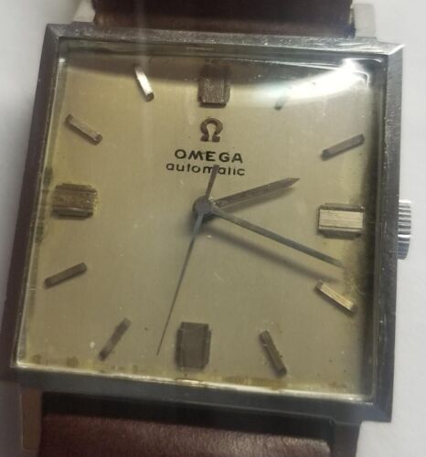
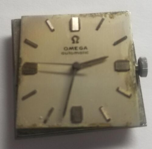
I feel kind of embarrassed that you guys could tell so quickly off of something like the print and I'm so new I couldn't. If you don't mind, I'll take a stab in the dark and one of the things you noticed was the thickness of the print and lower-case a in "automatic"?