- Posts
- 484
- Likes
- 810
smorrisonmd
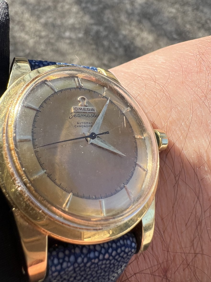
·and a plank dial Seamster Chronometer qualifies. I think this was pretty well done, but would appreciate comments from the experts and also about the 1,5,7, and 11 markers.

Please consider donating to help offset our high running costs.
and a plank dial Seamster Chronometer qualifies. I think this was pretty well done, but would appreciate comments from the experts and also about the 1,5,7, and 11 markers.
Perhaps exaggerated due to not being a head on shot…. But is anyone else bothered by the omega symbol not being centered on the vertical line?
I am with you when it comes to redone dials. I also try to avoid them but accept them on rare models or with very uncommon dial designs.
But we must accept that most collectors frown upon redone dials and that a reprinted dial ruins the collectability and value of the watch.
However an interesting dial design (even when restored) can give a lot of pleasure when worn on a watch as a daily companion. I understand why you like this particular dial.
But what I would correct asap:
The misaligned marker at 3 can be set straight - it stands out like a sore thumb
And the hands should be replaced because
1) the seconds hand is way too short
2) the minute hand is also a tad short and it looks as if it missed the facets - at least in the photo it looks flat.
3) the hour hand has lost some of it´s plating at the tip or it is heavy corrosion...
Source a nice play of hands and you have a watch you can enjoy despite of the restored dial.
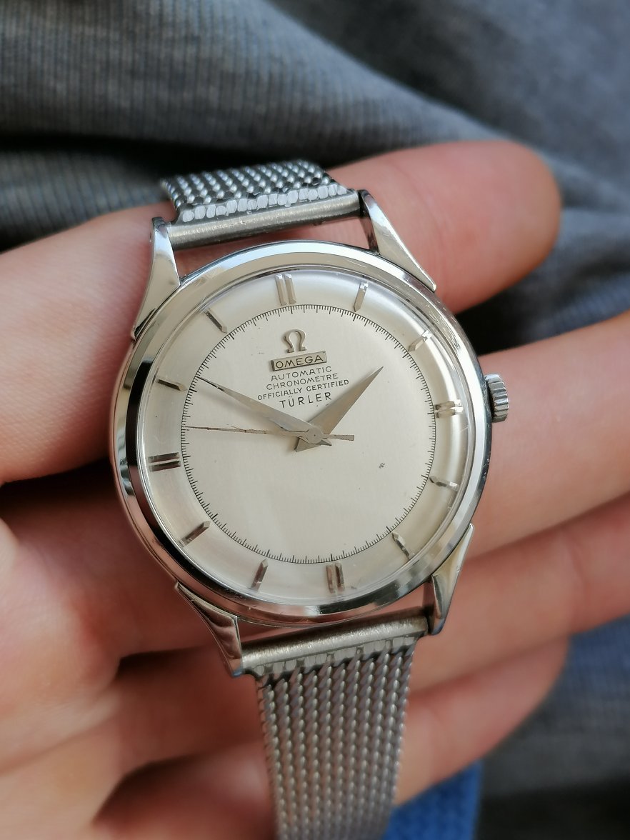
Not loving this one. It almost certainly wasn’t black to start. Fonts are not close. The issue with the “T’s” has been mentioned. I think the dial markers are OK. Norman Morris did some very strange stuff here in the USA.
If the watch was super cheap, then OK. It’s a pretty rare variation. Otherwise, I’d run the other way from this one.
gatorcpa