Help with Omega Constellation find

Posts
30
Likes
5
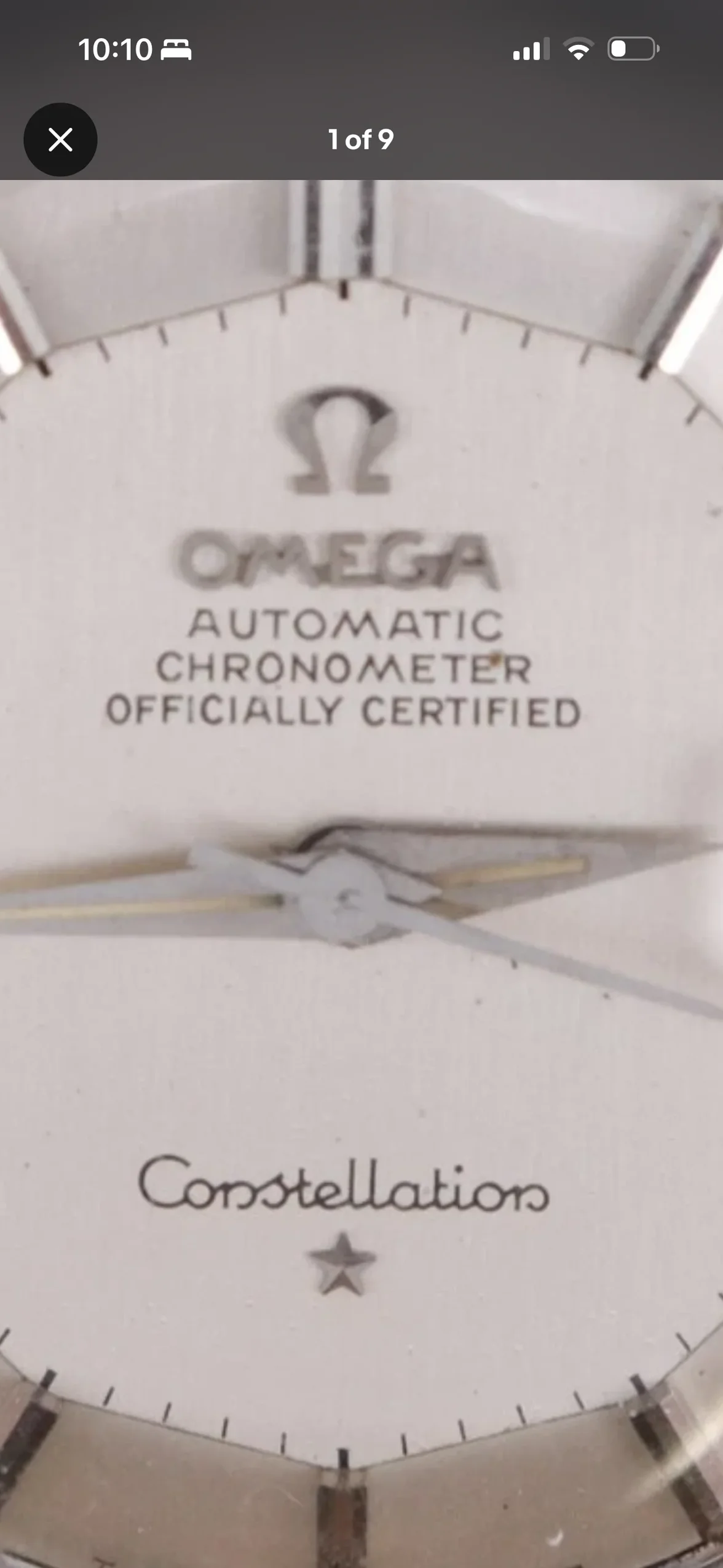
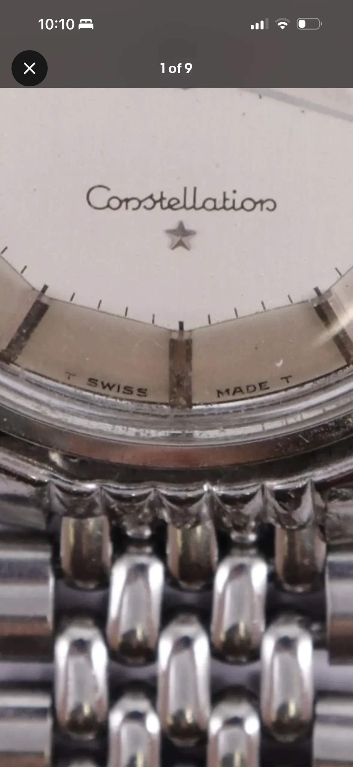
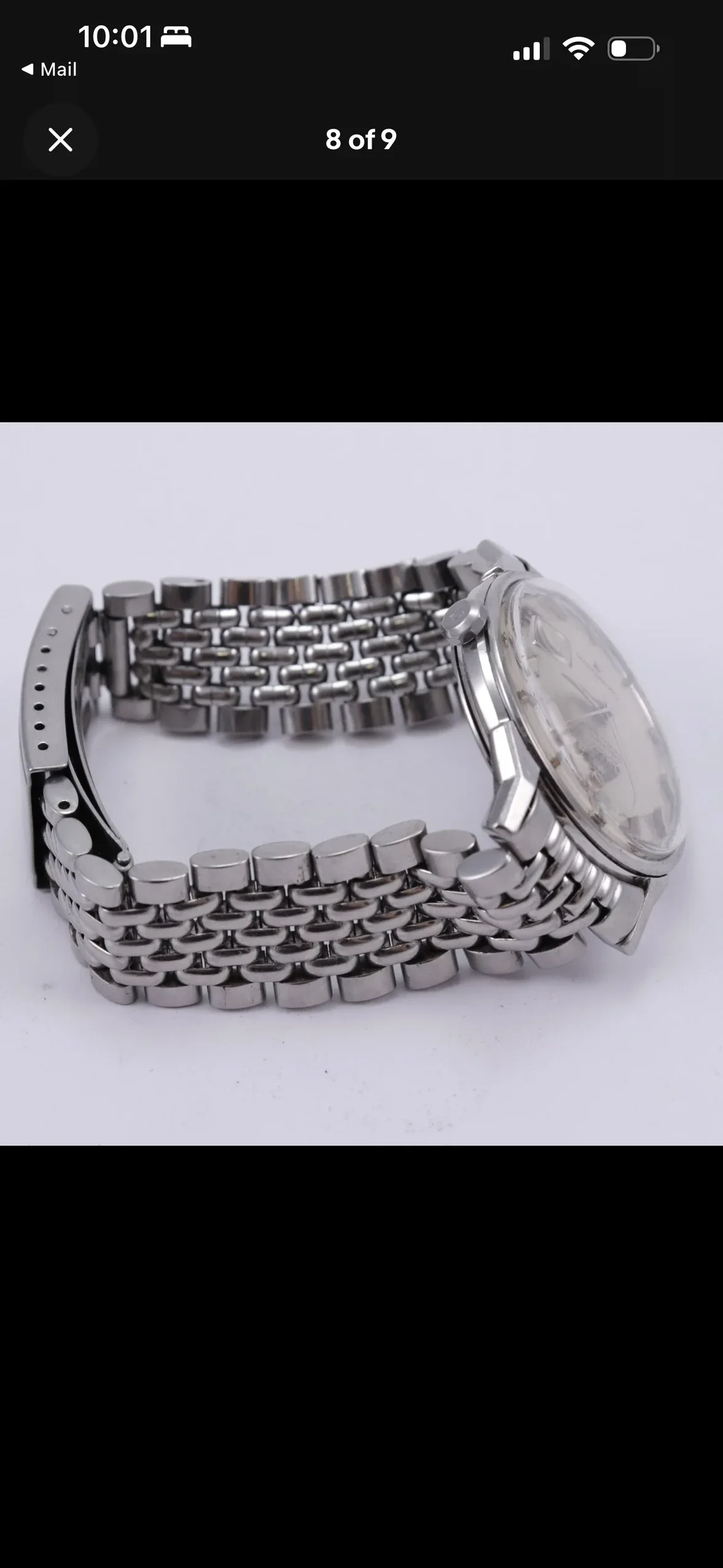
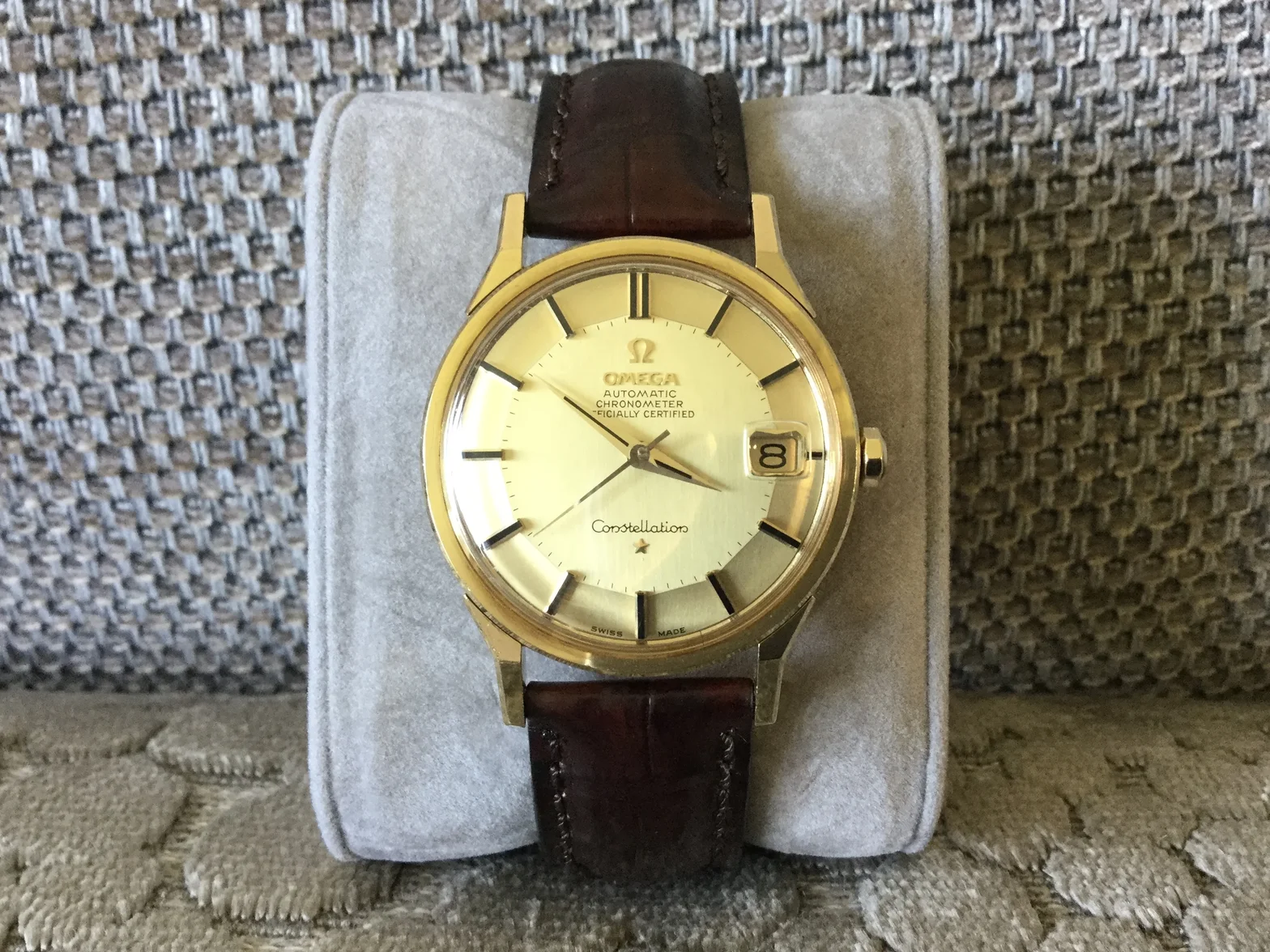
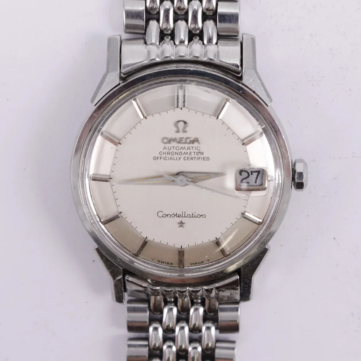
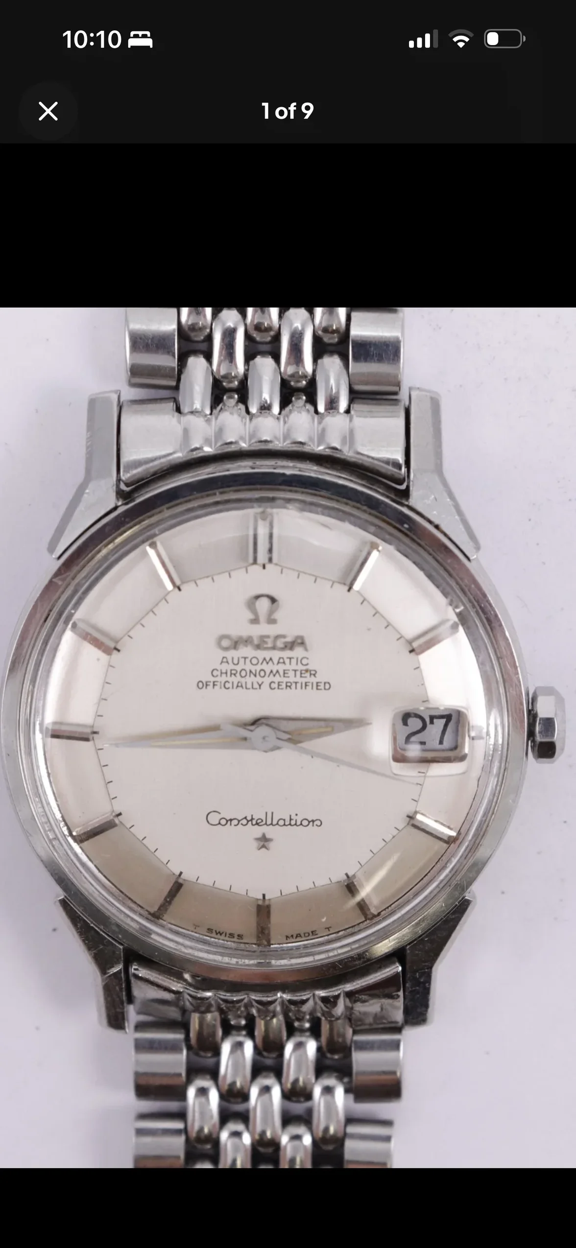
Good morning, everyone. I impulsively purchased a dog leg constellation on eBay. I've wanted one for awhile and as far as I can tell it is all original and unmolested. I'm just wondering if maybe I am wrong and it’s a radial. It was from a high volume eBay seller that sells a lot from estates and I paid $1800 USD for it. Any help would be much appreciated.
 
Posts
6,809
Likes
10,467
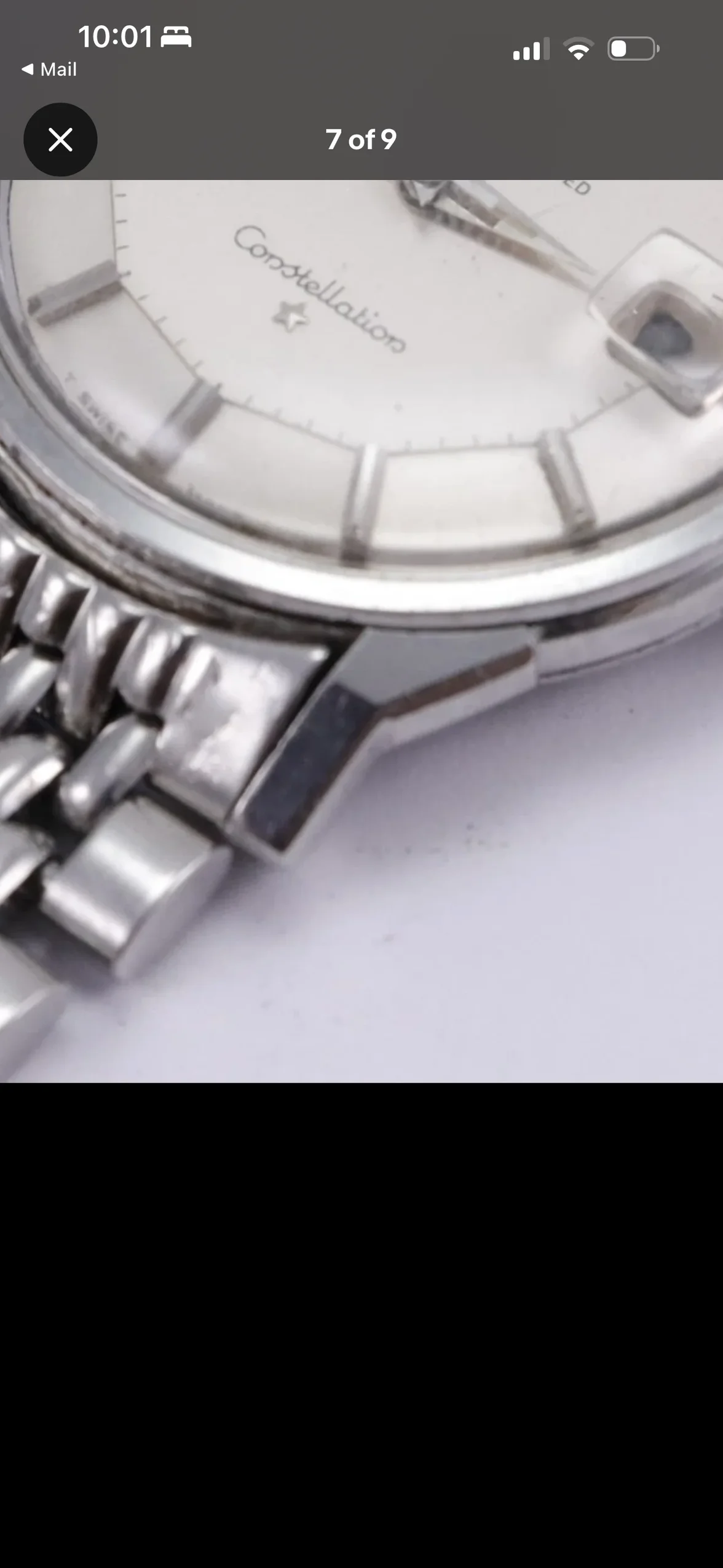
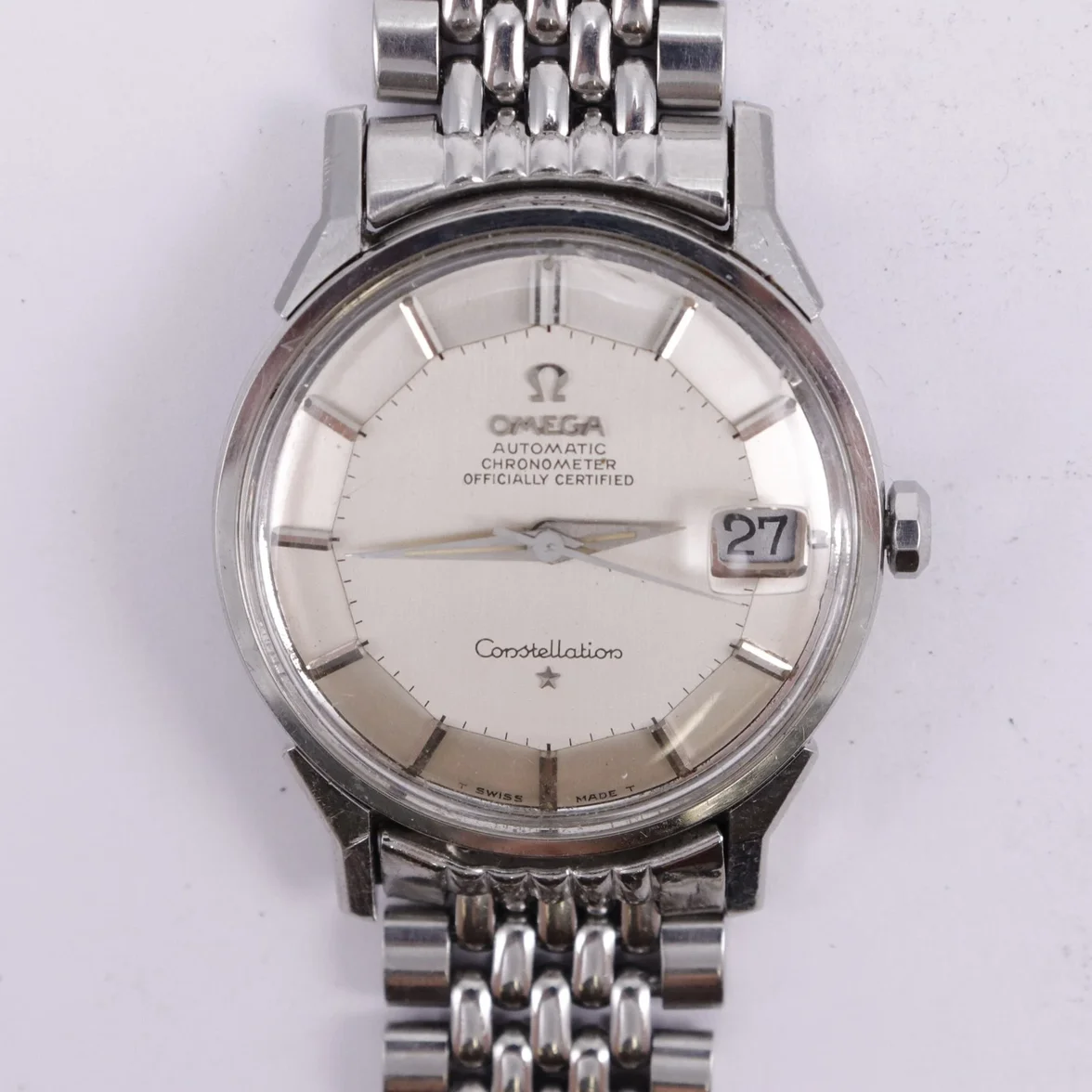
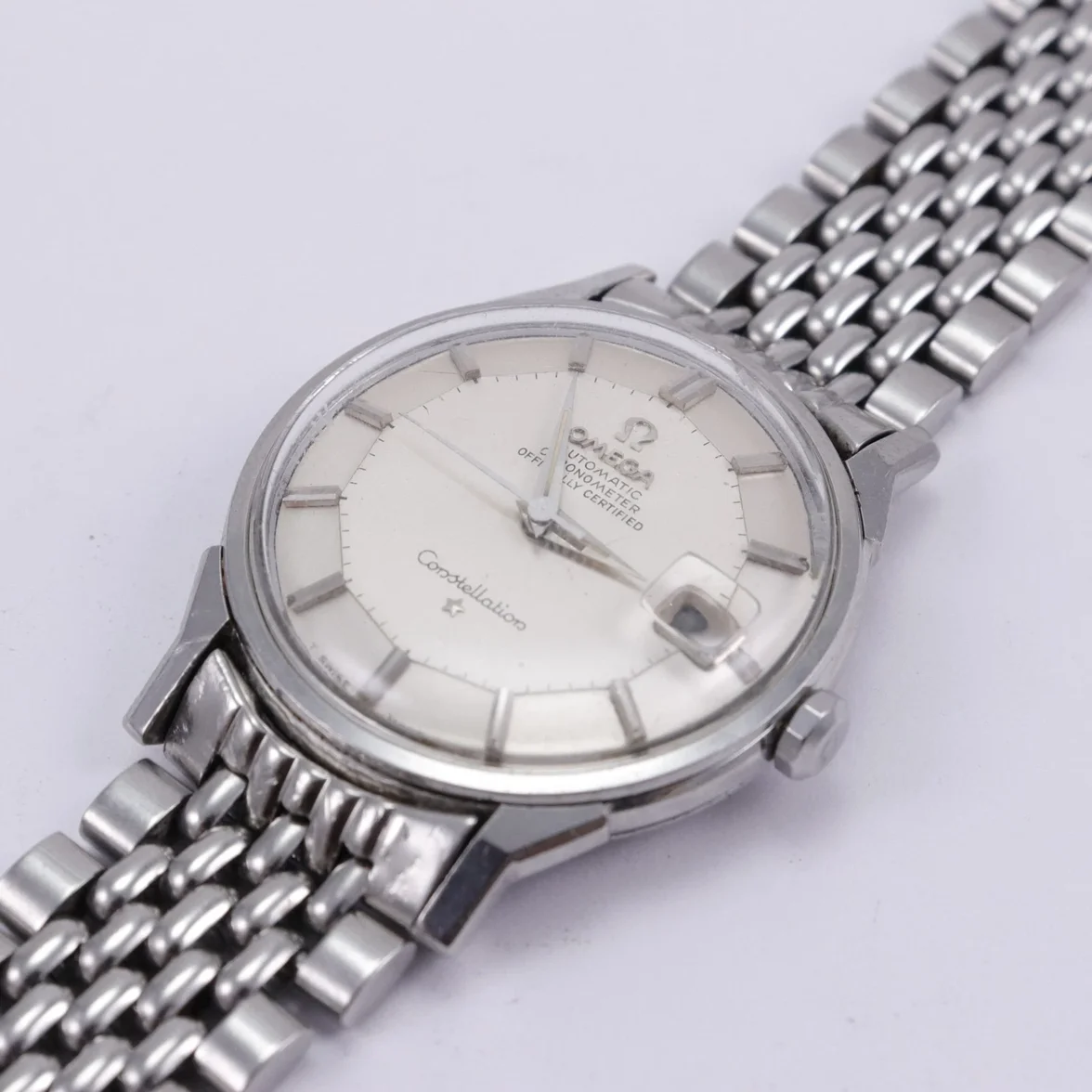
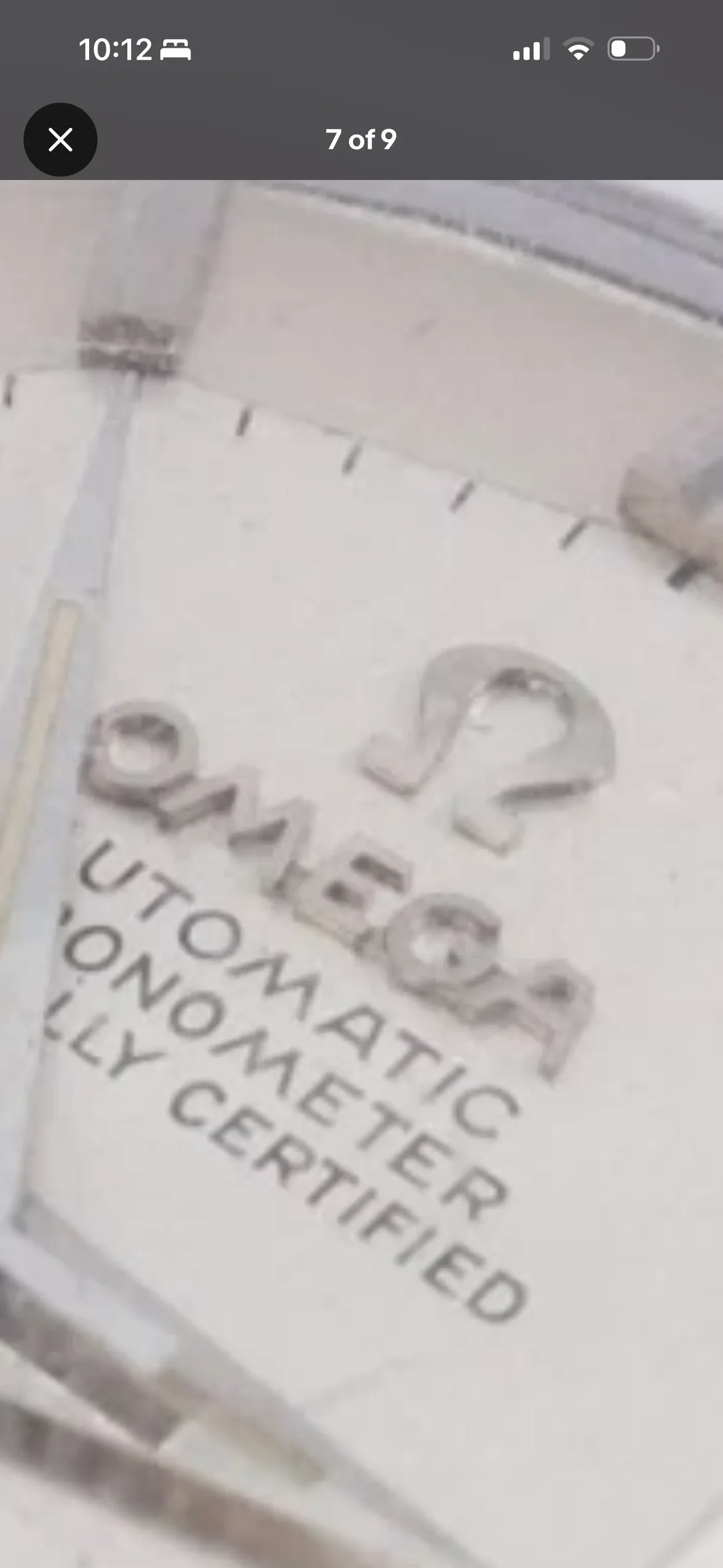
I'd like to see much clearer pics of the dial to see if the correct serifs are there - but I can't remember a dogleg pie pan that doesn't conform to the MOY test and this dial doesn't appear to.

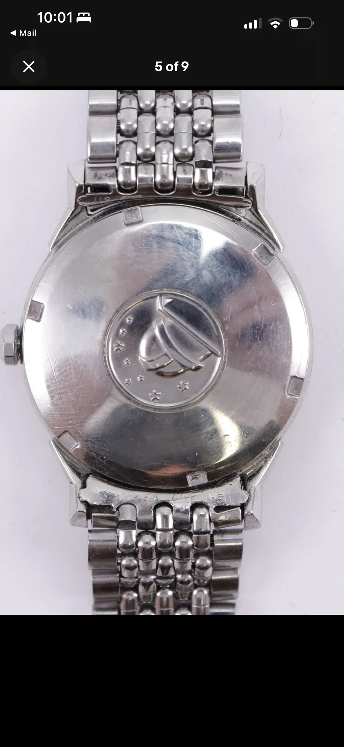
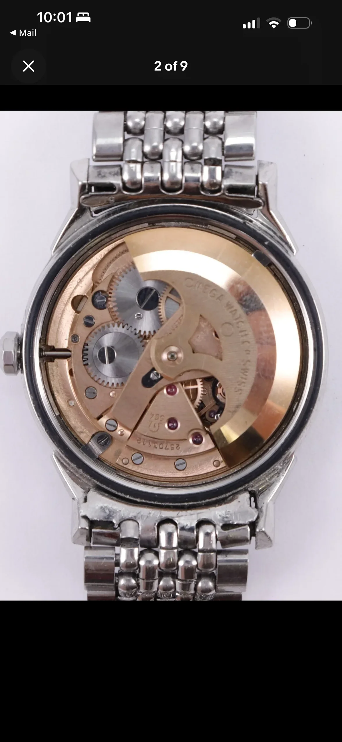
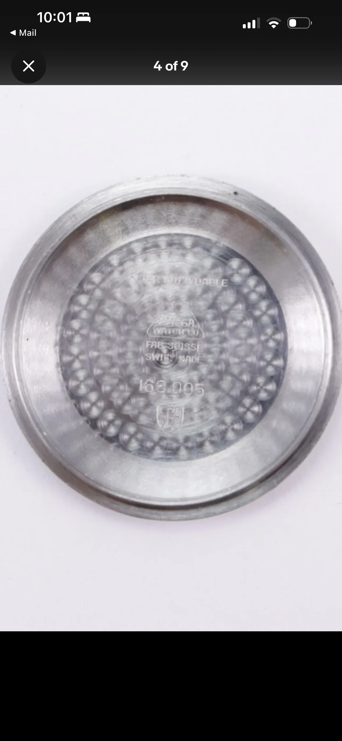
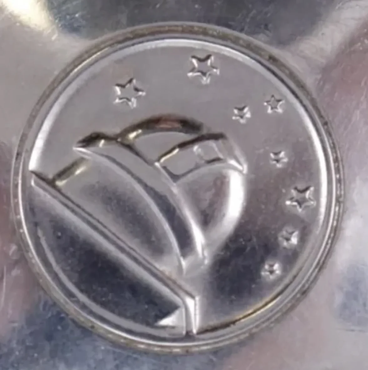
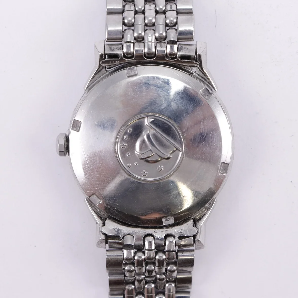
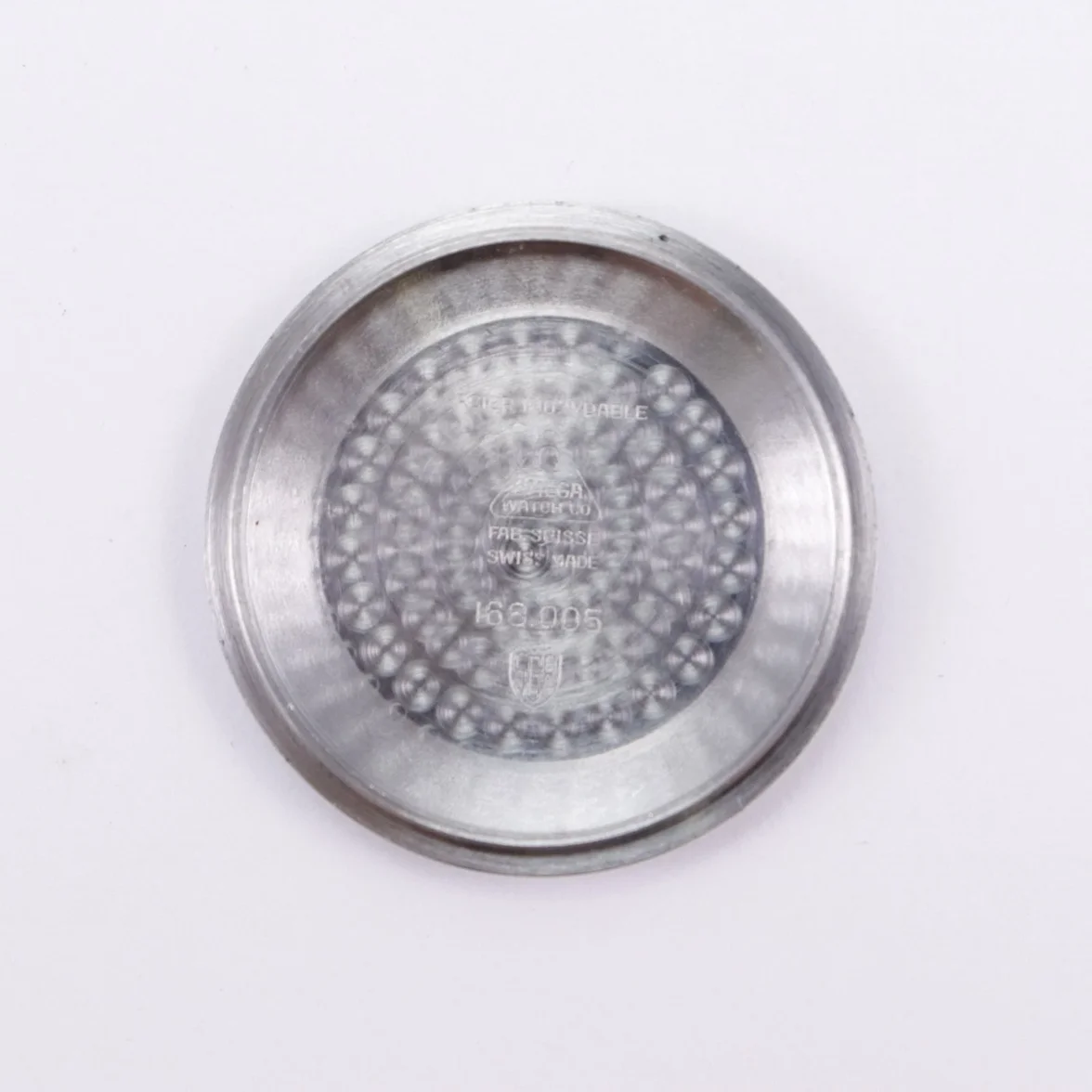
Plus, I'm really not happy with the caseback - neither inside not outside.
The perlaging doesn't look right and the observatory and stars don't look right either.
(are the stars 'hollow' with a raised section around the outside?)

Again, clearer pics may help.

 
Posts
30
Likes
5
Thank you. I don't have clearer pictures right now. I will take some clearer pictures when I receive the watch. It looks like I may have jumped the gun on this one.
 
Posts
6,809
Likes
10,467
not really but thank you for trying.

Best wait until you receive the watch now if it is on its way and post good sharp pics when it arrives.
 
Posts
8,848
Likes
62,672
Inside that case back gives me pause, but I like the dial.....for now. Need much better pix in natural sunlight.


The sellers pix are that "way" for a reason. Always a red flag.
 
Posts
30
Likes
5
Inside that case back gives me pause, but I like the dial.....for now. Need much better pix in natural sunlight.


The sellers pix are that "way" for a reason. Always a red flag.
Thank you. Can I ask what gives you pause inside the case back?
 
Posts
1,120
Likes
1,792
Thank you. I don't have clearer pictures right now. I will take some clearer pictures when I receive the watch. It looks like I may have jumped the gun on this one.
I wouldn’t start panicking just yet. That font configuration is identical to my dog leg deluxe dial from around the same period. The case back doubts are possibly just a result of bad photos. Post up some better pics when you can.

 
Posts
6,809
Likes
10,467
I wouldn’t start panicking just yet. That font configuration is identical to my dog leg deluxe dial from around the same period. The case back doubts are possibly just a result of bad photos. Post up some better pics when you can.
Thats quite interesting actually.
I was just trawling through the dogleg thread while you were posting and your deluxe was the only pie pan that I found that also missed the MOY test like the OPs does.
His isn't a deluxe dial but it could have been produced by the same manufacturer towards the end of the 60s.
 
Posts
30
Likes
5
I wouldn’t start panicking just yet. That font configuration is identical to my dog leg deluxe dial from around the same period. The case back doubts are possibly just a result of bad photos. Post up some better pics when you can.

Gorgeous watch! And thank you for sharing. Hopefully this is the case.
 
Posts
1,120
Likes
1,792
Thats quite interesting actually.
I was just trawling through the dogleg thread while you were posting and your deluxe was the only pie pan that I found that also missed the MOY test like the OPs does.
His isn't a deluxe dial but it could have been produced by the same manufacturer towards the end of the 60s.
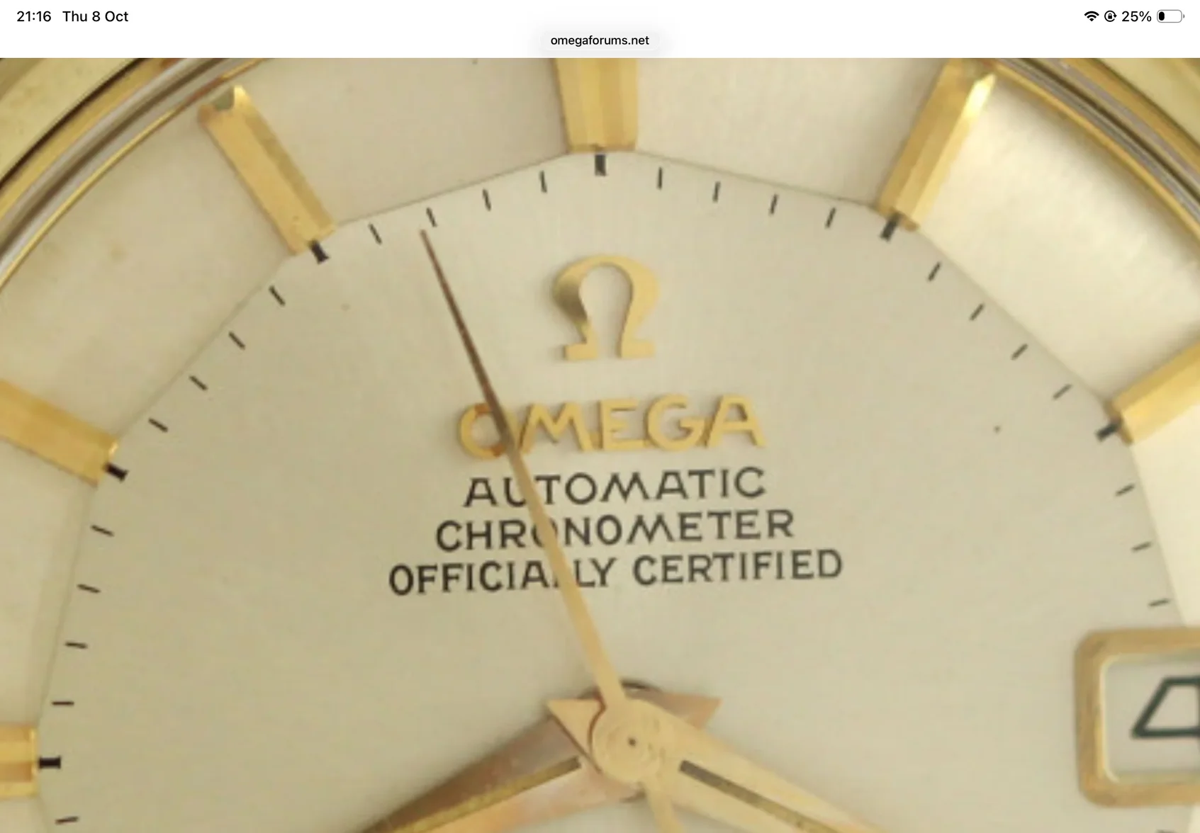
I’ve noticed a few over the years with this ‘squashed’ and slightly tilted o in the centre of chronometer. They really stand out to me as I’ve owned mine for a while now. As you say possibly a different manufacturer on the later dials.
 
Posts
899
Likes
1,240
@Peemacgee when you're mentioning the failed MOY test, do you refer to the oval "O"?
The second and third pages of Desmond's MOY PDF ("It's all about MOY, except when it isn't") does show some 1960s examples failing the test but being original dials, so I suppose there are few but some valid examples
 
Posts
30
Likes
5
I’ve noticed a few over the years with this ‘squashed’ and slightly tilted o in the centre of chronometer. They really stand out to me as I’ve owned mine for a while now. As you say possibly a different manufacturer on the later dials.
It would be so interesting to know if it is the case that there was a different dial manufacturer in the late 60s that could explain this.
 
Posts
6,809
Likes
10,467
I’ve noticed a few over the years with this ‘squashed’ and slightly tilted o in the centre of chronometer. They really stand out to me as I’ve owned mine for a while now. As you say possibly a different manufacturer on the later dials.
@Peemacgee when you're mentioning the failed MOY test, do you refer to the oval "O"?
The second and third pages of Desmond's MOY PDF ("It's all about MOY, except when it isn't") does show some 1960s examples failing the test but being original dials, so I suppose there are few but some valid examples

Ah, no.
The squashed O is a well known and quite common dial variant.
It’s true that, with a squashed O, while a vertical crosshair won’t properly bisect the O because of the shape, the cross hair will pass through the first peak of the M and kiss the right hand ‘arm’ of the Y.

It’s difficult to see with the OPs pics but if you draw a vertical line through the first peak it looks to miss the Y altogether.

Otherwise the general appearance of the fonts look correct.

It looks like @Noddyman ‘s deluxe dial might be the same.
 
Posts
30
Likes
5
Ah, no.
The squashed O is a well known and quite common dial variant.
It’s true that, with a squashed O, while a vertical crosshair won’t properly bisect the O because of the shape, the cross hair will pass through the first peak of the M and kiss the right hand ‘arm’ of the Y.

It’s difficult to see with the OPs pics but if you draw a vertical line through the first peak it looks to miss the Y altogether.

Otherwise the general appearance of the fonts look correct.

It looks like @Noddyman ‘s deluxe dial might be the same
This is complicated for a layman like myself. Are you saying that because it misses the Y altogether on my watch, it may not be original?
 
Posts
1,120
Likes
1,792
I started looking through the show & tell thread and found this one on the second page. I can’t see any discernible difference between any of them if I’m honest. All fonts look to be in the same place to my eye.

 
Posts
6,809
Likes
10,467
This is complicated for a layman like myself. Are you saying that because it misses the Y altogether on my watch, it may not be original?

Yes, but we could do with better pics.
 
Posts
30
Likes
5
Yes, but we could do with better pics.
Sounds good. When I take delivery of it I will be sure to take some better pictures and post them.
 
Posts
13,644
Likes
19,007
This watch was on the Recommended Vintage Omega thread:

My thoughts is that it is original and correct except for the crystal (no Omega logo), but a little bit later (1967) than most Ref. 168.005 watches we see.

I thought the price was fair but the cost to get into the U.S. would have been a dealbreaker.
gatorcpa
 
Posts
30
Likes
5
This watch was on the Recommended Vintage Omega thread:

My thoughts is that it is original and correct except for the crystal (no Omega logo), but a little bit later (1967) than most Ref. 168.005 watches we see.

I thought the price was fair but the cost to get into the U.S. would have been a dealbreaker.
gatorcpa
Interesting. Thank you for pointing this out. Hopefully you are correct in that it is all original. I will definitely take better pictures when I receive it.