- Posts
- 498
- Likes
- 677
eternalover
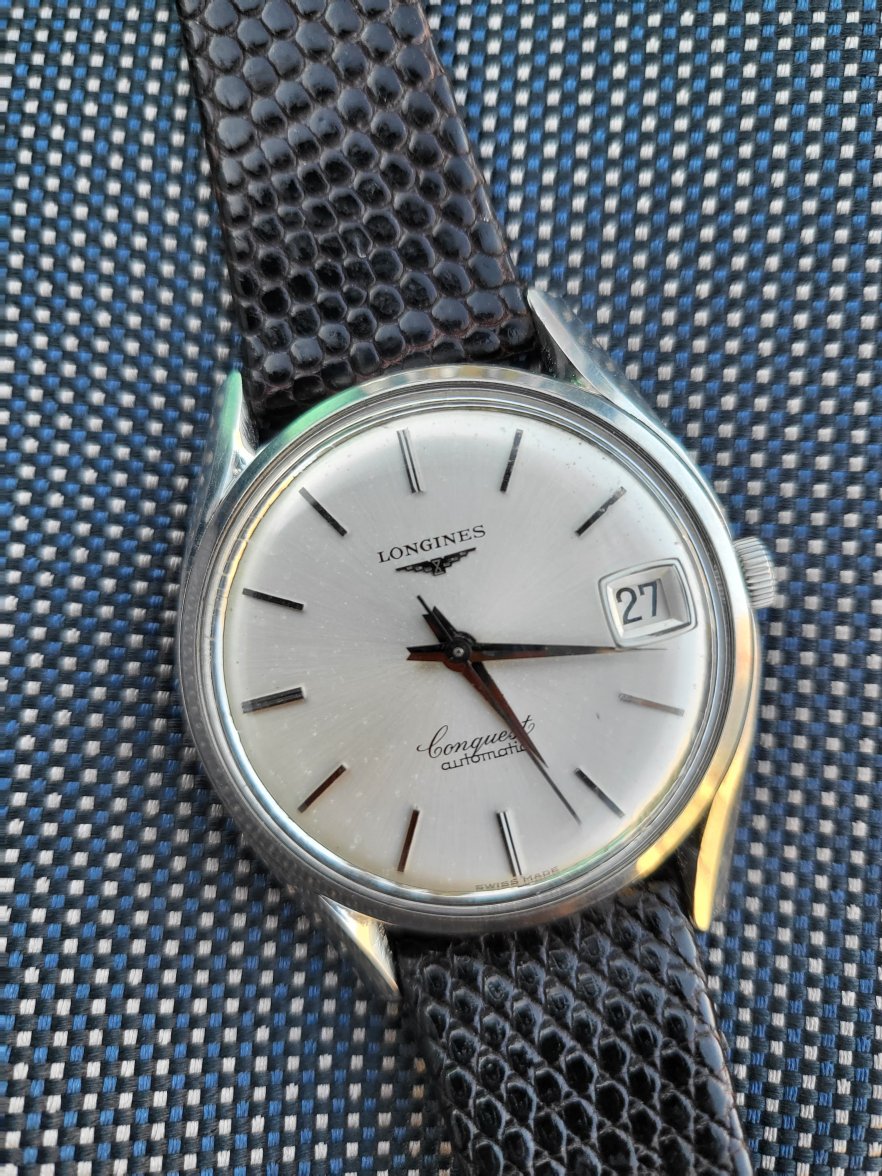
·have been looking for one of these for ages but am anxious about the dial on this _too good to be true?
https://www.ebay.co.uk/itm/Longines...7-e876-473e-9d16-b6ba892cb1fb&redirect=mobile
https://i.ebayimg.com/images/g/al4AAOSwVdFi6R64/s-l1600.jpg any help appreciated
https://www.ebay.co.uk/itm/Longines...7-e876-473e-9d16-b6ba892cb1fb&redirect=mobile
https://i.ebayimg.com/images/g/al4AAOSwVdFi6R64/s-l1600.jpg any help appreciated
This website may earn commission from Ebay sales.