cverstegen
·Hello!
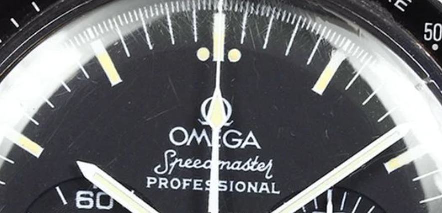
I am looking at a few 3590.50 examples and I have noticed two different fonts on the dials that I see.
There is this one (which i think is on the older ones)
And this one (which i think is from the younger ones)
Can anyone tell me about what year the font changed? Am I wrong about which one is older?
Also, I searched around for a thread that explained the dial evolution of the speedmaster pro, but could not find one (only some comparisons between 2 or three variations). Does anyone know a good place for me to see a comprehensive layout of the changes?

