- Posts
- 6,449
- Likes
- 9,968
Peemacgee
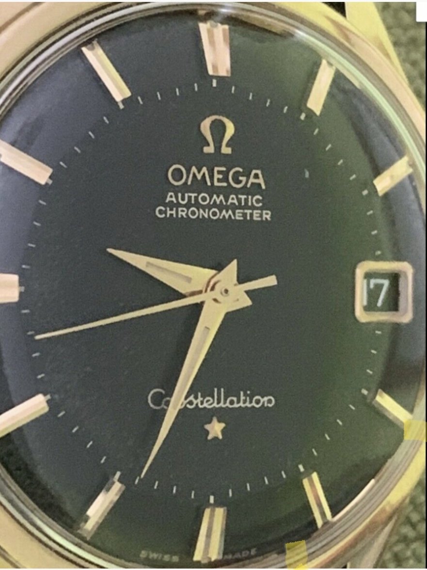
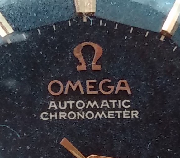
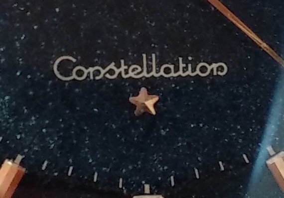
··Purrrr-veyor of luxury cat box loungersStill not brilliant pics but this latest shot doesn’t look to have have much serif-ing going on.
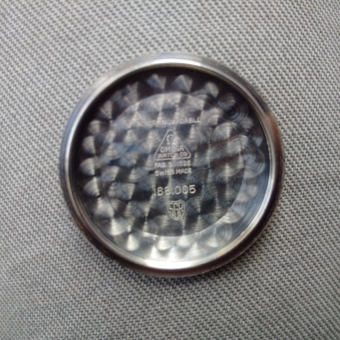
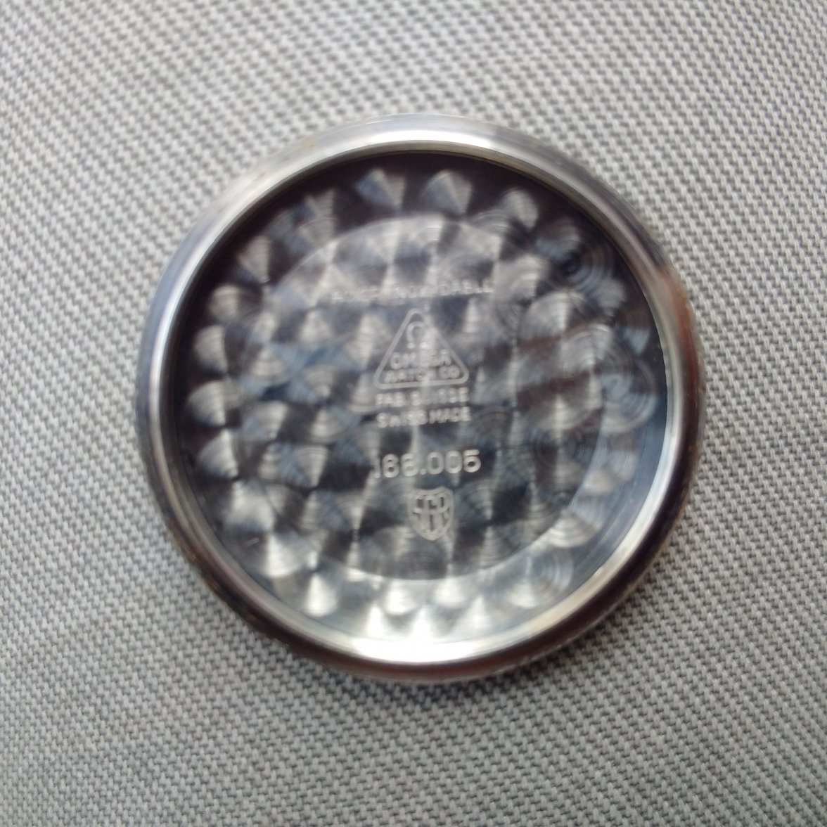
still need sharper images.

still need sharper images.
Please consider donating to help offset our high running costs.
If anything is suspicious, we should not buy it. That is my lesson from experience. But if you like it, you can still buy it
Hoailam - please use an online translator from whatever language you are currently typing to English.
It is not our job to do this, it is yours.