- Posts
- 435
- Likes
- 2,281
__ryan__
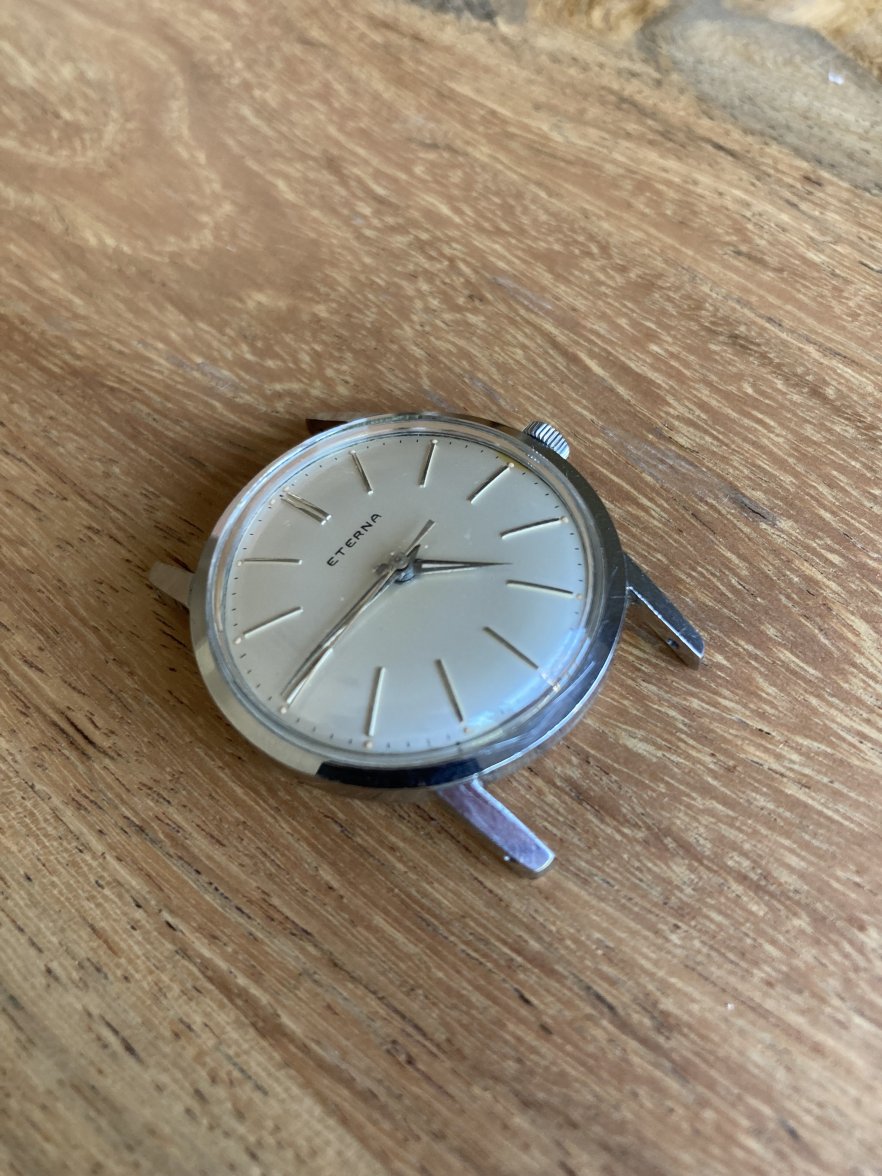
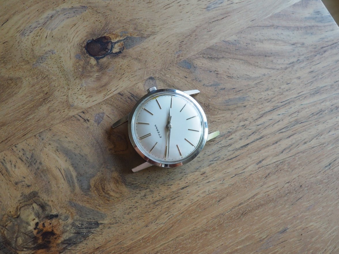
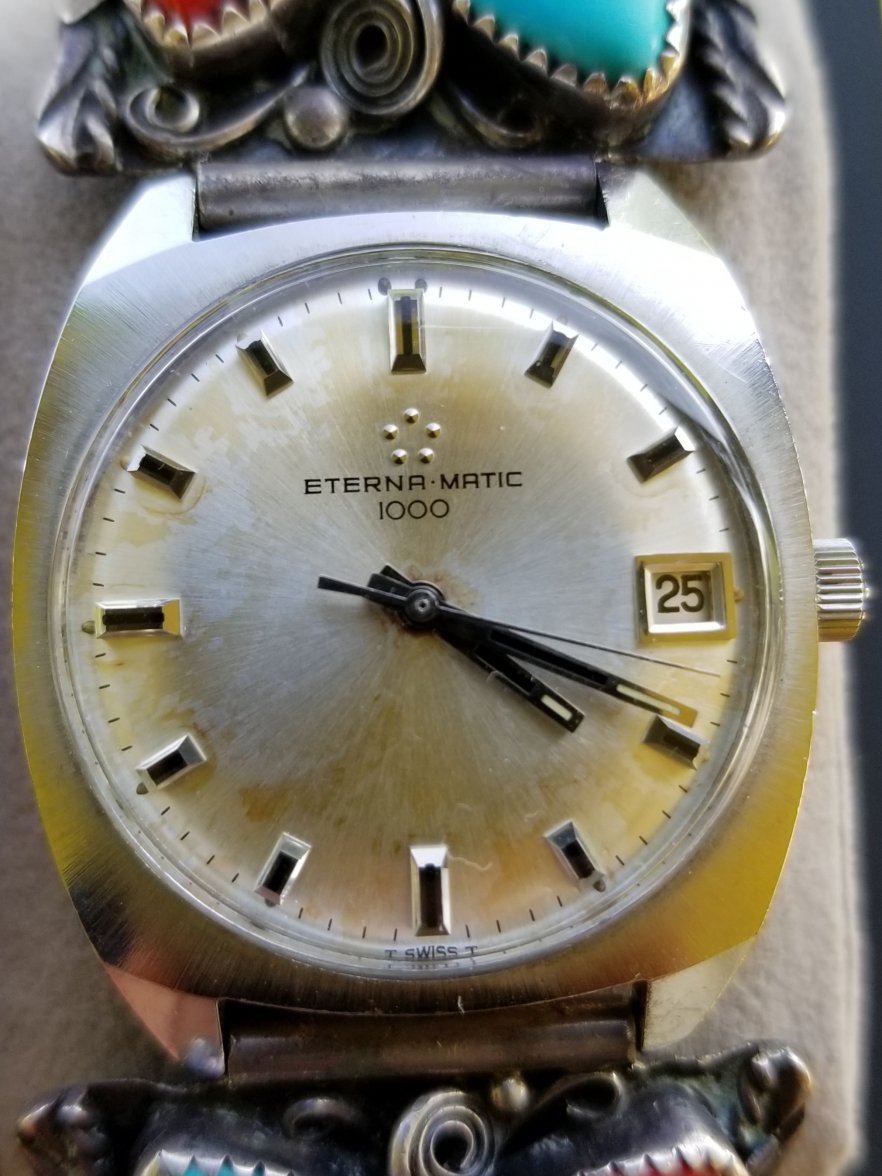
·I'm about 90% sure this has been redialed, but wanted to check-in with the experts. It's a hand winding movement (cal. 14xx) and the serial number dates to 1961.
I would think the dial is too flawless for a watch of this age. And although there does appear to be some variation in the typeface used by Eterna, this one seems off. There doesn't seem to be enough line thickness variation, the spacing between the E and R looks to be too close, and the A seems different from other variants.
Thanks for any input that can be provided.