- Posts
- 92
- Likes
- 214
thewristelier
·I may have a chance to buy this first one (has been on hold but hold expires tomorrow) but have a few questions..
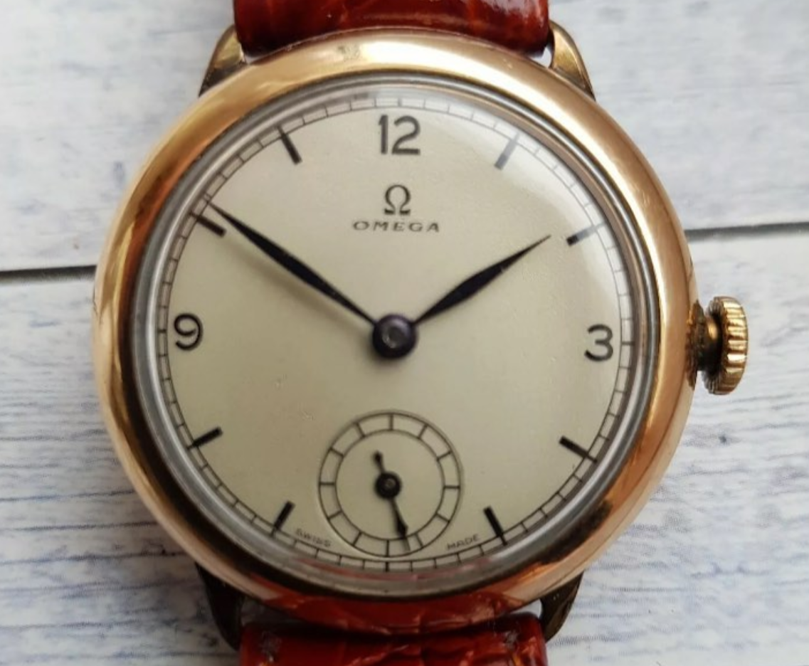
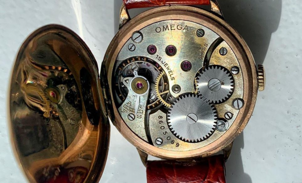
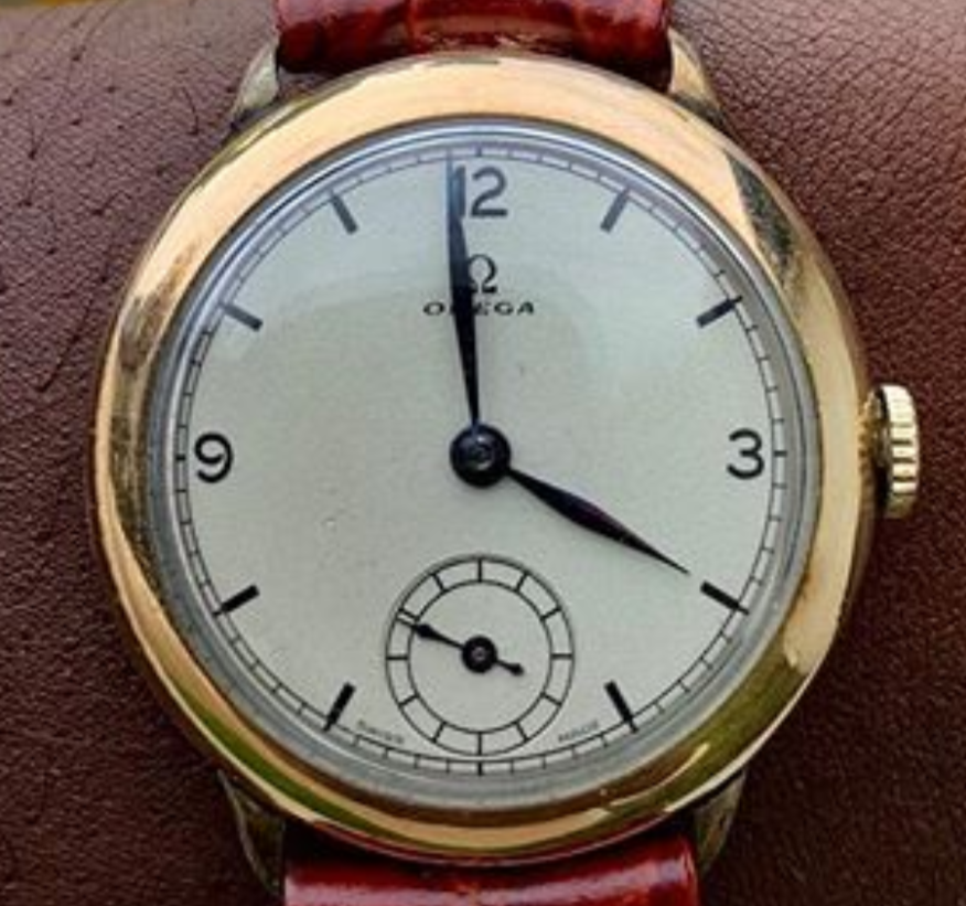
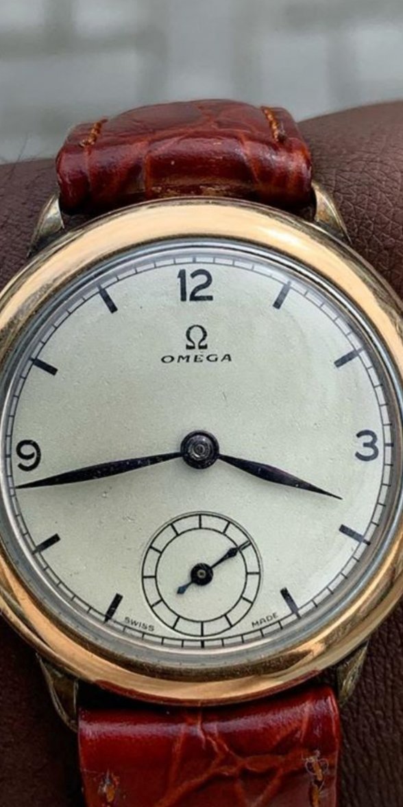
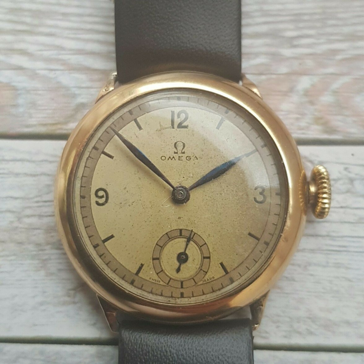
1. 1930's "Trench" 9ct Gold Omega
- First off, is this a redial? It looks very similar to another one for sale on the Bay, with some minor coloration variance, but is this TOO clean?
- The hands look OK to me, but thoughts?
1. 1930's "Trench" 9ct Gold Omega
- First off, is this a redial? It looks very similar to another one for sale on the Bay, with some minor coloration variance, but is this TOO clean?
- The hands look OK to me, but thoughts?
Edited: