- Posts
- 13,351
- Likes
- 23,176
Davidt
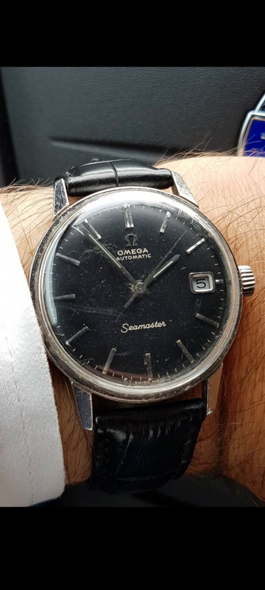
·I’ve been ridiculously busy over the last few months with work and family and have barely spent any time on the forum or watch collecting. Anyway, I recently got the itch and in my sleep deprived state bought this from a well know Japanese seller. I’ve kept an eye out for a black 166.010 after I missed out on one on the OF sales forum a year or so ago.
Anyway, I’m now going to have to chalk this up to experience and a reminder to check the details before buying. At first glance it looked ok, the serifs are there, ‘Seamaster’ looks correct, minute markers are evenly spaced etc.
However, when you get further into the details things aren’t quite right. Those serifs are a bit too pronounced and look at the spacing on ‘AUTOM AT IC’. The font is also slightly too heavy.
It’s a pain as I’ve already paid import duty (at 35%! thank you DHL!) and will have to claim this back separately but it’s all part of the game.