- Posts
- 382
- Likes
- 267
myatt
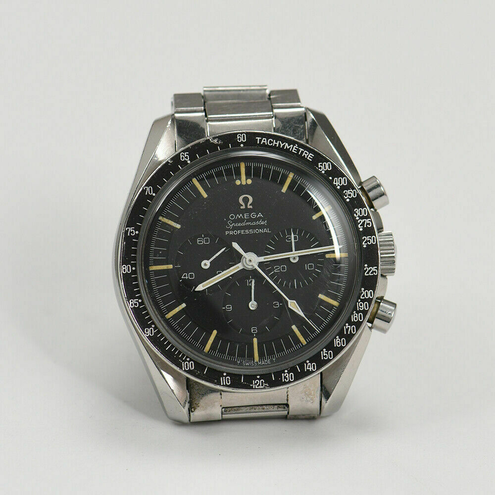
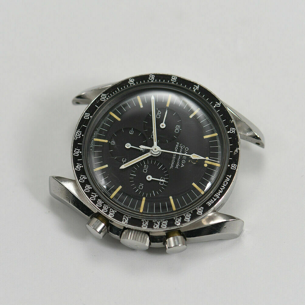
·Calling all vintage Speedy experts to opine on this DO90 bezel. Watch is attractive to my eyes, and the bezel dots seem to line up fine, as do the hooked 7s. My peeve is that the font seems just a shade thick to my eyes. Despite the serifs being in place, I just get a sense a thicker font might be evidence of this not being a factors original bezel from '65 - or it is my eyes playing tricks. I am no pro on how good/bad the later (or even the 70s and 80s) service DO90 bezels were. Just trying not to get blinded hence calling OF for help.